 eCommerce
 Memberships
 RAG Chatbot
 Online Courses
 Bookings
 Travel guide
 Events
 Content Creators
 Pickup & Delivery
 Newspaper
 Radio
Radio Schools
 Faith
Faith Organizations
 Restaurant
 Grocery
 Custom apps
 Employee Communication
 NO CODE APP BUILDER
 TECHNOLOGY
 WHY GOODBARBER?
 Design
 PRODUCT RESOURCES
 TOPICS
 MOBILE APPS RESELLERS
 DISCOVER
Design update: a new tabBar template
Written by Marie Pireddu on
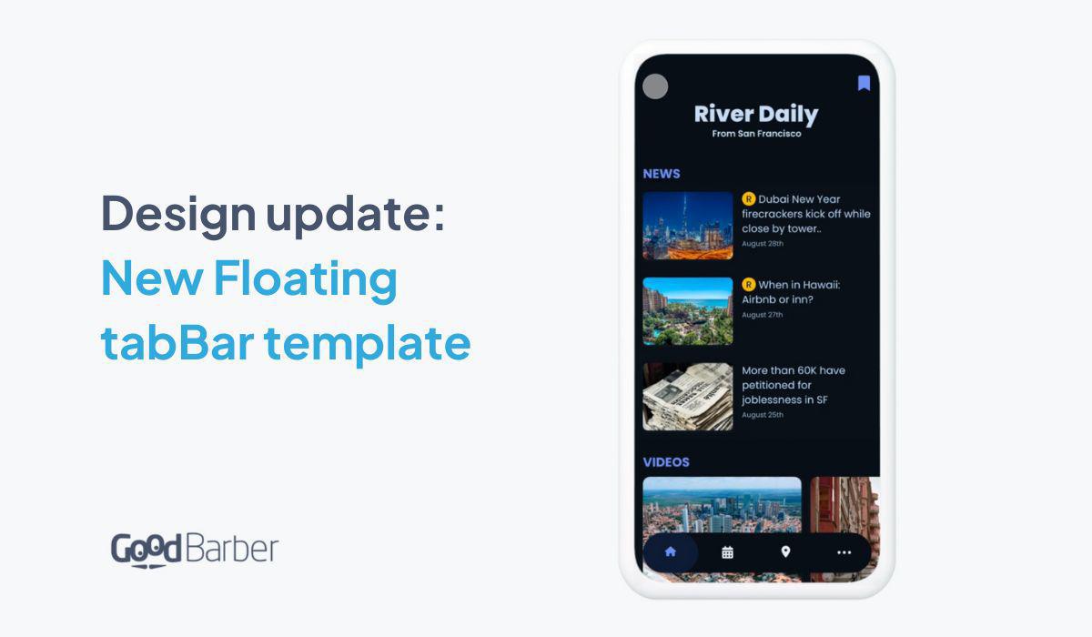
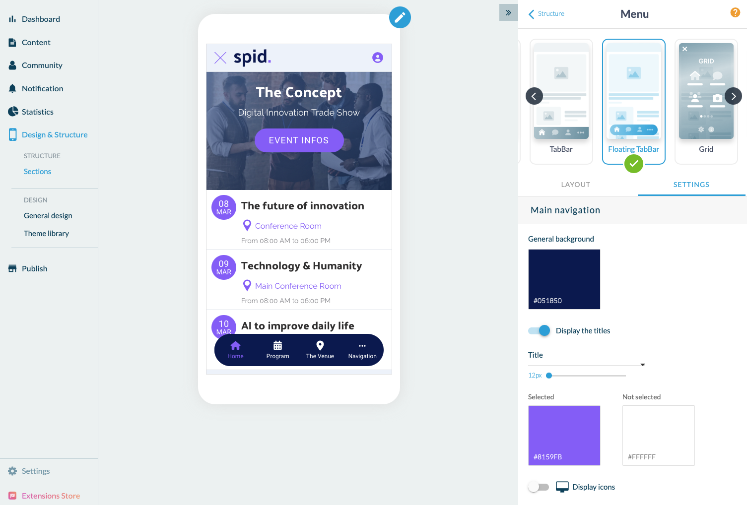
We already offer a tabBar template amongst our current 5 navigation menu templates. And today, we're happy to now introduce a new and trendy template: the floating tabBar.
Why is tabBar a popular navigation menu?
The bottom navigation bar follows the "thumb rule of design" which assumes that most app users navigate using their thumbs. This principle suggests that crucial screens and pages within an app should be within easy reach of a user's thumb. By aligning with this principle, the bottom navigation bar becomes a crucial element of app design. It places essential sections of the app within the reach of the user's thumb, enhancing convenience and accessibility.
Best practices for a tabBar :
When designing the bottom navigation, it is crucial to ensure that it provides quick access to the most frequently used or significant features of the app. To achieve this, there are some important things to keep in mind: - Limit the number of destinations: It is recommended to display 3 to 5 sections of your app in the bottom navigation. Using more than 5 can lead to a cramped and cluttered interface with tap targets that are too close together, which may result in users mistakenly tapping the wrong tab. Additionally, adding more tabs can increase the complexity of the app, potentially compromising its performance.
2 . Don't truncate or wrap titles: When creating text labels for navigation icons, it is important to provide brief and meaningful explanations. Avoid lengthy labels that cannot be truncated or wrapped. There is nothing appealing for your user to see "Things to ...."
3. Be consistent with the icons: Using consistently designed icons in your app can effectively communicate to the user that you value a high-quality user experience. By paying attention to the details and ensuring that the icons are consistent, you can make your app more appealing and engaging to users, keeping them more inclined to get back to it more often. Avoid using different colors for different icons as it may lead to confusion for your users. The color scheme used on your bottom navigation bar should agree with the overall theme of your app. If you're using one of GoodBarber's themes, you don't need to worry about that. Our designers have taken care of all these things and the design will be consistent all through the app.
How to apply the new template to your app?