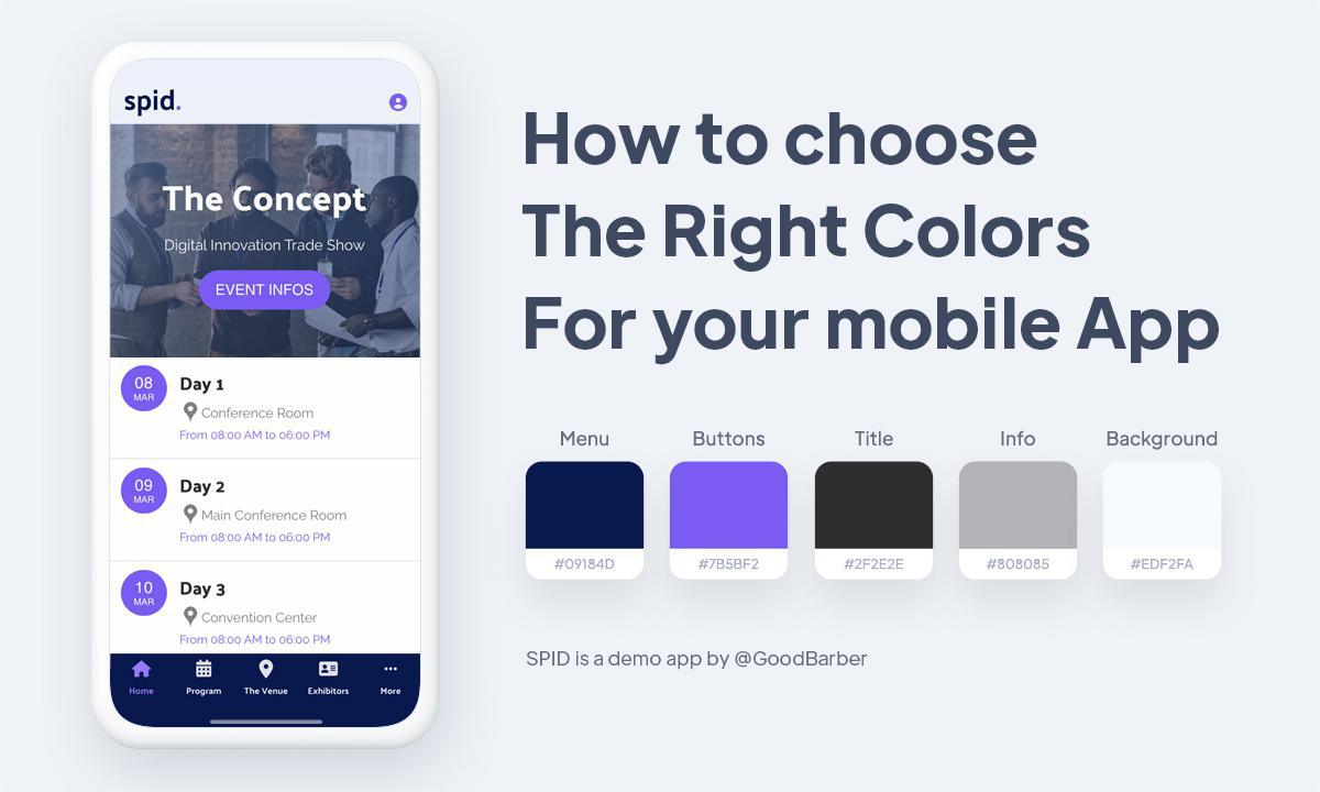
How to choose the right colors for your mobile app
Written by Marie Pireddu on

The use of colors in marketing relies on the science according to which colors can influence consumer behavior. And the color trends every year tend to represent the general mood or vibe of what's going on around the world.
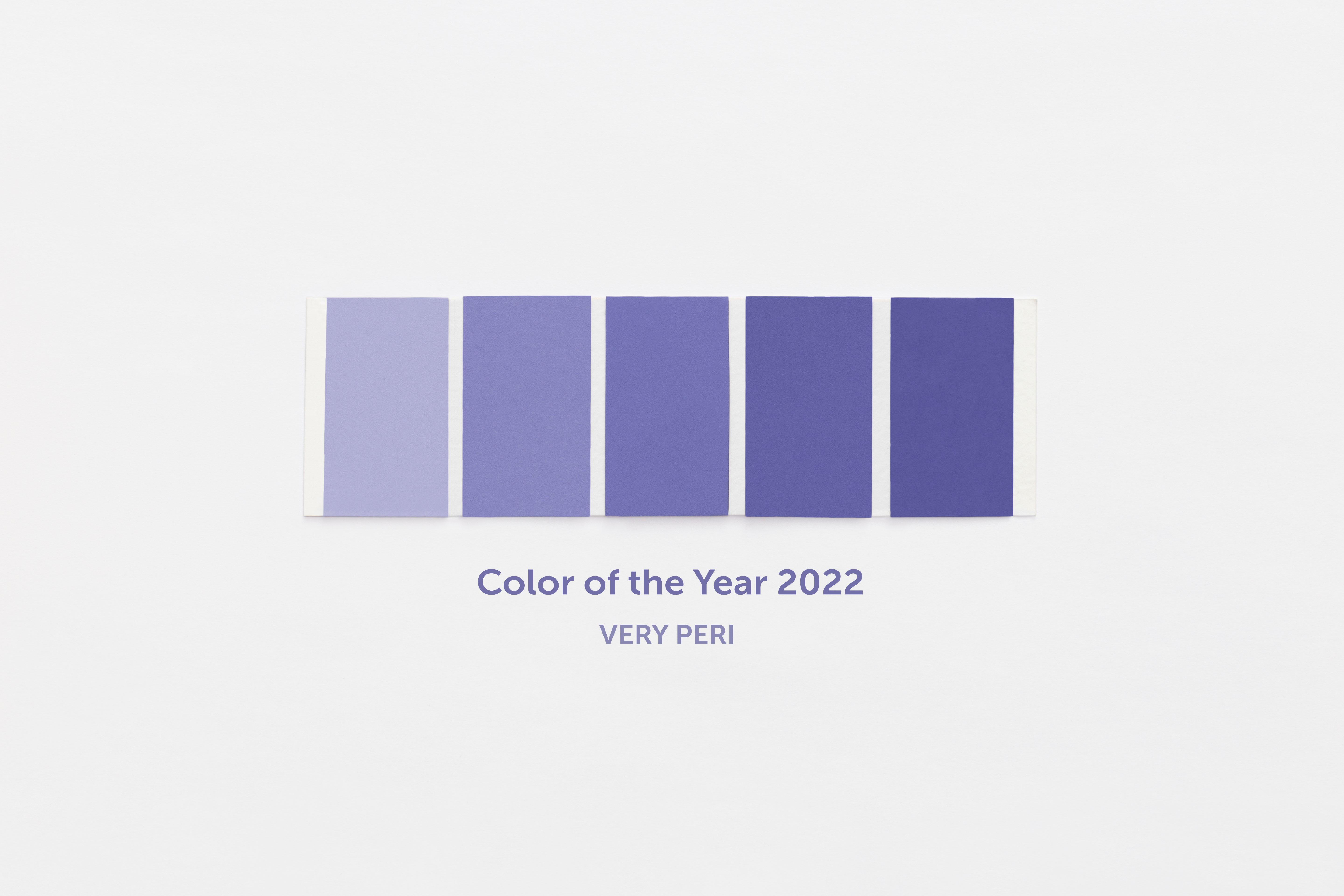
This year is no exception with Pantone revealing Very Peri as the color of 2022.
This inquisitive and intriguing color reflects the transformative times we're living in. After almost two years of isolation and restriction, our ways of life are changing. As Pantone puts it "our physical and digital lives have merged in new ways." Digital design and colors reflect these changes.

Very Peri - Pantone Color of the Year 2022
Now, let's dive into how to choose the right colors for your mobile app.
Why colors matter
Well, guess what, the choice is not casual. Companies are well aware of the importance of color when it comes to influencing consumer behavior. There are many examples of how companies improved their sales, retention and conversion rates, and other KPIs just by changing elements of their color scheme.
Studies show that different colors trigger different emotions in users. For example red triggers strong emotions like love, passion, and anger; In a marketing context, red is often used for special offers or discounts. People now associate this meaning so it’s a good idea to use red if you want to draw attention to some offer you are making. Blue and green are relaxing and soothing colors; They convey feelings of trust and commitment. Black and grey are elegant colors. Black is also used to give a modern and trendy feel. Yellow is a catchy and cheerful color but it must be used only in small amounts to highlight, otherwise it is perceived as irritating.
Color is a very useful tool to create a brand identity and trigger specific emotions in users.
How to choose the colors of your app

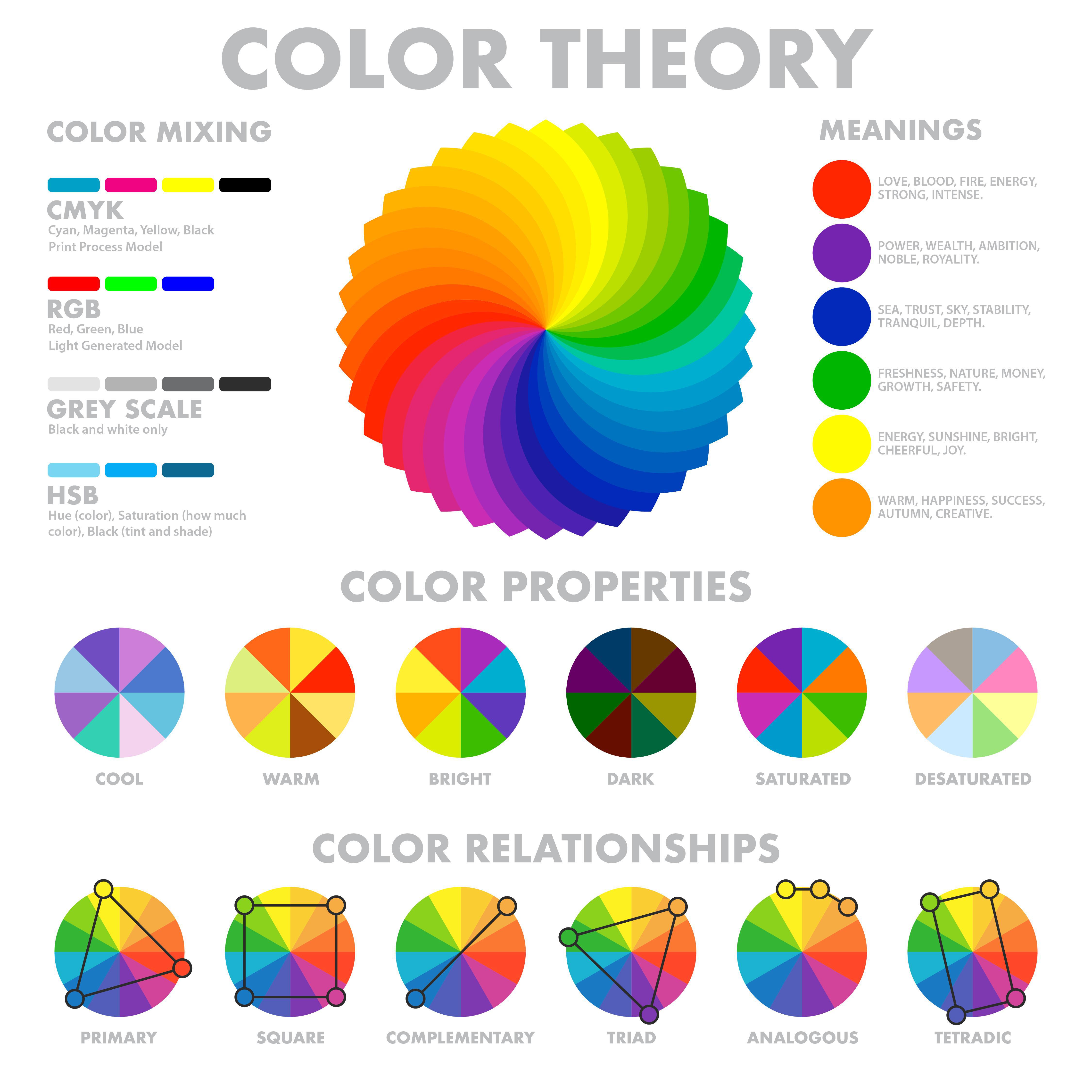
Color Wheel infographic
First, you need to know your brand and what you want it to be associated with. What is the mood or feeling your want to express? How do you want people to feel about using your app? Do you want your brand and app to feel accessible, calm, bold, sophisticated, polished, quirky, or elegant?
Once you've defined this, look at which color evokes this emotion.
Colors can be divided into two main categories: warm and cool. Warm colors tend to be associated with energy, while cool colors are linked with calmness and security.
For example, Your next step is to create your color scheme. A lot of successful brands have only one or two brand colors, so don’t be afraid to keep it simple and stick with that core brand color.
A color scheme is simply the way colors are combined together.
- You can choose one base color and then different tones of that one color. You can use a color wheel to help you choose different hues of that same color, varying the saturation and tone of the base color to pick out lighter and darker hues. This is called the Monochromatic color scheme. It gives a more uniform look and feel to your app.
- Next is the Triadic color scheme. There, you'll use three colors, equally spaced on the color wheel. This too will create a harmonious look but without the slightly ombre or monochromatic styling.
- A complementary color scheme is composed by using two colors opposite each other on the color wheel. This is the particularly contrasting of all color schemes which attracts the most attention. For example, red and green, blue and orange.
- Analogous colors are a group of three colors next to each other on a color wheel, such as violet, red-violet, and red. When these colors are grouped we call it an analogous color scheme. The color in the center of this group of three is sometimes called the mother color since the other two colors contain that center color. Analogous color schemes create a visually pleasing and calming display
Misconceptions to avoid
Consumers' differences: Colors don't have the same meaning everywhere. For example in the Western world, white symbolizes pureness and peace; It is generally used at weddings. But in China, white symbolizes bad luck and is used in funerals. Something to keep in mind when planning your color scheme as with the internet, you will reach users all around the world.
The sector in which your business operates. There are color schemes for every specific business. The most important thing is to consider the best color for you in your specific context rather than think about the general impact of color.
Once you've defined this, look at which color evokes this emotion.
Colors can be divided into two main categories: warm and cool. Warm colors tend to be associated with energy, while cool colors are linked with calmness and security.
For example,
- Red is often associated with bold or intense experiences
- Yellow is cheerful, joyful, optimistic
- Blue is one of the most prominent colors in nature. Associated with water and air, it’s tied to calmness and tranquility. It's also often used to symbolize stability and trust.
- Green symbolizes abundance, growth, and health, and has become popularly associated with peace, and environmental consciousness.
- Orange represents cheerful, confidence, and fun.
- Purple represents power, wealth, and royalty.
- White evokes light, purity, or cleanliness. It’s associated with simplicity and modernity in design.
- Black is associated with power, elegance, and sophistication.
A color scheme is simply the way colors are combined together.
- You can choose one base color and then different tones of that one color. You can use a color wheel to help you choose different hues of that same color, varying the saturation and tone of the base color to pick out lighter and darker hues. This is called the Monochromatic color scheme. It gives a more uniform look and feel to your app.
- Next is the Triadic color scheme. There, you'll use three colors, equally spaced on the color wheel. This too will create a harmonious look but without the slightly ombre or monochromatic styling.
- A complementary color scheme is composed by using two colors opposite each other on the color wheel. This is the particularly contrasting of all color schemes which attracts the most attention. For example, red and green, blue and orange.
- Analogous colors are a group of three colors next to each other on a color wheel, such as violet, red-violet, and red. When these colors are grouped we call it an analogous color scheme. The color in the center of this group of three is sometimes called the mother color since the other two colors contain that center color. Analogous color schemes create a visually pleasing and calming display
Misconceptions to avoid
Consumers' differences: Colors don't have the same meaning everywhere. For example in the Western world, white symbolizes pureness and peace; It is generally used at weddings. But in China, white symbolizes bad luck and is used in funerals. Something to keep in mind when planning your color scheme as with the internet, you will reach users all around the world.
The sector in which your business operates. There are color schemes for every specific business. The most important thing is to consider the best color for you in your specific context rather than think about the general impact of color.
5 free Tools to help your find your colors
You're now ready to pick your mobile app colors. These free tools will help you put all your learned in this article to good use so that you can pick the best color scheme and palette for your app
Pantone Studio , the official Pantone app. It allows you to create new Pantone color palettes on the fly, store their existing ones, or share them with clients and colleagues via Adobe Creative Suite or QuarkXPress. Colors can also be copied from files stored locally on your device or from a fresh photo taken from within the Pantone Studio app.
My Color.Space is a great free resource to generate color palettes and color gradients.
You start with a color of your choice. Enter the HEX code and ColorSpace generate several palettes matching your color. If you don't know the HEX code, there are plenty of free tools online that will give you the code from a photo you upload.
Color Hunteris a browser-based tool that lets you find and make color palettes created from images. Just upload your image and get a palette based on the colors it contains.
Color Viewfinder is a convenient app when you need to quickly create color palettes. This free iOS app automatically generates a color palette based on a photo on your device and requires little editing and changing. Color results can be added or removed from the generated palette, and the final selection of colors displays next to the original photo and their HEX color codes.
Palette Cam is a free app for iOS devices that lets you design a color palette using an image stored on your device. You can import a saved image or take a photo directly from the Palette Cam, then tap different parts of the picture to quickly register colors. Once the color palette is to your liking, the palette and the image can be saved to your device or shared via social media and email.
You're now ready to pick your color scheme for your mobile app. You have all the tips and tools you need to get started.
If this still seems a little too much, don't worry. You will find in your GoodBarber back office a catalog of different color schemes created by our designers. Find the one that best fits your brand, select it and it will automatically apply to all the sections of your app!
If this still seems a little too much, don't worry. You will find in your GoodBarber back office a catalog of different color schemes created by our designers. Find the one that best fits your brand, select it and it will automatically apply to all the sections of your app!
 Design