How To Make A Mobile App Icon
Written by GoodBarber Team on

Even though an app icon is small, it is responsible for the app’s first impression. An icon communicates what the app does, advertises the brand in the app store, and even impacts downloads and reviews. Therefore, to ensure people don’t scroll past your app, the app icon should be designed with the best design practices coupled with innovation.
In this article, we will share some critical insights on how to make a mobile app icon design, along with some tips and tricks to make the best app icon and reach your target audience efficiently.
What is it and what's an app icon used for?
1. The Research Stage

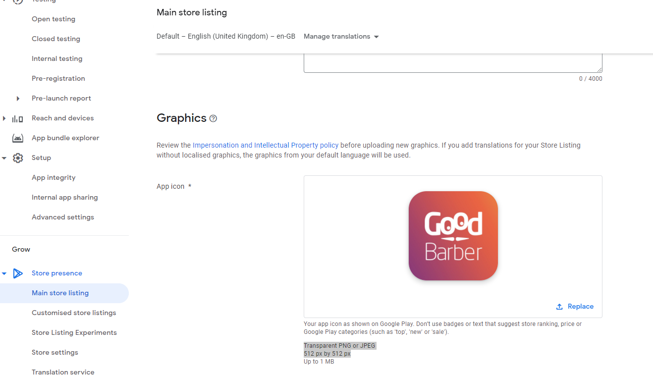
App icons for Google Play Store
Before you start creating icons, certain aspects need to be looked at, and you should ‘research’ about the icon you will create. Here are a few key points to note:
- The Icon Size: The first question that you need an answer to is the number of size variations you require in the project. There might be a chance that you only need one size, which makes the project way more manageable.
Dominant Features: each app icon has specific features that help it be recognizable. These include shape, color, size, elements, and graphics, to name a few. Before you design your app icon, ensure that you have noted down your vision for these features to give you a headstart.
- Icon Style: There are several styles used by app icon makers, which are constantly evolving and breaking the pixel barrier. It is essential to research the current design trends and then settle on the style. Some of the icon styles are dimensional, hand-drawn, pixel, and line art.
2. The Building Stage
Once you have decided the size, the style, and other dominant features, you must have a fair idea of how you want to design the app icon. Therefore, the next stage is the building stage, where you ‘build’ the icon. Regardless of the design tool you use, the next set of instructions apply to all of them. Here are a few key points to remember while creating the app icon:
- The Project File: While using your icon making software, ensure you have a centralized project file with the settings set as required. Moreover, ascertain that the app icon colors are set in the Web format since icons are digitally viewed.
- The Size: As we discussed above, the size of the icon should be predecided, and while building the icon, choose a standard measuring unit across variations to ensure smooth scaling. The default unit of icon measurement is pixels, and is used across devices and operating systems.
Use Various Layers: By creating multiple layers, you reduce the chances of moving other elements or grids and seamlessly execute the design. You can use this as a guideline for all your web-based projects rather than only for making icons.
- Exporting: Once the design is finished, you should ideally export them with a transparent background (unless specified otherwise) as it helps them blend in colored surfaces. While multiple formats such as SVG, PNG and JPG offer this functionality, PNG is the preferred option due to its high compatibility and small size.
3. The Testing Stage
Once the icons are created, before publishing them or sharing them with another party, you need to "test" if the icon is a perfect fit or not. Therefore, test it out against different screen sizes, operating systems, and even background colors to check if there are any imperfections in the app icon colors you need to fix. Once you are confident that the icon works as expected, then you can move on to the next step as per your goals.
Tips To Design The Perfect App Icon
Icons require a thoughtful design process, and crafting the design may be challenging for some. While we discussed how to make an icon above, here are some of the best tips to design the best mobile icon.
- Choosing The Right Tool
Before you search for the best icon maker online, it is imperative to understand that the tool might be the deciding factor of your icon’s quality. Therefore, a good starting point is finding the right icon making software. Some of the powerful tools that you can choose from are Photoshop, Sketch, and IconFx. However, if you are looking for an easy-to-use icon design app, you can go with Canva, Appiconmaker, and EasyAppIcon.
- Simple Is Still Best
While you design an app icon, remember that its simplicity will be vital in making it recognizable and memorable for the user. Therefore, you should choose a unique shape to stand out from other icons but keep it simple enough for the user to remember. However, do not flood the icon with too many elements, colors, and additional details. Since the icon will be scaled-down for the user, the simpler your design is, the more it stands out.
- Logo And Text Don’t Mix
Think about this for a second. Your app icon will be minuscule in the user’s phone when compared to your designed artboard. This means that users will have a hard time reading any text on the app icon, provided it is even visible with the app icon colors. Therefore, it is advised that you leave the text out of the logo. However, if required, a single alphabet of considerable size might work well.
- Research Your Competition Before You Design
Before you create your mobile icon design, look out for similar apps in the market. Once you do an elementary competitive analysis, you will see what is working for the top apps and what isn’t for the not-so-successful ones. You will get a fair idea of the color schemes, design aspects, and other features that can help you envision your own icon better.
 Design