 eCommerce
 Memberships
 RAG Chatbot
 Online Courses
 Bookings
 Travel guide
 Events
 Content Creators
 Pickup & Delivery
 Newspaper
 Radio
Radio Schools
 Faith
Faith Organizations
 Restaurant
 Grocery
 Custom apps
 Employee Communication
 NO CODE APP BUILDER
 TECHNOLOGY
 WHY GOODBARBER?
 Design
 PRODUCT RESOURCES
 TOPICS
 MOBILE APPS RESELLERS
 DISCOVER
Level up your app design with our new NavBar templates
Written by Marie Pireddu on
Your app design plays a vital role in creating an engaging experience for your users. At GoodBarber we're always committed to providing a product that is always at the forefront of mobile user experience.
For this reason, it was time to add new NavBar templates (for both Classic and Shopping Apps). NavBar is a key element of an app's identity helping you showcase your branding.
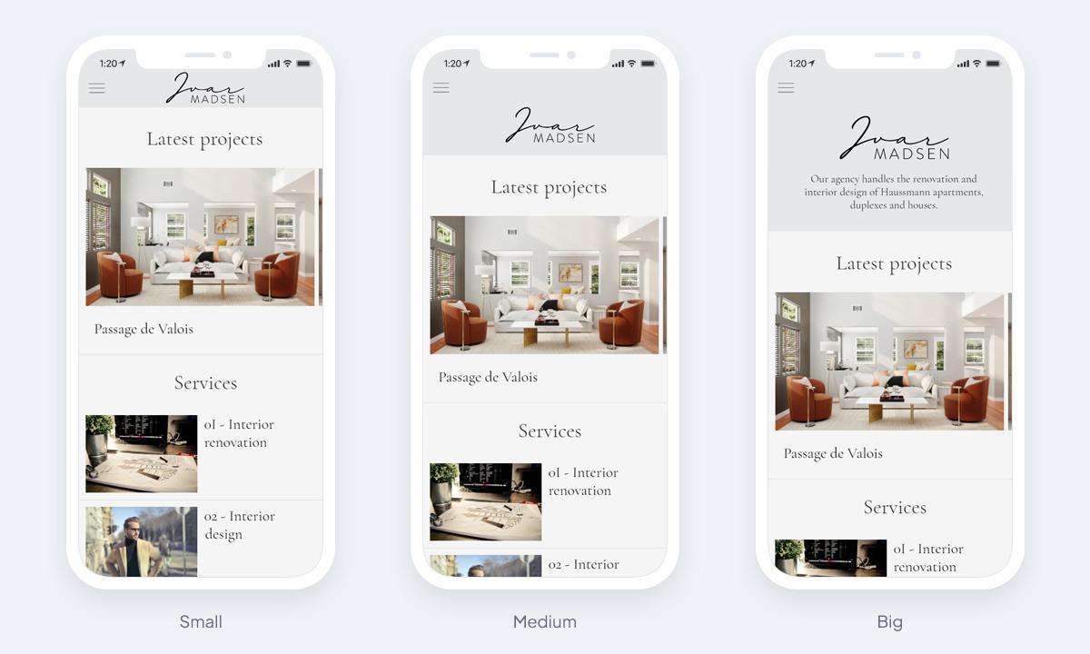
You can now choose between 3 different heights: small, medium and large
For this reason, it was time to add new NavBar templates (for both Classic and Shopping Apps). NavBar is a key element of an app's identity helping you showcase your branding.
You can now choose between 3 different heights: small, medium and large
How does it work in your GoodBarber back office?
In your app back office, under the menu My App > Design > General Design > Logo and Title, you can now see a new block "Header height".
From there, you will be able to choose between 3 different heights:
From there, you will be able to choose between 3 different heights:
- Small: displays the title or the logo image
- Medium: displays the title or the logo image (only available for sections in the main navigation of the right panel of your back office)
- Large: displays the title or the logo image + a short description (only available for sections in the main navigation of the right panel of your back office). This short description is shown in your header below the logo of your app.
You can of course customize the font and color of the text.

Why different height options
Having these 3 templates allows more ease in the design and more flexibility to showcase the different sections of your app. As you can unhook the headers according to the sections and thus have different sizes.
Go to the menu My App > Design > Section Design and click on "Header ". You can then select the height for this specific section.
You can also add a different description for the sections with the Large template.
Go to the menu My App > Design > Section Design and click on "Header ". You can then select the height for this specific section.
You can also add a different description for the sections with the Large template.

Stay tuned for our follow-up article showcasing the different use cases of these templates and give you some inspiration for your apps.