GBTC: Publish your app with easeDiscover GoodBarber Takes Care and simplify the app publication process for both the App Store and Google Play. Let us handle the technical details for you.Learn more about GBTC
The Home is the first screen of your app—and a very important one obviously. It is a pivotal element around which everything else falls into place. GoodBarber 4.0 introduces a modular system, ultra flexible, to manage the Home and make it the starting point of a unique user experience throughout your app.
Main navigation and selected content
The Home hosts most users’ activity—90% of users actually only visit the first section of the app! This is what the usage statistics of apps built with previous versions of GoodBarber show us.
Meanwhile, as a general trend within our industry, we've also started noticing more and more apps using the home to manage their main navigation.
Both these observations have brought us to imagine a radically new Home concept for V4 apps. With GoodBarber 4.0, the Home lets you choose which content to highlight upon opening the app. It also lets you display links towards the primary destinations making up your app, in your opinion. Consequently, we really believe that this concept will allow you to better distribute traffic within your app.
Infinite modularity
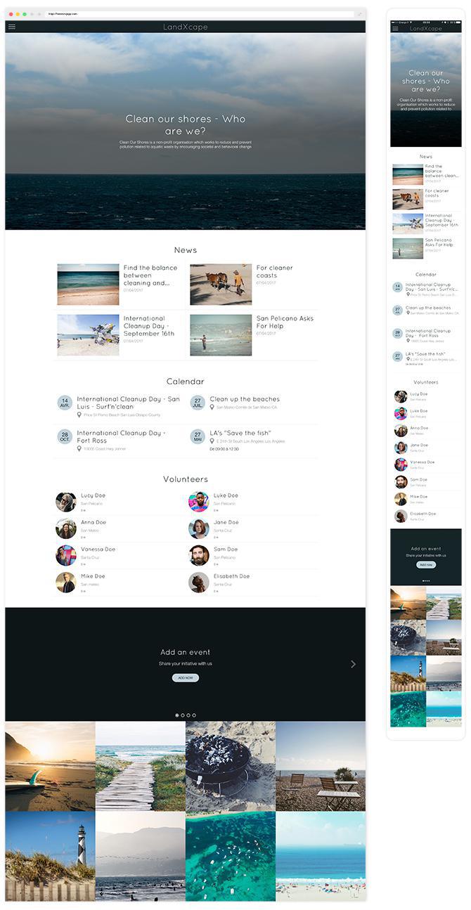
With GoodBarber 4.0, each Home is unique. This new feature remains aligned with the direction we took when we first launched GB: each app should have its own one-of-a-kind design. It’s the reason why we developed 66 widgets, available with the release of GoodBarber 4.0, to build one’s home.
Widgets are functional modules. To design them, we first considered the different templates’ displays on mobile. Usable space on mobile UI is not easy to come by! Thinking mobile first challenged our creativity, from which originated a resolutely modern design, with a level of rich functionality aligned with our offering, but with a cleaner interface at the same time.
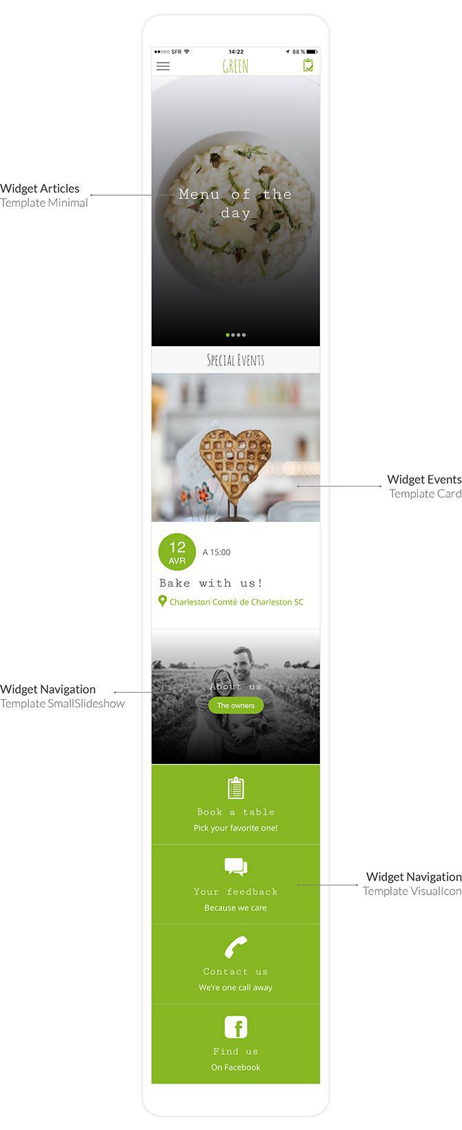
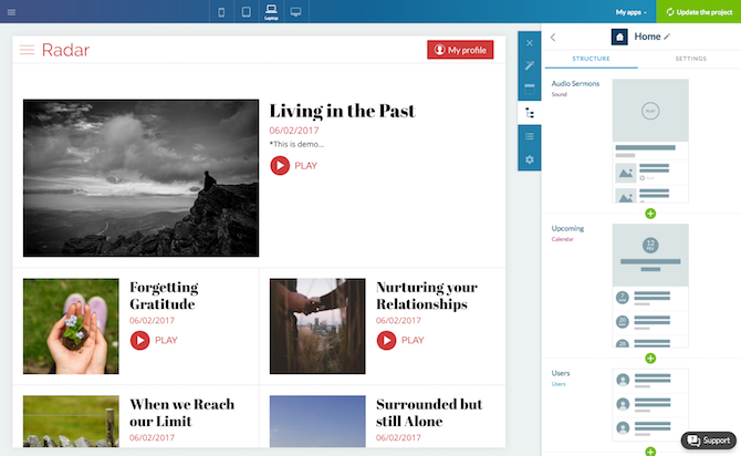
From the back office, the Home should be designed from the mobile view. You can think of your home as a vertical banner divided into horizontal slices. Each slice is made up of a widget. The variety of widgets is what makes the page dynamic.
Templates associated with widgets have a mobile, tablet and desktop declination. When you add a widget to your Home, the views to match each size screen are automatically deducted. And yet, you are still in charge when it comes to setting up particular details when it comes to a specific screen size.
The widgets
Widgets fall into 2 categories. Content widgets and navigation widgets.
On the UI Index page of the GoodBarber portal you can view the mockups of all available templates for navigation widgets and for content widgets related to each type of section.
CONTENT WIDGETS
Content widgets can be used to display items belonging to sections of the app, on the Home. They belong to 3 families.
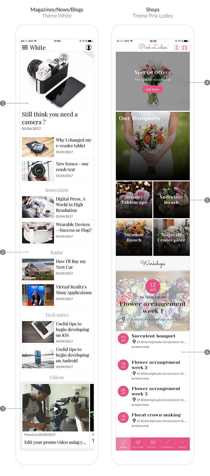
- list: the content is displayed in list format, with the possibility to highlight certain items (widget n°1 and n°6 from the example above). You can choose to display items belonging to a specific category within a section (widget n°2 displays the “Radar” category of the “News” section).
- banner: these widgets optimize usage of the usable space on the home. Browsing content is achieved through horizontal scrolling (widget n°3).
- highlight: these are semi-dynamic widgets. The first element displayed is a link to the section, the following elements are items belonging to the section (widget n°5). Sorting options to display items are plenty: per date, randomly, alphabetical order,…
NAVIGATION WIDGETS
These widgets can be used to create links towards sections, trigger actions or direct towards external urls. They belong to 3 families.
- list: these widgets take up the maximum space available. Links are displayed in list format. They can show a title, subtitle, button, images or icons, in order to highlight the action to be performed (widget n°4 from the example).
- banner: browsing the links displayed within these widgets can be achieved through horizontal scrolling. As a result, they can be used to minimize space usage. Titles, subtitles, buttons, images and icons are also available with this widget family.
- remote: these widgets can display up to 6 links, with a title and icon only. They are meant to be compact and generally, to be located at the bottom of the Home, as a footer.
The GoodBarber 4.0 modular home aims at giving as much value as possible to the traffic captured upon launching the app. Through the combination of content and navigation widgets, your home is truly unique. And now, it’s your turn to start building the best user experience for your app!
Bonus
We've also got you covered with a video tutorial, from our YouTube channel , which goes over the main steps to create your Home!
The short version. Mixcloud is an extension of GoodBarber, the no-code app builder, that adds a Mixcloud account as the source of an Article section. The section lists the account's public shows, newest first, with their cover, date and tags. Each show opens on its own page, where it plays in Mixcloud's official player, above its description. You connect it with the account name, or the link to its profile: no key and no developer account. It is free for Content apps.Mixcloud extensionSection of the appArticleWhat you enterThe account name, or the link to its profileWhat the app listsThe account's public shows, newest firstWith each showCover, date, tags and descriptionPlaybackMixcloud's official player, on the show's page: no offline or background listeningUpdatesAbout every 30 minutesPriceFree for Content appsMixcloud was built for long-form audio: radio shows, DJ mixes and podcasts. By its tenth birthday, in February 2020, 1.7 million creators had uploaded 50 million shows to it, according to Mixcloud's blog. Here is why replays matter for a station's audience, and how the extension plays out for a community station that uploads its shows every week.
 eCommerce
 Memberships
 Chatbot
 Online Courses
 Bookings
 Travel guide
 Events
 Content Creators
 Pickup & Delivery
 Newspaper
 Radio
 Schools
 Faith
 Organizations
 Restaurant
 Grocery
 Custom apps
 Employee Communication


 NO CODE APP BUILDER
 TECHNOLOGY
 WHY GOODBARBER?
 Design
 PRODUCT RESOURCES
 TOPICS

 MOBILE APPS RESELLERS
 DISCOVER