New design update for your Classic apps
Written by Marie Pireddu on

We are very happy to introduce today a new design update for our Classic platform.
At GoodBarber we are always committed to providing a product that is always at the forefront of technology and mobile user experience, as well as adhering to Apple and Google's requirements so that your apps can be successfully published on both stores.
As the style of the action buttons that we offer was no longer satisfactory, we had to make this update in order to keep your apps up to date with the latest design trends.
The update will give a great refresh to the UI of your apps.
The button new design
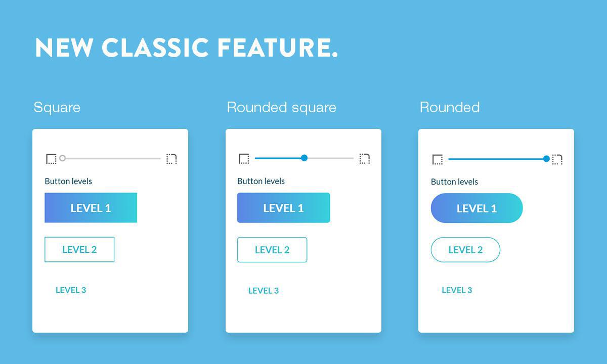
From now on you will have 3 levels of buttons, each level corresponding to different action in different sections.
Level 1 will always be filled
Level 2 will always be outlined
Level 3 is only a link
Level 1 will always be filled
Level 2 will always be outlined
Level 3 is only a link
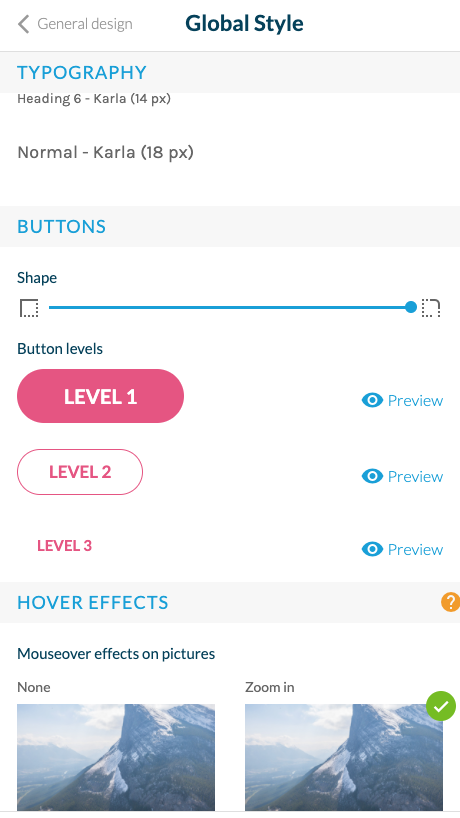
Global style menu

From the Global Style menu, you will be able to change the radius of the button.
Of course you will be able to change the color of a particular button, in each Section Design panel.
Of course you will be able to change the color of a particular button, in each Section Design panel.
What's new on the User side ?

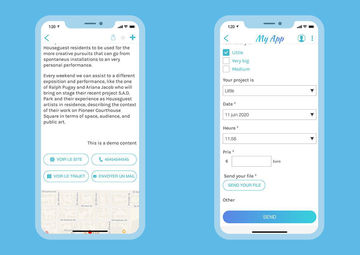
This is a major design update that will impact your entire project as buttons are frequently used in a Classic app.
The buttons will now be bigger and therefore more adapted to the new resolutions.
The buttons will now be bigger and therefore more adapted to the new resolutions.
The other noticeable difference is that depending on the level of the button, your users will see either text (level 3) or an outlined button (level 2).
 Design