 Design
New pager design: a modernized navigation
Written by Muriel Santoni on
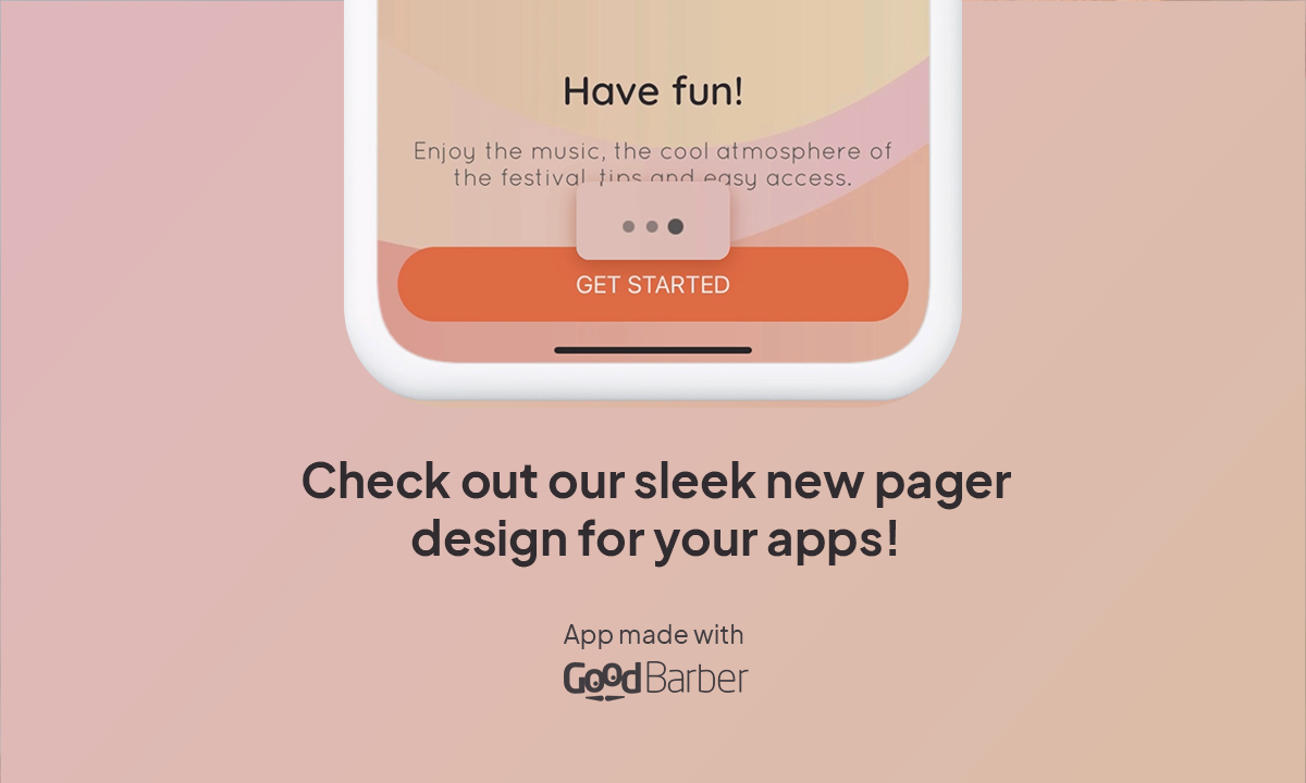
At GoodBarber, we constantly strive to refine our designs to offer the best possible user experience. Today, we are thrilled to present a significant improvement to our pager design, making navigation within our apps smoother, more intuitive, and aesthetically pleasing.
Our design team has passionately worked to rethink the appearance of our pager, which plays a crucial role in how users interact with scrolling content. Inspired by iconic designs seen on platforms like Vinted, Instagram, and Airbnb, our new pager now features a cleaner and more contemporary look, optimized to function perfectly regardless of the number of items displayed.
What has changed?
The primary goal of this redesign was to visually simplify the pager while enhancing user interaction. We implemented a common behavior where only six dots are displayed at a time, regardless of the total number of items in the carousel. This approach reduces visual clutter and highlights the currently viewed content, making navigation easier for users. To create a more dynamic experience, we adjusted the size and animation of the pager dots. When users scroll, the dots animate smoothly, improving the understanding of scrolling and position in the list. This subtle design not only enhances the interface's aesthetics but also improves accessibility and interaction.
This new behavior has been applied to all templates and views where the pager is used in your app. No matter where they are, users will now benefit from visual and functional consistency across all interfaces.
This new behavior has been applied to all templates and views where the pager is used in your app. No matter where they are, users will now benefit from visual and functional consistency across all interfaces.
The improved pager design exemplifies our ongoing commitment to delivering high-performance and aesthetically pleasing tools. We firmly believe that this update will enhance the user experience, making navigation not only more enjoyable but also more intuitive. At GoodBarber, we continue to innovate to ensure your applications remain at the forefront of technology, meeting modern standards of interaction and design.