 Design
The New GoodBarber Backend
Written by GoodBarber Team on
As those of you who've switched to GoodBarber 3 or even created your first app with it will have noticed, the new backend is radically different from the preceding version.
Native mobile applications are increasingly becoming a primary means of web access, and we wanted our backend to reflect that. In essence, GoodBarber is more than an app building tool; it's an app building and management tool.
So what exactly is new about the backend, and why? In this article, we'd like to address some of the major changes and the rationale behind them.
A self-guided process

One of our goals was to design an interface that lets new users intuitively grasp the steps they need to take to build their app.
Because creating an app is a novel experience for most GoodBarber users, the underlying idea was to provide a path to follow from idea to publication, rather than confronting users with a clean slate and forcing them to first spend time familiarizing themselves with the backend rather than delving right into creation.
To help guide users, we wanted to provide an indication of the steps necessary to create an app from the very beginning.
That's why we decided to display a breadcrumb trail at the top of the screen that outlines the four steps to create a GoodBarber app, from opening an account to publication:
- designing the app,
- adding content,
- testing the app
- and finally publishing it.
Everything starts with design
Just like a new GoodBarber user, let's first have a look at design. Users who come to GoodBarber already know why they want to create an app, and so they also already know what content they want to put in it.
For someone who has no prior experience in creating apps, the most difficult step is designing the app.
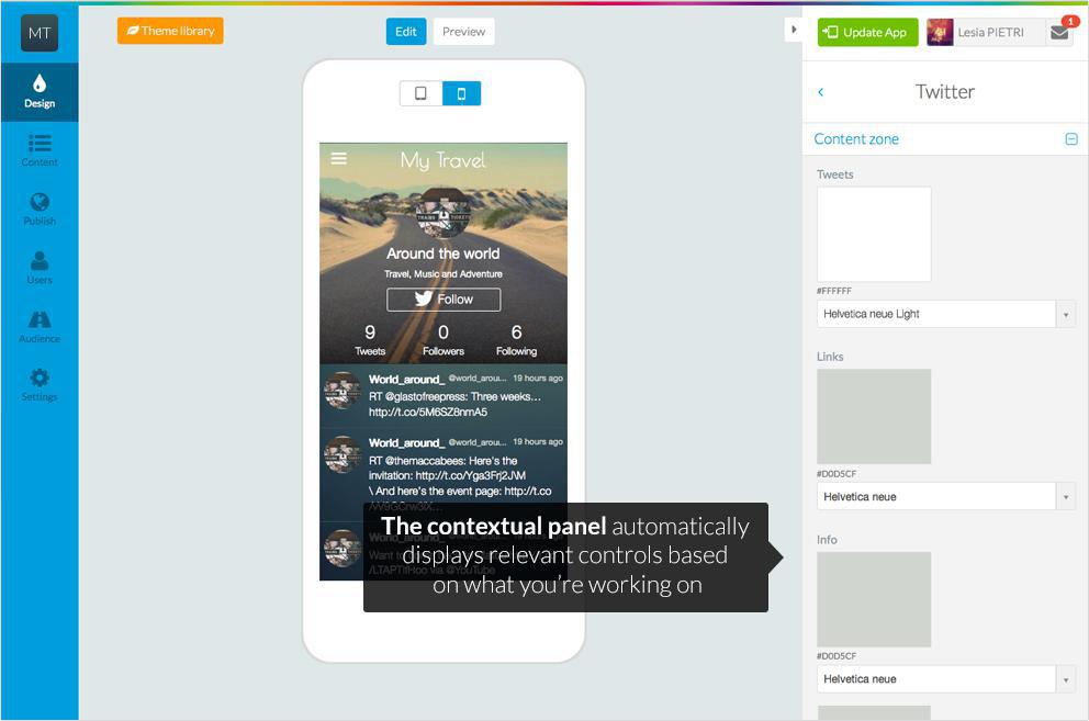
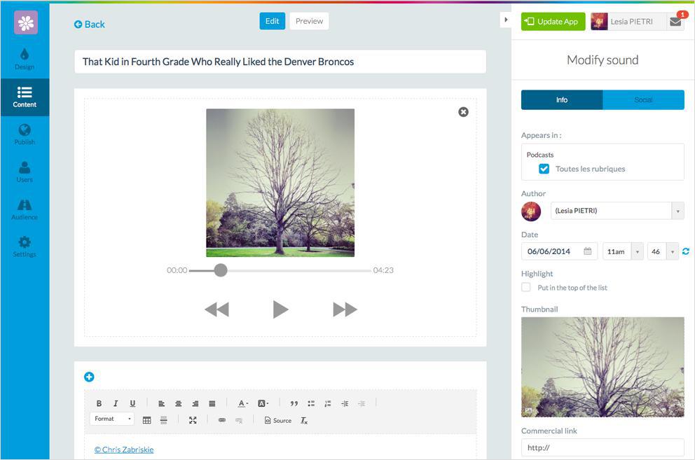
In the design tab, the backend is organized into three columns:
- at the left, the panel that lets users switch between the main controls, and always stays the same.
- at the center, the preview of your work. We dedicated a big area to this preview.
- at the right, a contextual panel, where we put the controls relevant to designing the app itself.
Let's talk about this contextual panel. By only displaying the controls you need when you need them, we've eliminated clutter and let you concentrate on the task at hand, not on finding the right button or menu.
That isn't all we did to let users create their app as easily as possible. We also separated the controls into three tabs: one for basic configuration, one for more advanced settings, one for other options. This way, you needn't concern yourself with smaller details right away.
The center column is where you can see the magic happen, and any modifications you make are applied in real time. In the preview, you can switch between an Android device, an iPhone and now also iPad.
For someone who has no prior experience in creating apps, the most difficult step is designing the app.
In the design tab, the backend is organized into three columns:
- at the left, the panel that lets users switch between the main controls, and always stays the same.
- at the center, the preview of your work. We dedicated a big area to this preview.
- at the right, a contextual panel, where we put the controls relevant to designing the app itself.
Let's talk about this contextual panel. By only displaying the controls you need when you need them, we've eliminated clutter and let you concentrate on the task at hand, not on finding the right button or menu.
That isn't all we did to let users create their app as easily as possible. We also separated the controls into three tabs: one for basic configuration, one for more advanced settings, one for other options. This way, you needn't concern yourself with smaller details right away.
The center column is where you can see the magic happen, and any modifications you make are applied in real time. In the preview, you can switch between an Android device, an iPhone and now also iPad.
iPad adaptive design
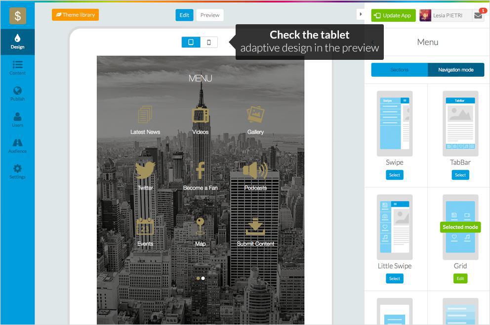
One of the most important new features of GoodBarber 3 was the introduction of an iPad version of the apps.
Our iPad apps are not merely stretched iPhone apps - they are designed and built specifically with the larger screen size and different dimensions in mind.
Utilizing the real estate available is critical for a good tablet app - but also presented us with a challenge. How do we create an iPad app that makes the most of the device, without forcing users to design the app twice?
Our solution was to develop two completely different versions of every theme, every navigation mode, etc. In this way, the vast majority of the necessary adaptations are undertaken directly by GoodBarber - users make one choice, and the two versions are created automatically. Only occasionally are specific configurations necessary, and where that's the case the user is alerted with a small icon corresponding to the respective devices.
This approach to creating tablet apps with an app builder is unique and has never been done before.
Visualization from the very beginning
Nevertheless, even if you begin by designing the app, it can be difficult to imagine what the final result might look like.
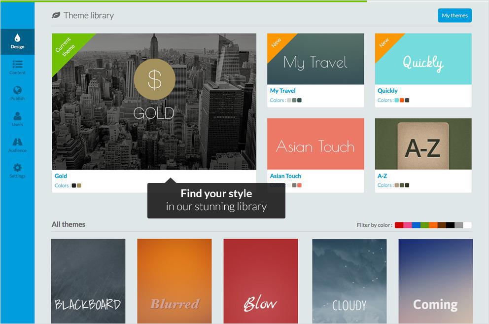
That's why every new GoodBarber users is randomly assigned a design theme. Of course, the user can then choose a favorite among the 50 templates we offer - that can in turn be fully customized.
Just as importantly, the theme is also filled with sample content from the very beginning. This frees the user from needing to add his or her own content to see what the app will look.
It's far easier to visualize what the final result will look like when the app is already filled with content.
Simplify adding content
Since the release of GoodBarber 2.5 Salvador, we'd noticed that a majority of our users come to us for the built-in CMS.
This is a reflection of mobile's growing importance, as many users are skipping some forms of a traditional web presence such as a blog entirely and have an app as their primary internet presence. That's why we not only improved the interface of the CMS, we also introduced the possibility of adding sounds in addition to text, images and videos.
Interactivity in mobile applications is increasingly in demand, and we took note of the popularity of the Submission section that lets the app's users upload text, videos and pictures and increased the prominence of this section.
All the while, when you're adding content to your app, you'll notice that the basic layout of the interface is unchanged from the Design section: main controls at left, section-specific controls at the right, and what you're working in the middle.
The My GoodBarber App
The My GoodBarber App acts as a mobile extension of your backend.
Previously, you needed to build the app before being able to actually test it on your phone. Now, with the My GoodBarber App, you can test your app directly from your phone.
This feature can be especially handy if you have more than one account, as you switch between your different apps in a matter of seconds. Not only that, you can also track statistics and even send push notifications on the go.
Publication and beyond
After you've designed the app and added your content, you've finished configuring and you'll be ready to build, test and publish.
Submitting an app to the App Store and Google Play can admittedly be quite complicated. We've done all we can to make the process as simple as possible by providing very detailed, step-by-step instructions in the backend that accompany the user.
Otherwise, we also provide the GoodBarber Takes Care option - for a one-time fee we'll take of the submission of both the iOS and Android versions, as well as all subsequent updates.
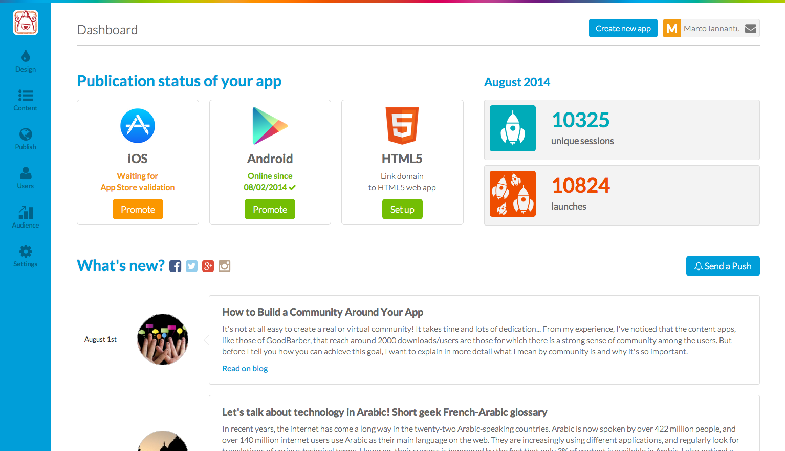
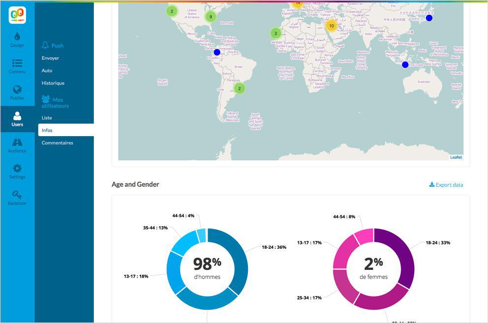
After publication, most users are also interested in knowing who their users are and how they use the app. Detailed statistics are easily available in the backend, but for those who really want to work with the numbers it's never been easier thanks to one-click exporting of statistics to Excel.
Submitting an app to the App Store and Google Play can admittedly be quite complicated. We've done all we can to make the process as simple as possible by providing very detailed, step-by-step instructions in the backend that accompany the user.
Otherwise, we also provide the GoodBarber Takes Care option - for a one-time fee we'll take of the submission of both the iOS and Android versions, as well as all subsequent updates.
After publication, most users are also interested in knowing who their users are and how they use the app. Detailed statistics are easily available in the backend, but for those who really want to work with the numbers it's never been easier thanks to one-click exporting of statistics to Excel.
Why the new backend?
At GoodBarber, our goal is to let people create the best possible user experience for their users.
In turn, it's only natural that we want to do the same. However, a great backend isn't just a matter of convenience. We believe that a better interface actually lets users build better apps.
By freeing users from focusing on using the backend, they can devote all of their energy and creativity to turning great ideas into great apps - which is what GoodBarber is all about.