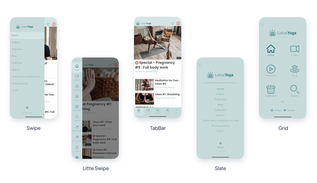
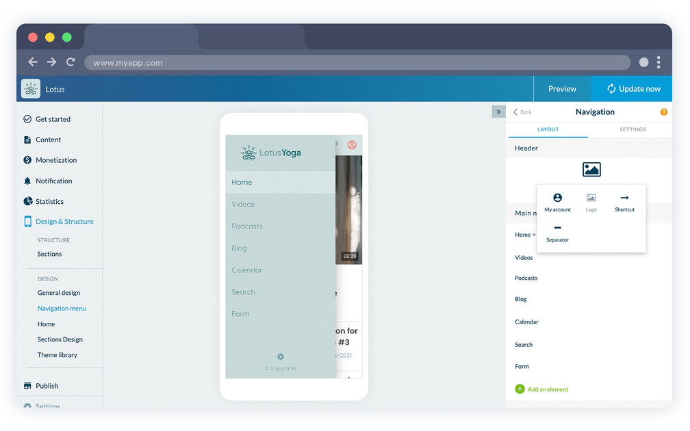
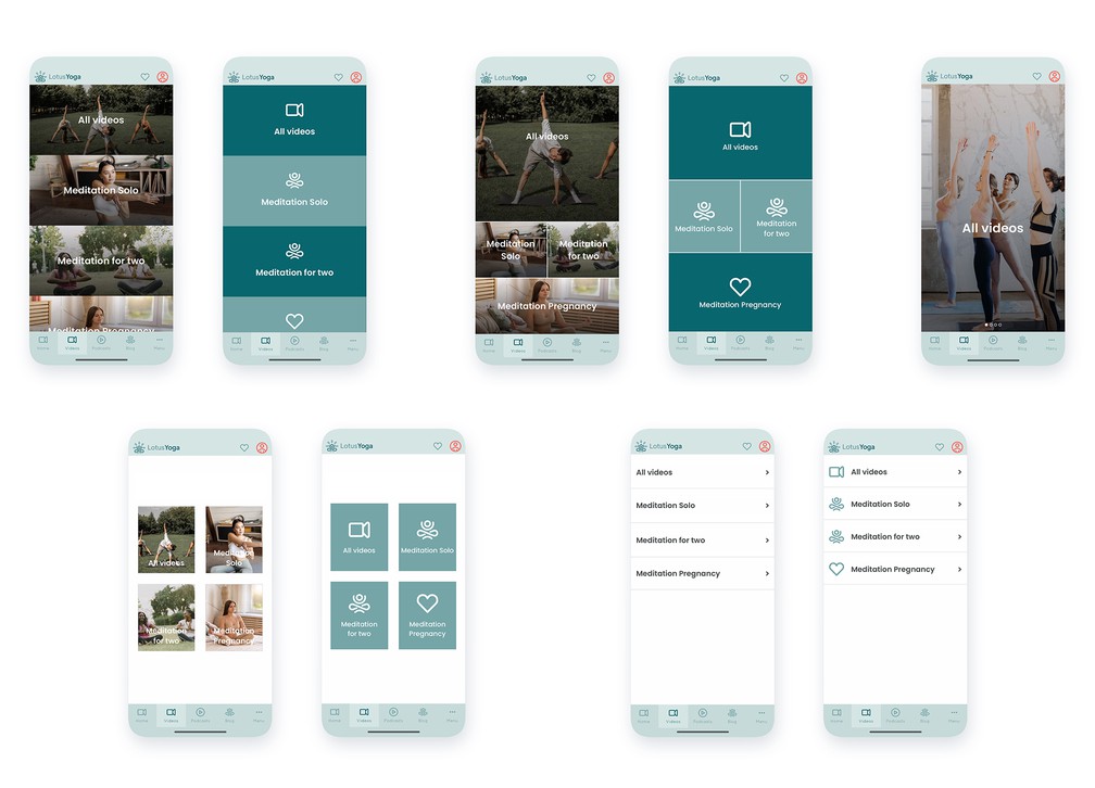
Modular Design
Enjoy the best no-code app builder to create a beautiful design for your app
General Design+
Tailored to each device
GoodBarber has got design fully covered from mobile to desktop. Our elements of design perfectly adapt to each screen size for consistent quality on each device, smartphone, tablet, laptop or desktop.
Global Style Tool
Manage your app's overall style from one, single menu: the color theme, typography, action buttons, hover effects, and other elements. Create your design and apply it to the entirety of your app, in one click.
Images background management
GoodBarber lets you integrate images within your design and display them in the background.
Customizable margins
Customize the margins of your project—horizontal for all screens, vertical only for mobile screens display.
Hover effects on texts
Add a Hover effect on your texts: underlining, brightening or darkening of the font color.
Hover effects on images
Add a Hover effect on your images: zoom in, zoom out or opacity.
Changing your theme
You can change your theme in one click while maintaining your navigation mode and the overall architecture and content of your project.
A solution for each purpose
The diversity of templates, as well as the variety and capacity of the customization options available, let you create an app tailored to your purpose.
Style editor
Manage your styles at the global level in order to ensure a coherent design throughout the different views of the app.
Modifications log
The GoodBarber back office includes a log of modifications which lets you access a history of all the modifications performed on your project.
Updating the design without rebuilding
Updates related to the design of your project do not require you to rebuild your app. Once approved they are automatically taken into account and visible for your users, without extra action.
Images library
Store images in your personal library in order to easily access them for later use.
Selective image resizing
Images are resized to several ratios, compressed and cached to reach the best weight, performance and display quality combination. Loading times are optimized without jeopardizing display quality.
Monochrome effect
Thanks to the image editor integrated within the GoodBarber back office you can add a monochrome effect on your images.
Blur effect
Add a blur effect to your images in one click, directly from the GoodBarber back office, thanks to the integrated image editor.
Zoom effect
Apply zoom effects upon rollover on the images, on the desktop version of your project.
Icon and splash screen generation assistant
The GoodBarber back office offers a tool to assist you in creating your app icon and launching screen from scratch.
Gradient management
Integrate color gradients in your app's design by choosing one from the full library (which uses the https://uigradients.com service). Once you've chosen one, the gradient is automatically generated and applied to your app's design.
Home+
Modular home
The Home section is the first section of your app, it is made up of widgets and completely flexible. With the great variety of widgets available, the Home lets you build your project in a way that makes your app truly unique.
Activate or deactivate
You can choose to activate or deactivate the Home section in your app. If you deactivate it, the navigation will depend solely on the navigation mode you choose.
77 widgets
With widgets you have unique flexibility to organize your app’s home.
Content widgets
Content appsMake the home of your app more dynamic with widgets which automatically refresh each time new content is published inside your project.
Navigation widgets
Content appsOffer direct access to the most important sections of your app with widgets dedicated to navigation. The perfect way to guide your user towards the key function of your project.
eCommerce widgets
eCommerce appsCreate direct entries to your products and collections, from the Home page of your app using the Product list widget and the collection list widgets
Promo widget
eCommerce appsDisplay a promotional message as soon as users arrive on the Home of your shop. You can highlight a product, a collection, a list of collections. The promotional widget is very flexible and will help you increase your sales.
Semi-dynamic widgets
These widgets let you build a home which automatically updates whenever new content is published, all the while offering a clear architecture to the user when it comes to navigating the app.
Other widgets
This category regroups useful widgets such as the search, newsletter, advertisement, or even HTML widgets.
Drag & drop construction
Arranging the different widgets featured on your home is easy. Just drag and drop your widgets where you want them to be.
Sorting options
Access a wide range of options for managing the display order of the elements within your content widgets: by date, popularity, alphabetical order, randomly,…
Number of items
The number of elements displayed by a widget can be set up for each widget, in order to allow maximum flexibility to organize your home.
Header+
Customizable NavBar
The NavBar is a strategic location within your app. Therefore, you have complete control over its design and features. Choose from 3 different height formats (Small, Medium, Big) to display your logo, a title or description.
Customizable icons
Each link added to your NavBar is assigned an icon. This icon is fully customizable.
Adding shortcuts
The NavBar can display up to 6 shortcut links to key sections of your app or external sources.
Managing shortcuts
Access to the customization of the look and feel of your NavBar shortcuts lets you maintain a coherent user experience throughout your app.
Automatic arrangement
Based on the number of shortcuts available in the NavBar, the best arrangement will be automatically managed by the app.
Customizable shortcuts
The design of each NavBar shortcut is customizable. Access a library of over 1000 vectorial icons, add your own icons and customize the link titles.
Effect options
Content appsApply transparency, blur or hiding effects to the header. These subtle effects can give your app the final polished touch and set you apart from the crowd.
Automatic effects management
Effects are automatically applied to the header by GoodBarber based on the device and OS through which the app is displayed.
Declinable header per section
A specific header and related NavBar can be set up for each section within your app.
Design resources+
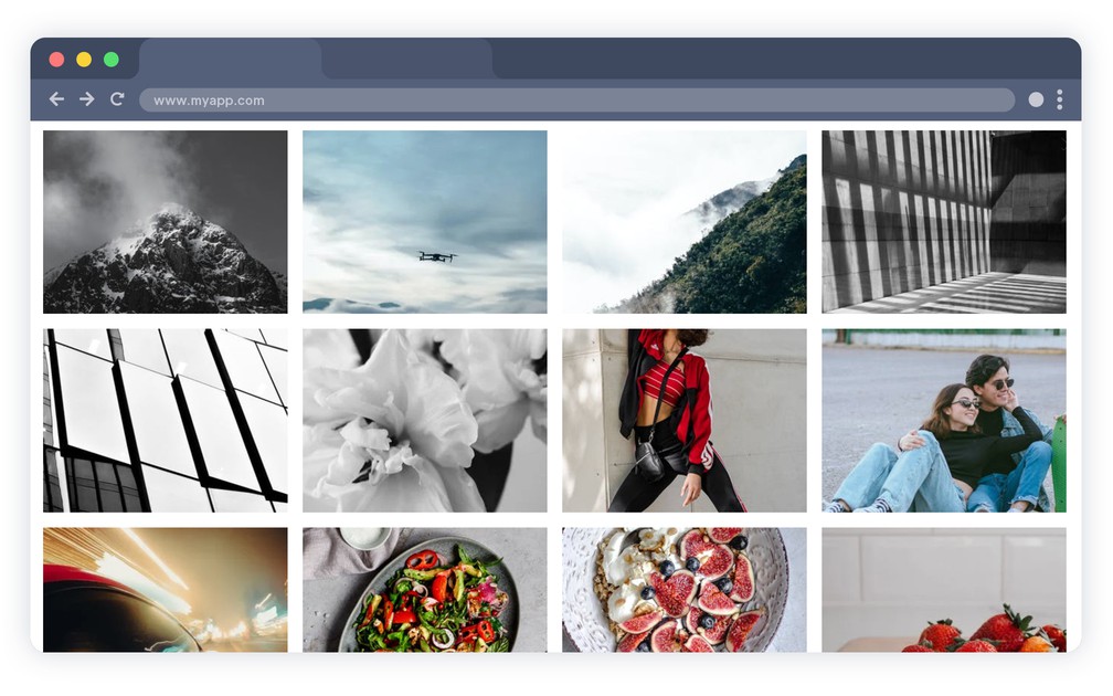
Icons gallery
A collection of more than 1000 icons created specifically by our team of designers and organized into 3 different sets is available in your back office.
Customizable icons
Create your own icon collection by uploading your own icons or images, directly from the back office of your project, in .png format, 260px x 260px.
Professional themes
The GoodBarber back office features 25 professional themes produced by our team of expert designers. Inspired by our mobile-first philosophy, they are designed to perfectly adapt to each device, keeping with the current trends, plus fully customizable.
Google Fonts library
GoodBarber features a set of more than 400 Google Fonts which can be used directly in the back office, without the need to embed extra code.
Pexels library
GoodBarber clients can access the Pexels photo library, directly from the back office, with over 500,000 high resolution images.
Images advanced search
The Pexels library in the GoodBarber back office is equipped with an advanced search engine to sort images by theme, keyword or color.
Sections+
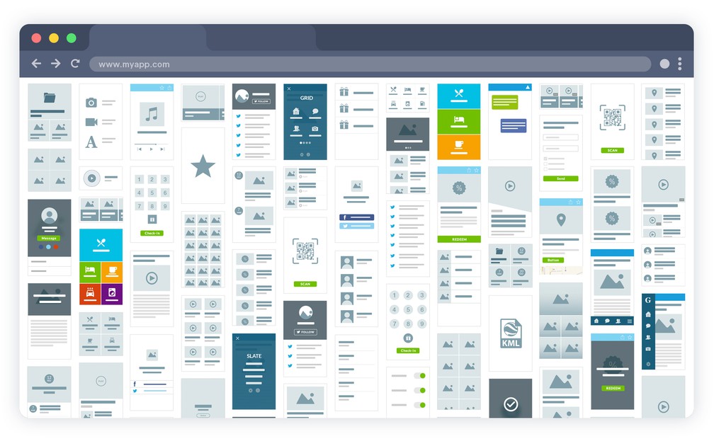
30 different types of sections
GoodBarber offers 30 different types of sections which you can use to build your project.
Advanced settings for the information to be displayed
For each section, choose the information to display, such as the date or the author for an Article section.
Toolbar customization
Content appsFor each section choose the actions available in the toolbar: comments, sharing, text size, bookmarking the item.
Comments access
Content appsAllow users to access the comments page from each content view.
Direct link to share on social media
Add direct sharing links to social media in each content page.
Progressive page loading
Intuitive gestures allow the user to display extra content, on demand, when visiting a section. This allows for a faster display while improving the user experience.
 Design