 Design
App Store Description: 5 Mistakes to Avoid
Written by Muriel Santoni on
After polishing your App, working on every last detail to make it perfect, and running a series of tests, you're finally there. Time to publish it on the stores and share it with the world!
To make your work shine and not blow this all-important launch, you still need to focus on a key part of the submission process: your app's description on the stores (Android and iOS).
Why does it matter?
First, your app's description plays a role in improving its ranking on the stores — what's known as App Store Optimization (ASO).
Second, it's your only chance to "pitch" your app and convince a mobile user to download it. You have to win them over with very little text, on a small screen. Your app's distribution success depends on it. Every download counts.
Here are the main pitfalls to avoid when writing your app description for the App Store and Google Play:
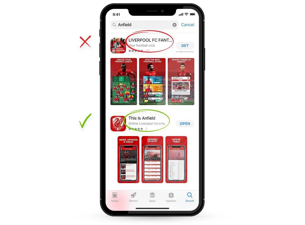
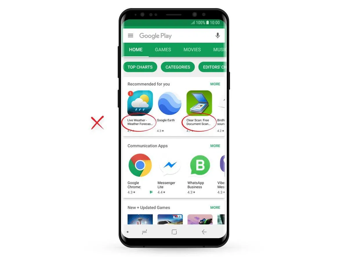
1. Neglecting your screenshots
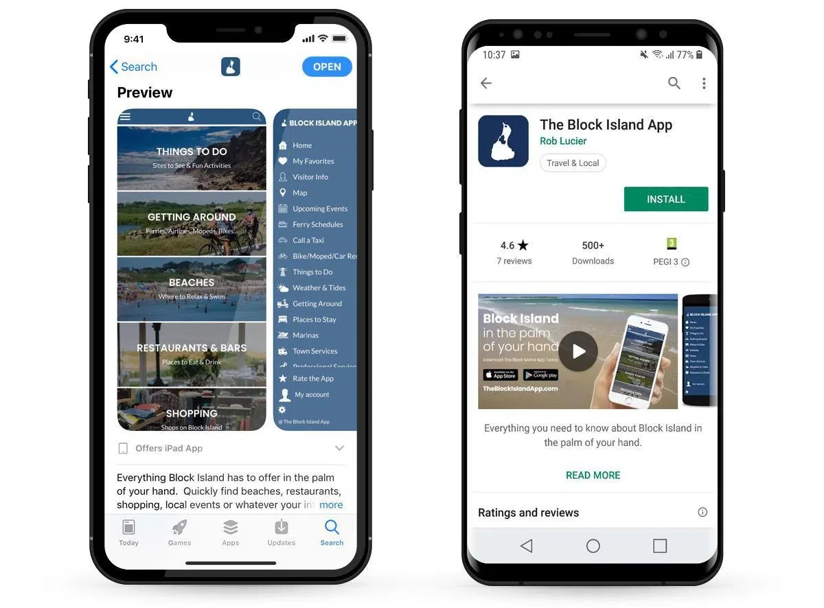
As we said above, mobile users browse on a small screen. They're flooded with information and quickly swipe through the selection of apps on the store. Your visuals and overall form need to be polished, both to catch the eye and to show that you deliver quality work. You spent time building a beautiful app, don't cut corners on your screenshots — they're your storefront. They should be at optimal resolution for each store.
The 1st screenshot is the most important. It should make visitors want to view the others. If you add text to your screenshots, use action verbs that encourage people to dig further.
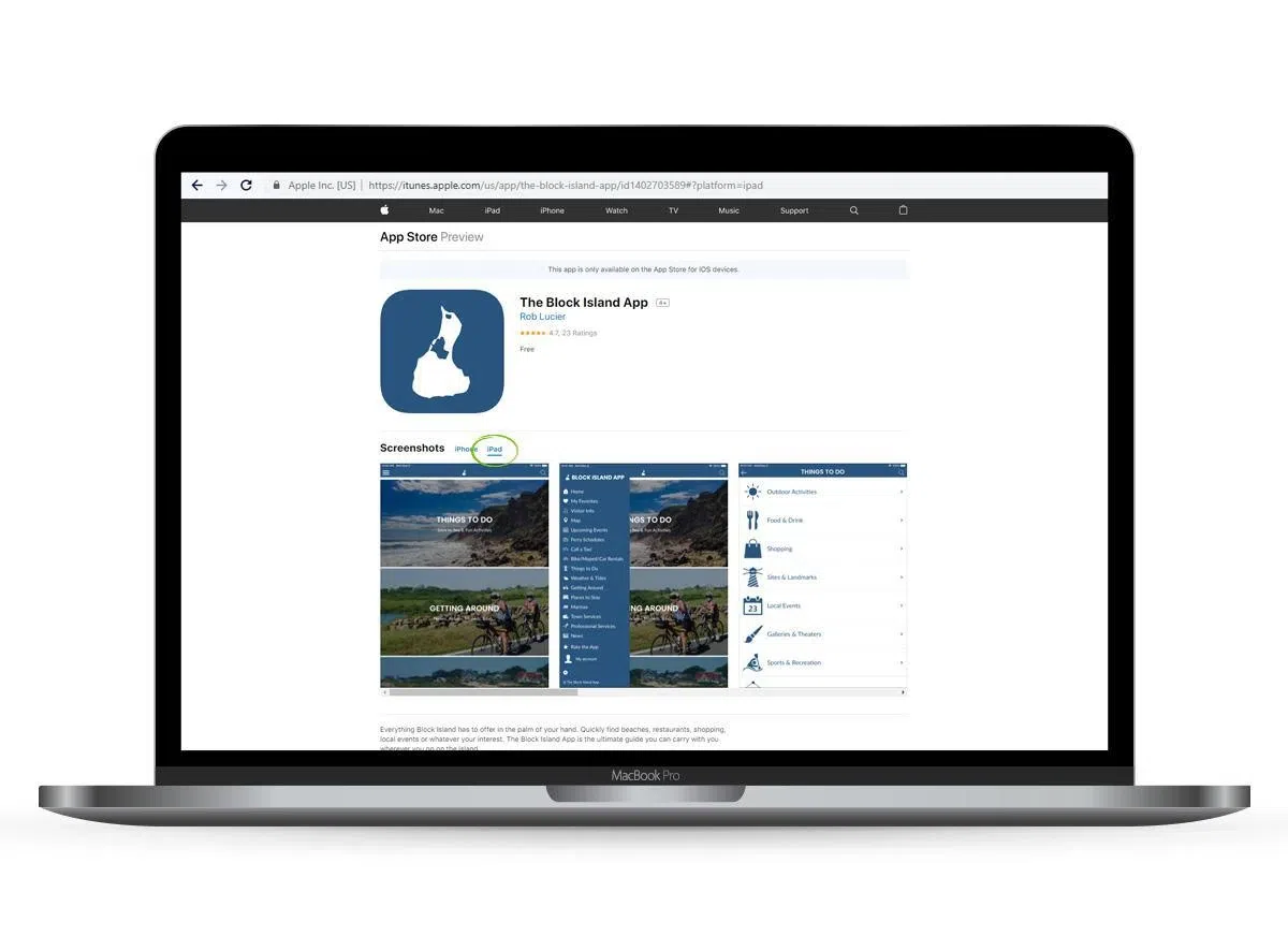
On iOS, you'll need to provide screenshots in 3 different sizes: 5.5", 6.5" and 12.9". This covers Apple's full mobile lineup (including iPad and iPad Pro).
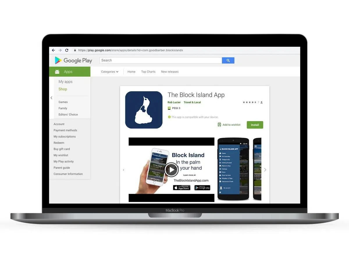
For Android, you must add at least 2 screenshots and up to 8. It's better to use as many as possible because the screenshots best suited to the device the user is browsing on are shown first. Even though it's not mandatory, we recommend also creating screenshots for tablets (7" and 10"). You can also add an extra element: a preview video of your app. The video is always displayed first in the screenshot list.
2. Writing poor-quality text
Beyond form, the content matters too: to convey a serious image, your texts must be flawless. Typos and grammar mistakes are dealbreakers. They have a major impact on your app's success. On the App Store (iOS) and Play Store (Android), the description can hold up to 4,000 characters — so it's easy to slip up or duplicate a word. Ideally, get someone else to proofread your text. Plus, once your app is live on the store, if you spot an error, it's too late to fix it. You'll have to request a re-submission. It's a shame to re-submit just for typos.
Finally, you need to adapt your text to the platform you're publishing on. On the App Store, for instance, you're not allowed to mention third-party platforms in your descriptions. So words like "Google" or "Android" must be banned from your text, or you'll be rejected. It's also better to use Apple product names like "iPhone" or "iPad" rather than generic terms like "Smartphone" or "Tablet". The Play Store, for example, forbids user reviews inside your description, as well as competing brand names.
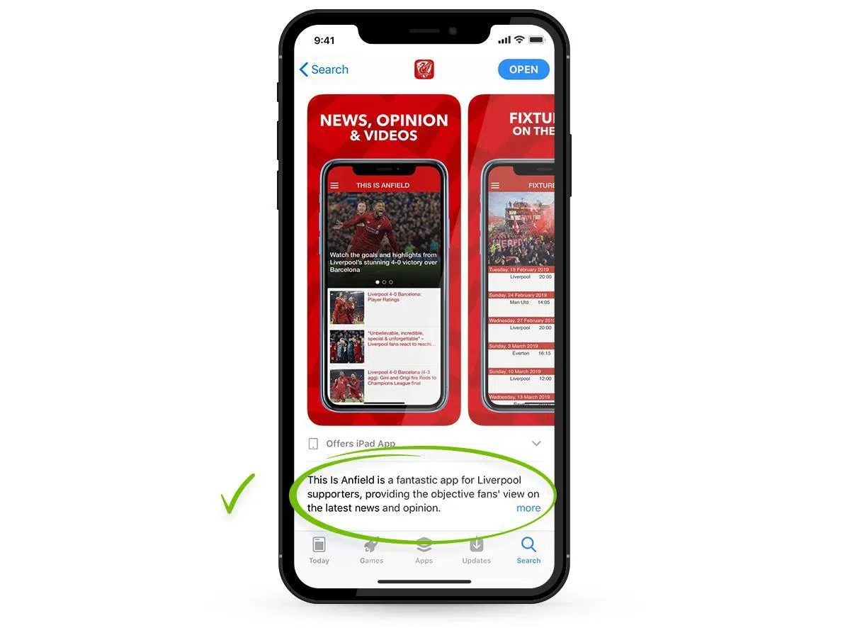
3. Assuming everyone already knows your app
When you launch an app project, you have to be pedagogical. Users need to understand in a split second what your app does and what benefits they'll get from it.
Don't hesitate to be as descriptive as possible. Feel free to contextualize your explanations or give examples. Even if some things seem obvious to you, not everyone has your expertise in your field. You should obviously avoid overly technical or "industry" jargon to reach the widest audience.
When you're passionate about your project, you assume everyone has grasped its value: that's wrong. That's why you have to show your users concretely how downloading your app will save them time or give them useful information. The common mistake is to list features without showing how they'll be used day to day. Again, the best approach is to have your text proofread by someone outside your field of activity to get unbiased feedback.
And you have to keep your promises. Beyond being pedagogical, you have to be totally honest about your app's features. Don't get carried away by your passion or your overflowing desire to "sell" your app. Explain your features without overselling. An app is very easy to download but even easier to delete. If you don't deliver on your promises, your user will be disappointed and will remove your app from their phone right away.
4. Failing to optimize the length of your texts
Each store has its own quirks when it comes to allowed character counts. You need to master and optimize the length of your texts to avoid those infamous ellipses (…) at the end of your titles or descriptions.
Apple App Store:
At Apple, the app's name and subtitle can each hold up to 30 characters. But if you browse the store on an iPhone X, say, and run a keyword search, you only see the first 19 characters of the title and the first 25 characters of the subtitle in the results page. You have to open the app page to see the full 30 characters. For more impact, it's better to avoid having truncated text on iPhone search pages.
Tip: Once you're on the app page, there's also a "Promotional Text" field that lets you write a sentence (170 characters max) above the full description. This field is optional but we recommend using it because it helps avoid truncated text on your app page. The second perk of this field is that it can be edited without re-submitting your app.
Google Play Store:
At Google, the Title field can hold up to 50 characters. But to avoid the truncated-text problem in app listings, it's best not to exceed 22 characters. If you want to add more info, the Short Description field gives you 80 characters. But this field is only visible once someone clicks through to your app page. There's no subtitle option in Play Store app listings.
Here the description is the most important part for your app's positioning in the Store. Unlike Apple, Google indexes the entire content of your description and uses it to rank apps on the Play Store. That's why you should use as many characters as possible (4,000) and not forget to include your main keywords.
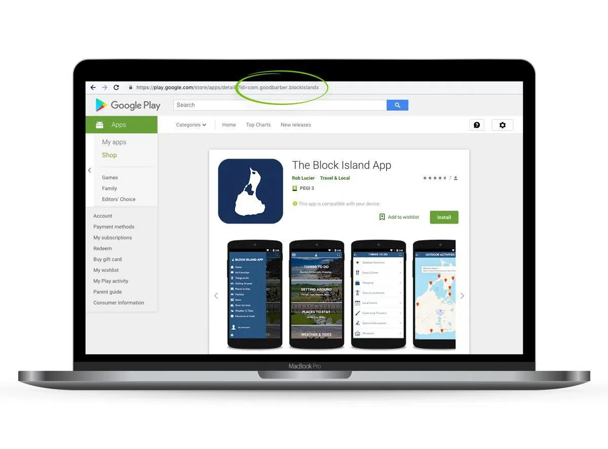
Tip: On Google Play you can set your Package Name when building the app. Usually it looks like this: "com.myapp.example". It's visible at the end of the app's URL. Why customize it? You can insert a keyword to improve your app's discoverability. Choose carefully because it cannot be changed later.
5. Forgetting to "sell" your app
While you're filling in your description, your project is almost across the finish line. But don't think success is guaranteed just because your app will be on the stores. You have to make your visitors want to download your app. And to do that, you have to make your case. That's why your texts matter.
Title and subtitle
The texts visible without opening your app page are the most important ones. You have to describe what your app is for, quickly and clearly. No mystery. Be simple and direct. In the title and subtitle, show your name and possibly a clear, catchy tagline. If a browsing user can't immediately tell what your app does, they won't open the description page. Remember, it's best to avoid truncated text.
Full description
On the App Store, the "Promotional Text" field is very handy. It lets you build on your subtitle and spark interest. Use this field to truly promote your app. Highlight an award you've won, your competitive edges, or a quote from an influential blog or site. On the Play Store, the "Short Description" plays the same role.
For the rest of the description, you can go deeper into your app's features. Avoid heaviness, though. Remember the visitor is reading on a small screen. We recommend short paragraphs (4 lines max) and using tabs or lists. You can also put sentences or titles in caps, but be careful not to overdo it. On the Play Store, you can add Emojis in the description. But like with caps, don't overdo it. If your app targets professionals, we recommend not using them at all.
Keywords
To rank more easily in searches, the keywords you add to your description matter. At Apple, you can also add tags to improve your ranking on relevant searches. We recommend avoiding overly generic keywords (or tags). Be precise to stand out from the competition. For example, for a local news app, don't use the word "news" on its own. Instead, pick your city's name, your region, local events or landmarks.
"Call-to-Action"
At the end of your description, feel free to add a call-to-action to convince the last holdouts. You can flag a benefit like "free for life" or create urgency ("Download MyApp and discover the treasures of Ancient Egypt"). You can also add a line like "App built by the creators of.." or "Perfect for..". The goal is to put your visitors in an action mindset.
Conclusion
To recap:
1/ Create great screenshots and tailor them to each store
2/ Be very careful about text quality, avoid typos and errors, get it proofread
3/ Explain simply and clearly, contextualize, be pedagogical
4/ Play with each store's field limits, avoid truncated text
5/ Make visitors want to download your app, show the benefits they'll get
If you use GoodBarber to build your app, a team of experts is on hand to help and guide you throughout the submission process.
If you're not a user yet, you can try the solution for free for 30 days: Free Trial
Written on 08/24/2015
Updated on 05/28/2019
Updated on 12/07/2020*