 eCommerce
 Memberships
 Online Courses
 Bookings
 Travel guide
 Events
 Employee Communication
 Content Creators
 Pickup & Delivery
 Newspaper
 Radio
Radio Schools
 Faith
Faith Organizations
 Restaurant
 Grocery
 Custom apps
 NO CODE APP BUILDER
 TECHNOLOGY
 WHY GOODBARBER?
 Design
 PRODUCT RESOURCES
 TOPICS
 MOBILE APPS RESELLERS
 DISCOVER
PWA: how mobile usage drives new desktop best practices and behaviors
Written by GoodBarber Team on

There’s no doubt that mobile has invaded countless aspects of our everyday lives, lives which are in turn getting increasingly connected. From waking up in the morning to visiting a restaurant, booking a trip or yet again making a purchase, using one’s smartphone has become second nature for most of us. In that respect, the influence of mobile and its characteristics on the desktop web comes as no surprise.

The omnipresence of mobile not only influences our behaviors in the physical world but also virtually, with new expectations when it comes to navigating or browsing, thus resulting in new trends on the part of the desktop web.
One could even go as far as saying that the two areas of expertise are increasingly merging. Long gone are the days when mobile and desktop web were opposites. Nowadays, the notion that the user should be able to shift seamlessly from one device to the next, is commonly accepted and taken into consideration by a growing number of players of the sector, towards a more unified user experience.
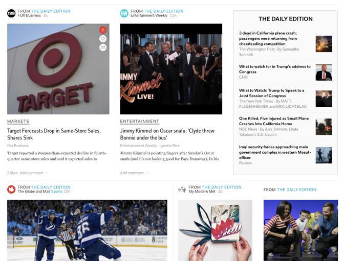
Specifically this translates into new best practices on desktop. For instance, you might have noticed that more and more websites have turned on notifications, on their desktop browser version. A new visual esthetic is also appearing, highly inspired by mobile. This is characterized by the absence of the footer on more and more websites, in the favor of the infinite scroll—incidentally making content king, an outcome we cannot help but to rejoice at. Besides, this navigation mode is definitely derived from mobile, with most call to actions now located at the top of the screen:
One could even go as far as saying that the two areas of expertise are increasingly merging. Long gone are the days when mobile and desktop web were opposites. Nowadays, the notion that the user should be able to shift seamlessly from one device to the next, is commonly accepted and taken into consideration by a growing number of players of the sector, towards a more unified user experience.
Specifically this translates into new best practices on desktop. For instance, you might have noticed that more and more websites have turned on notifications, on their desktop browser version. A new visual esthetic is also appearing, highly inspired by mobile. This is characterized by the absence of the footer on more and more websites, in the favor of the infinite scroll—incidentally making content king, an outcome we cannot help but to rejoice at. Besides, this navigation mode is definitely derived from mobile, with most call to actions now located at the top of the screen:
As we’ve just exemplified, websites which take after mobile applications are already a fact.
Of course, the responsive design model on desktop still has good days ahead, but it’s being challenged by a new approach, in terms of visual design, driven by mobile.
These websites introduce a new esthetic, with a block layout, from the visual and technical point of view, starting from the requirements of a small screen, to add up more blocks on a larger screen. It’s the exact opposite of the old logic which consisted in deconstructing the ergonomics of a desktop page to fit into a mobile version. This new way of designing online pages takes into consideration the growing proportion of mobile users, with blocks easily adapting to the variety of screen sizes out there.
An example of the look and feel of this block architecture:
This evolution also comes along with new features, staples of the mobile app economy but still rather cutting-edge on the desktop web, such as notifications, but also the possibility to access content offline or even the "install".
This is still a relatively niche dimension, but is nevertheless being explored and even praised by more and more developers, as it's aligned with the idea that the division between mobile and desktop is dated, while not ignoring the undeniable concept : the user is the boss.
This is still a relatively niche dimension, but is nevertheless being explored and even praised by more and more developers, as it's aligned with the idea that the division between mobile and desktop is dated, while not ignoring the undeniable concept : the user is the boss.
As summed up by Jake Archibald in this Dev Summit 2016 video, nowadays, users expect a top notch experience both on mobile and desktop, with the same advantages, regardless of the device they use.
The good news is that the technology to enable such an ecosystem already exists. Progressive Web Apps, of which Flipboard is an example, are indeed taking on the challenge. Note that, while Progressive Web Apps rely on the best of web technologies, they still carry the "app" label?. A clear sign that this ongoing revolution is driven by mobile first and foremost.
From our point of view now, we are of course big advocates of mobile still, and of native apps in particular, simply because, to this day, native apps have been the best solution to deliver a qualitative user experience—which is what ultimately drives us. With that commitment in mind though, the topic of PWA has definitely caught our attention. But more on that in our next episode ;)