 Design
Using the science of colors in marketing. How to choose the best colors for your app.
Written by Katrina Bertacci on

Have you ever wondered why social apps like Facebook and Twitter are blue and conversation apps like WhatsApp, WeChat and native sms apps are green?
Color in marketing strategies
Well guess what, the choice is not casual. Companies are well aware of the importance of color when it comes to influencing consumer behavior. There are many examples of how companies improved their sales, retention and conversion rates and other KPIs just by changing elements of their color scheme.
Studies show that different colors trigger different emotions in users. For example red triggers strong emotions like love, passion and anger; In a marketing context, red is often used for special offers or discounts. People now associate this meaning so it’s a good idea to use red if you want to draw attention to some offer you are making. Blue and green are relaxing and soothing colors; They convey feelings of trust and commitment. Black and grey are elegant colors. Black is also used to give a modern and trendy feel. Yellow is a catchy and cheerful color but it must be used only in small amounts to highlight, otherwise it is perceived as irritating.
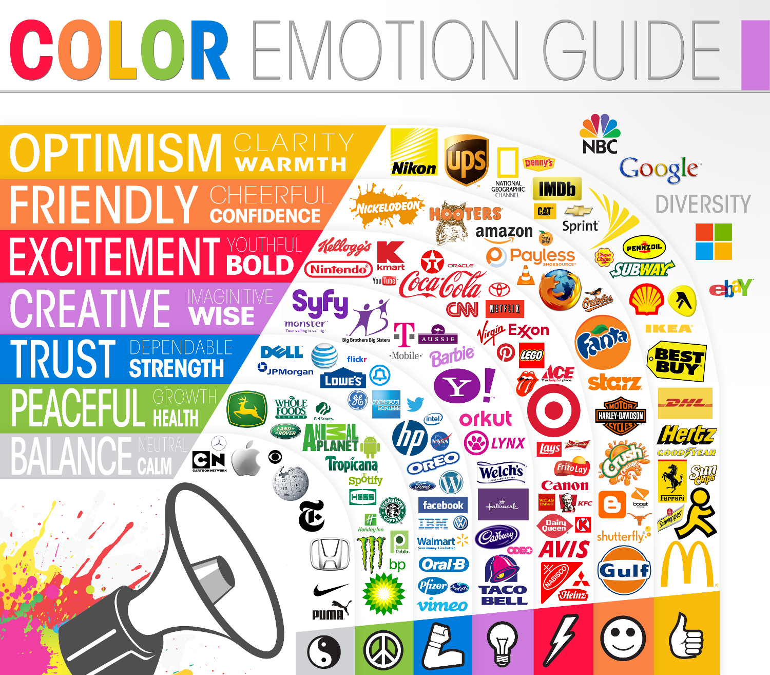
Color is a very useful tool to create a brand identity and trigger specific emotions in users. This picture clearly illustrates how brands position themselves using color:
Studies show that different colors trigger different emotions in users. For example red triggers strong emotions like love, passion and anger; In a marketing context, red is often used for special offers or discounts. People now associate this meaning so it’s a good idea to use red if you want to draw attention to some offer you are making. Blue and green are relaxing and soothing colors; They convey feelings of trust and commitment. Black and grey are elegant colors. Black is also used to give a modern and trendy feel. Yellow is a catchy and cheerful color but it must be used only in small amounts to highlight, otherwise it is perceived as irritating.
Color is a very useful tool to create a brand identity and trigger specific emotions in users. This picture clearly illustrates how brands position themselves using color:
Common misconceptions about the impact of color
When choosing the color scheme for your app it’s important not to fall into the traps of common misconceptions and easy generalizations. There are many factors which influence the perceptions consumers have of colors.
Consumers differences
The effect that color has on consumers depends greatly on their previous experience. Factors such as gender, geographical location, upbringing, context, can often distort the effect of color on customers. As a result, it is not possible to state that colors have a universal effect. For example: in the Western world, white symbolizes pureness, peace and cleanliness; Moreover it is used in weddings. In China instead, white symbolizes bad luck and is used in funerals. Since with the Internet it is now possible to have a global reach, it is ever more important to take these cultural differences into account.
Brand differences
It’s important to think about the sector in which your business operates and what product you are selling; There are color schemes for every specific business. For example if you blog about health and lifestyle, green would be an appropriate color because it indicates nature, it makes users think of rebirth, spring and growth.
The most important thing is to consider the best color for you in your specific context rather than think about the the general impact of color.
How can colors affect conversion rates?
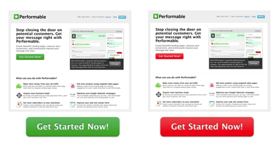
We all know how important conversion rates are, and the use of colors to influence them is a very hot topic now. As you may imagine by now, there is no “best“ color for conversion rates. But there is an interesting study showing how you can play with color coordination and contrasts to create a hierarchy that will lead your users where you want them to go. Here is an example of how changing the color of a single button from green to red increased the conversion rate of a website by 21%:
This is not because red has a secret power to increase conversions. If you take a closer look at the picture you can see how green is the dominating color of the website, on this background the red button stands out much more than the green one.
Tips to choose the best color for your App:
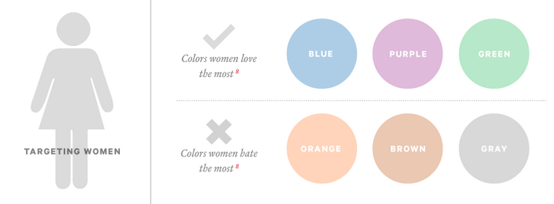
- Consider your target segment, their age, location, gender etc. For example if you are addressing a female public find out what colors they prefer. KISSmetrics did a study about the differences in color perception between men and women with interesting results:
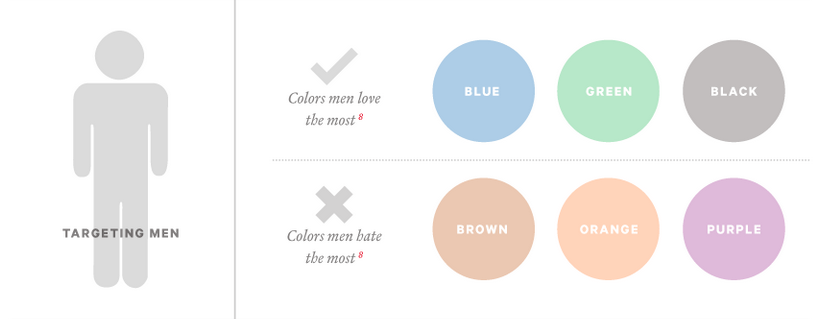
For men the color hierarchy is different:
- Think about what brand image you want to portray. This will help you find out what emotion you want to trigger in your audience. Do you want to be seen as cool, trustworthy, friendly, exciting… according to the main emotion you want to trigger, you can find the most adequate color.
- Be coherent. Once you have chosen the main color, make sure the whole design of app is coherent with your choice. This is necessary to create a strong brand identity.
- Play with contrasts and highlights to attract attention. If the main color of your App is blue and you want to draw attention to a particular button, maybe to lead your users to your event section because you have an event coming up, a bright yellow button will surely catch their eye!
- Think about your competition. Do you want to position yourself close to a leading competitor or do you want to distinguish your app from the crowd of apps in the stores? Sometimes for very small businesses it can be useful to position themselves close to leader to benefit from their fame. If you are already big and have a strong brand, it’s better to distinguish yourself.
- Track the data. Make minor changes in the color scheme, like the color of a single button and monitor the results to see if it produced the desired effect.
Let’s get started!
Now that you are familiar with the power of color, it's time to start creating your Beautiful App. The good news is, with our premium design templates and the many customization tools provided in your GoodBarber backend, you can't go wrong.
