 Design
Why use the new navbar templates?
Written by Muriel Santoni on
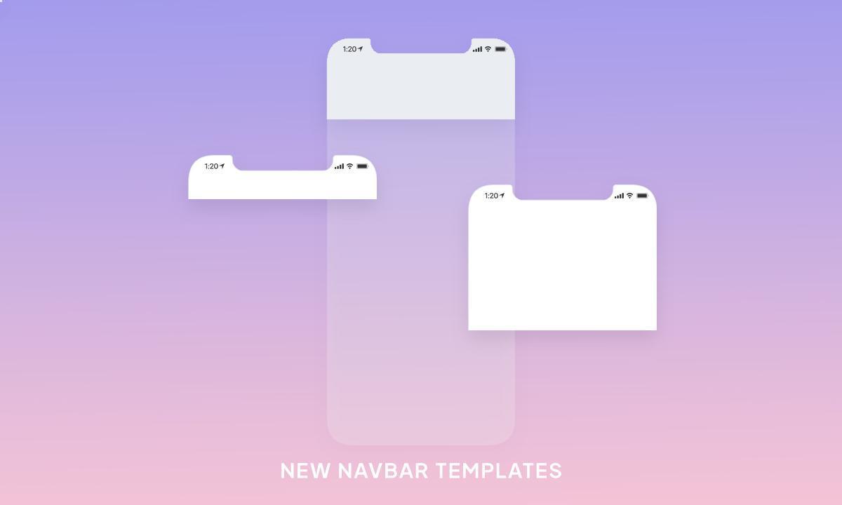
As you saw recently, new navbar templates are now available to design your Header. You can now choose between 3 different heights:
- Small
- Medium
- Large
Small template: the classic option

The Small template is the one you've always known. In addition to the logo or the title of the app, that's where you can find action buttons, and the height of the header is as small as possible. The header takes little space and remains relatively discreet compared to the other elements of the app.
Here are three use cases of the Small template:
Here are three use cases of the Small template:
- The Dali Corp app is an employee communication app. It has no commercial or branding vocation, the target already knows the brand since it's the employees of the company. The app must be clear and efficient, the focus must be put in priority on the info conveyed in the app and on the contact options it offers to employees to get in touch with the HR department or the employees' reps. This is why the Small format was chosen for the app's header. It allows the company logo to be displayed without attracting the user's full attention. An action button referring to the Contact section has also been integrated to highlight the purpose of the app: to promote communication between the management and its employees.
- The app of the Paraigua school has more or less the same needs as the previous example. The public is already familiar with the school's identity, except that the app is also aimed at new or future students. The Small template is therefore used in addition to a color that stands out from the school's visual identity. The header remains discreet, but with its sharp color, it allows to brand the app in a stronger way. Students can focus on the info presented by the app, but no matter which section they're in, their school colors will be displayed, promoting a sense of belonging.
- Here's a different context with the Metek home decor app. Being an online store, the primary objective of the app is of course to sell the products presented. But it's a home decor store where great importance is given to the universes presented in the different departments. The goal is really to immerse the potential customers in the different universes of the season so that they can imagine the different pieces in their interior. That's why the color of the header was chosen to be relatively neutral and why the header is as small as possible. The logo is present and identifies the store well, but the black background color and the small height of the header allow to give a place of choice to the different universes put forward by the store.
Medium template: a design variation

The Medium template offers only one difference from the Small template: the height of the header. Indeed, this template doesn't offer any new options except a visual rendering totally different from what you know and which offers many possibilities in terms of design.
Here are three use cases of the Medium template:
Here are three use cases of the Medium template:
- The Leonie Apparel app is a boutique app with a very clean style both in terms of its design and the materials used to make its clothes. The look of the app is very clear, and it's this feeling that is highlighted with the choice of a Medium template for its header. With a greater height, this black-on-white header offers a feeling of space and purity characteristic of the brand. The deliberately very thin logo also contributes to this feeling.
- The Edaname restaurant has a very strong visual identity. Very dark as can often be the other sushi shops, this restaurant stands out by the choice of a colorful logo, almost kawaii. This is what we wanted to highlight by choosing a Medium template for the header. The logo is highlighted and can particularly stand out against the very dark background color, which is the same on the header as on the background of the app, giving an impression of continuity that lightens the overall visual of the app. Moreover, since the logo contains an illustration and text, it's much more visible in a slightly larger height than on a more classic header.
- Finally, the Maison de Launey app is the online store of a Parisian delicatessen. The physical store is particularly known by its regulars for its wine-colored front. It was crucial for the owners of the brand that this emblematic color be present in their app. To avoid darkening the background of the app too much, the color was applied on the background of the header, with a Medium template so that it is really present in all sections of the app.
Large template: the descriptive option

The Big template, even higher than the Medium, offers a major difference with its two little brothers: the possibility to add a short description under the title of your app or your logo. This little novelty has in fact a huge power that will shake up your designs and the experience you'll offer to your clients. In this case, don't forget that you can "unhook" the headers of each section to add different texts for each section if needed.
Here are three use cases of the Big template:
Here are three use cases of the Big template:
- Urban Shango is a particularly committed sneaker brand. It advocates strong values and is very involved in the fight against inequalities and exclusion. Beyond the sale of its products, the brand wants to convey its message to its customers and leads. That's why a Large template has been applied to its header to continuously display the brand's slogan, and carry the values that represent it to the highest level.
- The Portland app is a very complete tourist guide. The challenge in creating this app was to maintain a very clear design and UX despite the numerous contents inside. The Large template in the header is an integral part of the app's architecture since the descriptions are used to guide the user through the navigation, explaining in a few words the purpose of the contents of the section they're in. It's an effective way to clean up the menu, for example, which in this case is made up of icons without text, which considerably reduces the overall view of the app.
- Finally, the Freyja Spa uses its app to communicate with its customers, to allow them to book a treatment, and also to maximize its loyalty program. The app has become the privileged communication tool between the clients and the salon. The Large template of the header is used to display important information that shouldn't go unnoticed by clients. The text changes regularly according to the needs of the manager. Here, for example, is an important info about the organization of the salon during the Covid-19 epidemic.
As you can see, there are many ways to use the different navbar templates, so don't hesitate to test them in your back office to choose the format(s) that will suit you best!