 Design
Clean TabBar: a text-only, subtle and elegant navigation
Written by Lesia PIETRI on
Clean TabBar is designed for apps looking for a more discreet, more elegant and more editorial navigation. With its text-only approach, the absence of a background on the active state and its different selection indicators, this layout offers a particularly polished and refined take on navigation.
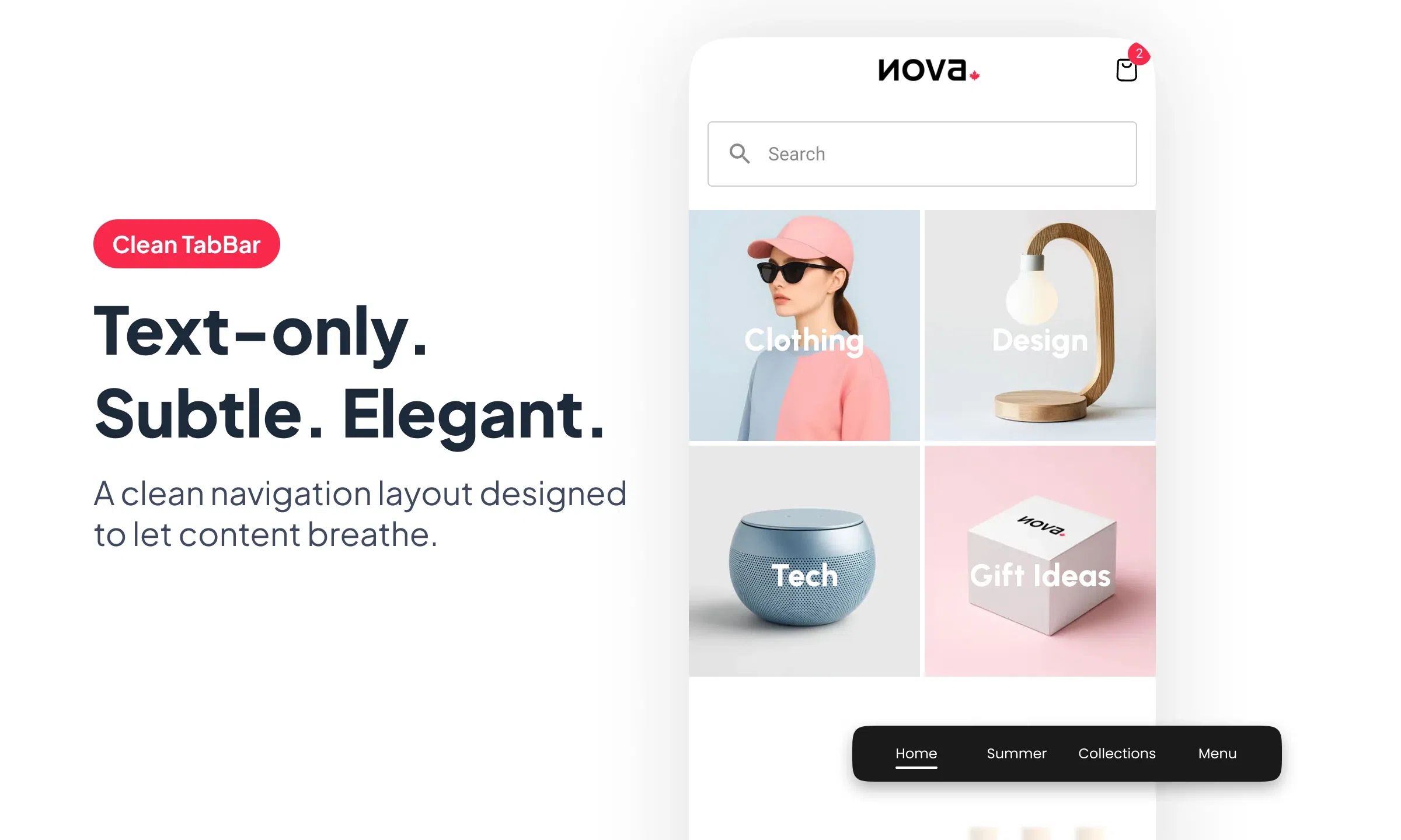
Among the three launch layouts of the new generation of TabBar, Clean TabBar is the one that most clearly expresses a search for sobriety and precision.
Here, navigation does not rely on overly demonstrative icons, nor on a strong background to signal the active state. It rests on a more discreet, more textual, more elegant writing. It is a layout that gives the tabBar a very legible place in the interface, while keeping a measured presence.
Clean TabBar works particularly well in apps that want to leave more room for content, for the rhythm of the page and for the overall quality of the composition.
A text-only navigation, clear at first glance
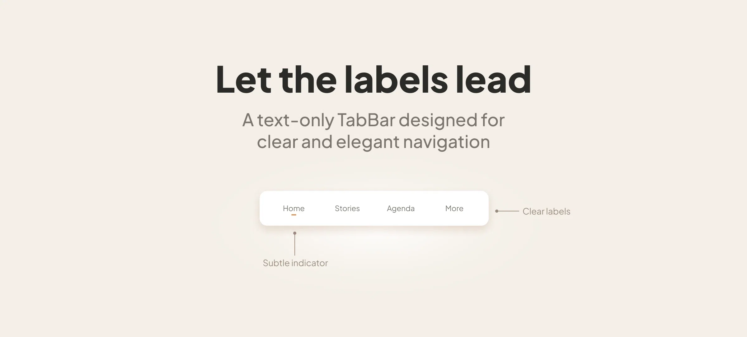
The principle of Clean TabBar is simple: navigation expresses itself first through text.
The labels become the main landmarks. This approach immediately gives the tabBar a more editorial, more poised, almost calmer tone. Navigation appears less cluttered, more direct, and often more natural in interfaces where content, layout and typography already occupy an important place.
This choice also changes the visual rhythm of the screen. The navigation bar becomes lighter in its construction, without losing legibility. It accompanies the interface with discretion, but remains perfectly identifiable.
A selected state expressed with finesse
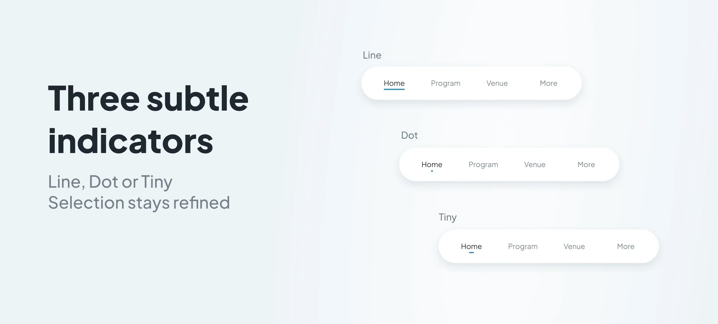
In Clean TabBar, the active state is not marked by a background applied to the text or the icon. It expresses itself in a more subtle way, thanks to a selection indicator.
The component lets you play here with several styles of indicators:
- Dot
- Tiny
- Line
This variety is particularly interesting, because it lets you fine-tune the level of accent given to the active item. Depending on the graphic universe of the app, the selection can remain very discreet or, on the contrary, a little more pronounced, while preserving the elegance specific to the layout.
This is one of the strong points of Clean TabBar: it shows that it is possible to have a very legible navigation without resorting to overly emphatic visual effects.
Animations at the service of discretion
Like the other layouts of this new generation of TabBar, Clean TabBar benefits from selection animations that adapt to the chosen style.
Here, these animations take on their full meaning, precisely because navigation rests on more subtle signs. The movement therefore accompanies the selection with precision, without overplaying the effect. It reinforces the legibility of the state change and prolongs the sense of finesse carried by the layout.
This consistency between design, selection indicator and animation contributes a great deal to the perceived quality of the component.
The haptic effects also participate in this quality of execution, providing a discreet tactile response consistent with the elegance of the layout.
A "More" menu in the same logic of simplicity
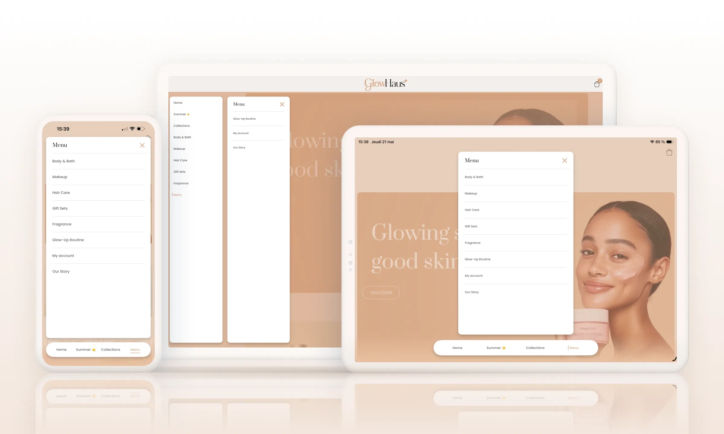
The "More" menu of Clean TabBar, for accessing the hidden tabs, extends this same search for sobriety.
It too favours a simple, very legible presentation, with a clear visual hierarchy and a refined design. It remains in continuity with the layout, without introducing any break in style with the main bar.
On mobile as on desktop, this continuity works particularly well. The "More" menu keeps the same restraint, the same clarity, and the same quality of presentation as the navigation itself. It lets you open the tree without weighing down the experience, which fits perfectly with the spirit of the layout.
A discreet navigation, but a highly crafted one
Clean TabBar shows that a navigation can be both very simple in its appearance and very crafted in its conception.
With its text-only approach, its selection indicators, the absence of a background on the active state and its "More" menu in continuity with the layout, it offers a particularly elegant take on mobile navigation.
For apps seeking a more editorial, more sober and more refined navigation, Clean TabBar is a particularly solid foundation.