GBTC: Publish your app with easeDiscover GoodBarber Takes Care and simplify the app publication process for both the App Store and Google Play. Let us handle the technical details for you.Learn more about GBTC
The header is the zone which makes up the upper part of your app. When used to its potential, it can be a very strategic area. It's an essential element in your app's visual identity as well as an area providing instant access to links. If you are looking for best practices on how to make an app, read on!
Visual Identity
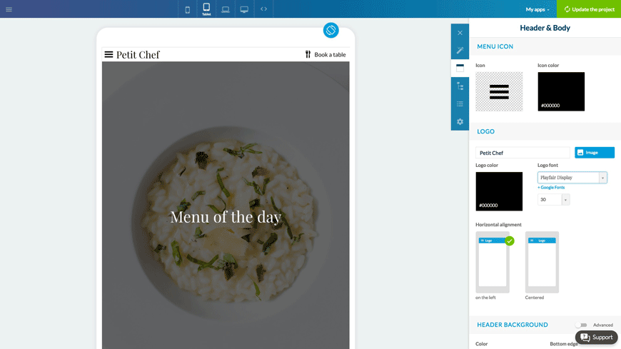
The header is where you display the title of your app, or even your logo. The header is visible both in the home and inside sections. In the detail pages, it's used to display navigation and sharing buttons.
In your header, you can apply background colors, textures, and alignments. You can choose the navigation button icons and the text fonts. There are numerous options for setting up this area's design in order to seamlessly integrate your visual identity.
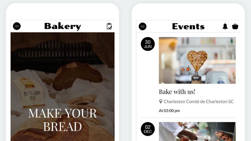
It's possible to personalize the display of the header depending on the section. For example, in a cooking app you could have a specific header for a "Recipes" section and another one for an "Events" section. This option gives you a lot of flexibility, but be sure to still maintain some sense of consistency between the various headers so you don't confuse your users.
Shortcuts
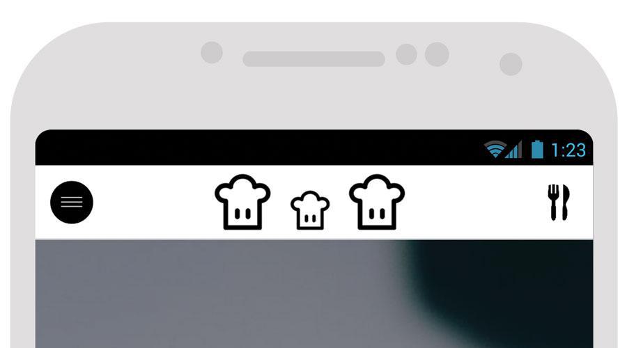
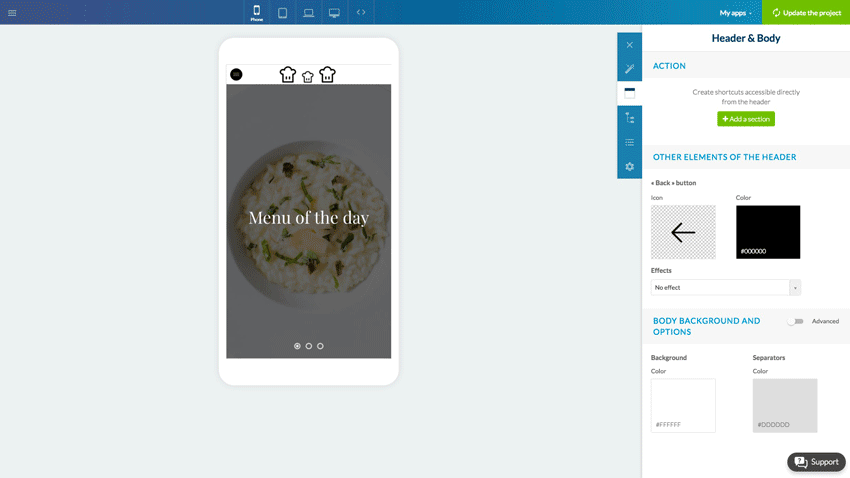
The header has 3 slots that can hold links. Use these slots to suggest quick actions that are easily accessible from almost anywhere in the app. You have the option to add up to 6 shortcuts in the header. When you have 4+ shortcuts, the third slot is automatically used to display an additional menu.
The icon, the destination, the title, and the colors for each shortcut can be personalized.
On mobile, the shortcut can only be represented by an icon. On tablet, it's possible to display the a title for a shortcut next to its icon. On laptop or desktop, the shortcut can be transformed into a button, by adding a background color under the icon and title.
The way the additional menu works is identical on mobile and tablet. It appears in overlay at the bottom of the screen. On laptop and desktop, it drops down from the icon when clicked.
The header gives you the extra flexibility to organize the navigation in your app–it's complementary to the home and menu.
On iPhone Duo, an app switches displays every time the phone opens or closes: the outer display, narrow and tall, then the inner display, as wide as a small tablet. Apple asks apps to treat that switch as a simple change of size, like a window being resized, and draws a rule from it: when the device opens or closes, people find what they left.A GoodBarber app follows that rule to the letter. When iPhone Duo opens or closes, it keeps its screens and lays them out again at their new size: the same screen, the same place, what's playing, what was typed into a form. The gesture changes the shape of the screen, never what you were doing.
 eCommerce
 Memberships
 Chatbot
 Online Courses
 Bookings
 Travel guide
 Events
 Content Creators
 Pickup & Delivery
 Newspaper
 Radio
 Schools
 Faith
 Organizations
 Restaurant
 Grocery
 Custom apps
 Employee Communication


 NO CODE APP BUILDER
 TECHNOLOGY
 WHY GOODBARBER?
 Design
 PRODUCT RESOURCES
 TOPICS

 MOBILE APPS RESELLERS
 DISCOVER