 Design
UneStory: two formats, one layout
Written by Lesia PIETRI on
GoodBarber expands its layout options with UneStory, a new layout that takes the immersive feel of the Story layout and adapts it to denser navigation, designed for apps that publish content regularly.
Two reading levels in a single layout
In a content app, you often need to strike the right balance between visual impact and readability. Some articles deserve to be immediately visible, while others should remain easy to browse without cluttering the screen.
UneStory addresses this need with a two-tier structure.
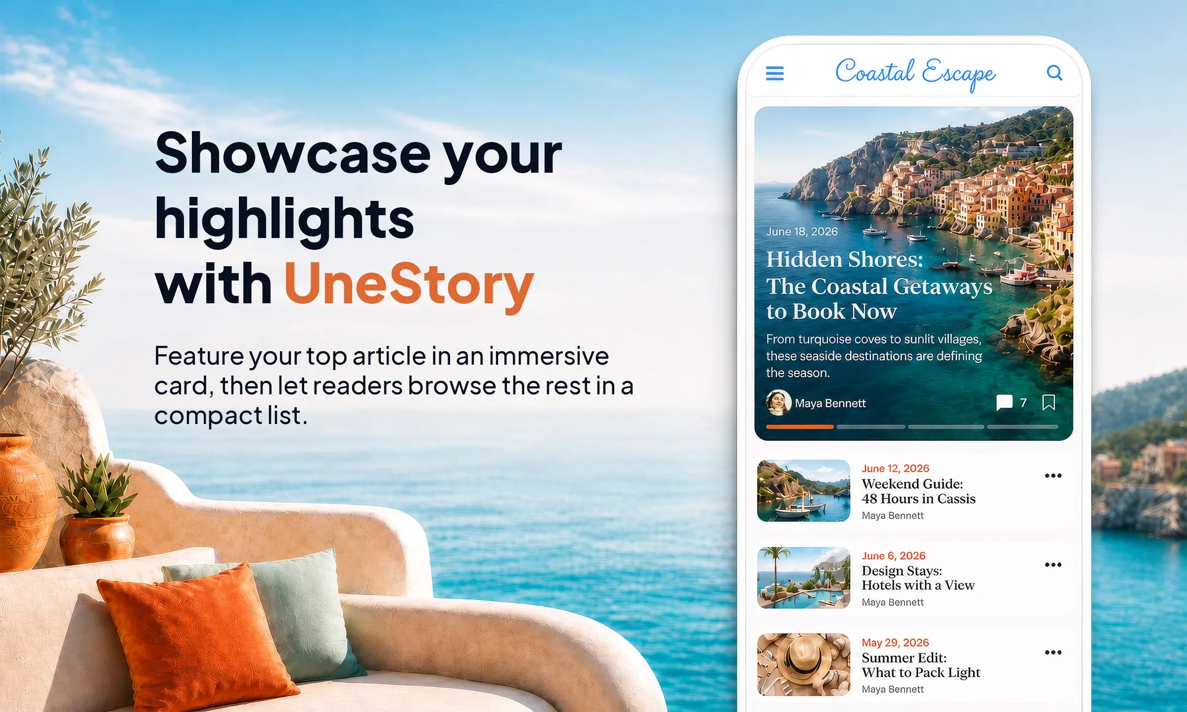
At the top, featured articles are displayed in a large visual format, with the image taking center stage and the key information embedded directly in the card: title, description, author, date and interactions.
Below, the other articles are presented in a compact list, clean and quick to scan. The reader gets a strong visual entry point, then continues browsing smoothly.
Available for the Home Articles widgets and the Articles sections, UneStory brings real editorial hierarchy to your pages.
A layout designed for editorial content
UneStory is particularly well suited to apps that publish content regularly: media outlets, magazines, blogs, creators, communities or editorial apps.
The layout lets you give more visibility to important articles without hiding the rest of the publication. It creates a more rhythmic, more structured, and more pleasant page to browse.
A consistent experience on every screen
Like the other GoodBarber layouts, UneStory adapts to different screen formats. On mobile, the featured section stays immersive and the list keeps a natural vertical reading flow. On tablet and desktop, the available space lets you display more content while keeping the same hierarchy logic.
The result: a polished, responsive presentation that always stays readable.
How to enable it
UneStory is available directly from the GoodBarber back-office, in the layout options of the Home Articles widgets and the Articles sections.