 eCommerce
 Memberships
 Chatbot
 Online Courses
 Bookings
 Travel guide
 Events
 Content Creators
 Pickup & Delivery
 Newspaper
 Radio
Radio Schools
 Faith
Faith Organizations
 Restaurant
 Grocery
 Custom apps
 Employee Communication
 NO CODE APP BUILDER
 TECHNOLOGY
 WHY GOODBARBER?
 Design
 PRODUCT RESOURCES
 TOPICS
 MOBILE APPS RESELLERS
 DISCOVER
How do I adjust the shadow in my app?
In a GoodBarber app, a well-set shadow goes unnoticed: it lifts the content off the background and gives the screen depth. It comes ready to use: one tap turns it on, our settings calibrate it. And if you want it your way, every value can be adjusted.

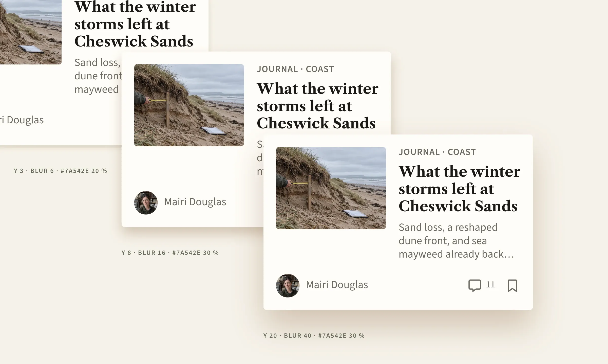
Here is how the shadow is set in a GoodBarber app, from the tap that turns it on to fine-tuning, down to the pixel.
A shadow in one tap
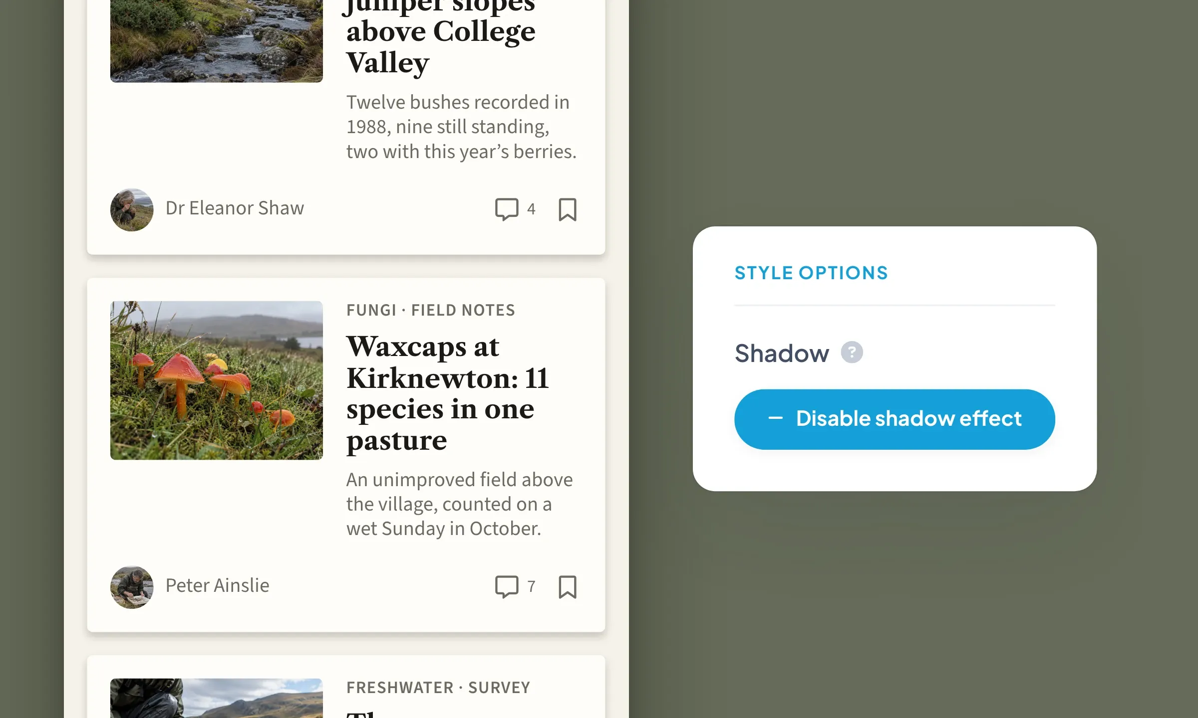
In the design panel of a list, a widget or a category bar, whenever the layout allows it, adding a shadow takes one tap: “Enable shadow effect”. The path: My App › Structure › your section › Edit the design › STYLE OPTIONS. GoodBarber's default settings do the rest (3 px offset, 6 px blur, black at 20%). Discreet, the shadow lifts each element off the background without catching the eye.
The TabBar and the floating button carry their shadow from the start, a higher one (6 px offset, 12 px blur), because they sit above the content.
A shadow needs a surface to lift, such as a cell background, a thumbnail or a button. It never sits on a text or an icon, so as not to blur their reading.
You turn the shadow on; the system knows where it can sit, and at what level. This default setting makes your life easier and keeps your shadows consistent across the whole app. That is our “No design burden” principle, so that design is never a burden.
What makes a shadow
Lay a sheet of paper on your desk: its shadow stays stuck underneath, sharp. Lift it a few centimeters, and the shadow slides down and softens. On screen, it is the same story, in three settings:
- The offset: the shadow moves away from the element, opposite the light. By default, it drops 3 px under a list, 6 under the TabBar. The further it moves, the higher the element seems.
- The blur: it softens the edge of the shadow. By default, 6 px under a list, 12 under the TabBar. The larger it gets, the more the shadow melts into the background.
- The color, and its strength: the shadow takes a tint and an opacity. By default, black at 20%. A tint from your palette gives it your character.
These values are set for each list, widget or category bar. The TabBar, the floating button and the form fields are set once for the whole app.
And for fields, the inner shadow
A shadow also has a position. External by default, it lifts the element; internal, it hollows it. We keep the inner shadow for form fields, because a hollow invites writing. The values stay the same, only the position changes (external or internal).
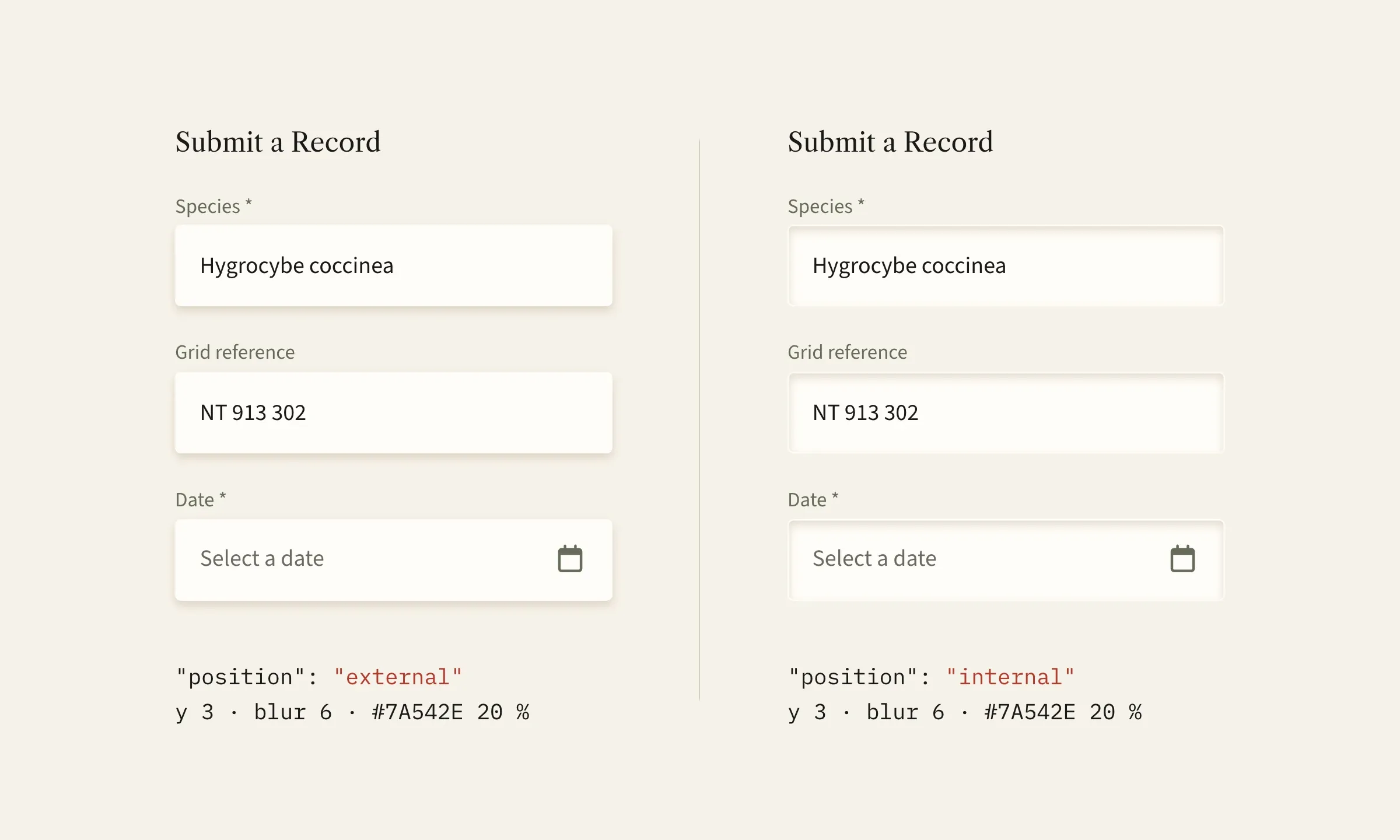
Customize your shadow in GoodBarber
To set the shadow values yourself, the Advanced edition extension opens the JSON, the complete list of settings. There, the shadow is set down to the pixel. It is then up to you to keep the same shadow from one list to the next.
Free, the extension installs from the “Extensions Store” menu, on the “Advanced edition” page. Your design screens then gain the { EDITION } button, top right.
- In the design panel of your section or your widget, turn the shadow on with the “Enable shadow effect” button. That is what creates the shadow object.
- Open the JSON with the { EDITION } button and unfold the shadow object. The keys are sorted alphabetically.
- Start with the color. Under shadow, click “+ Add”. In the newKey field, type color, leave “Value” selected, enter its hex code (#7A542E here), then “Add”. Save, and the shadow takes the tint while keeping its offset and blur.
- Switch to free setting: add type the same way, with the value custom. Without it, the next settings are ignored.
- Add blur, the blur in pixels (16 here), and opacity, the strength of the color, from 0 to 1 (0.3 here). Then offset, as an “Object”: add x and y to it the same way (0 and 8 here, the shadow drops by 8 px).
- Save, your shadow is in place.
A trap to know: opacity is written with a point, 0.3 and not 0,3. With a comma, the value falls back to the default setting.
Before, after: the shadow takes your color
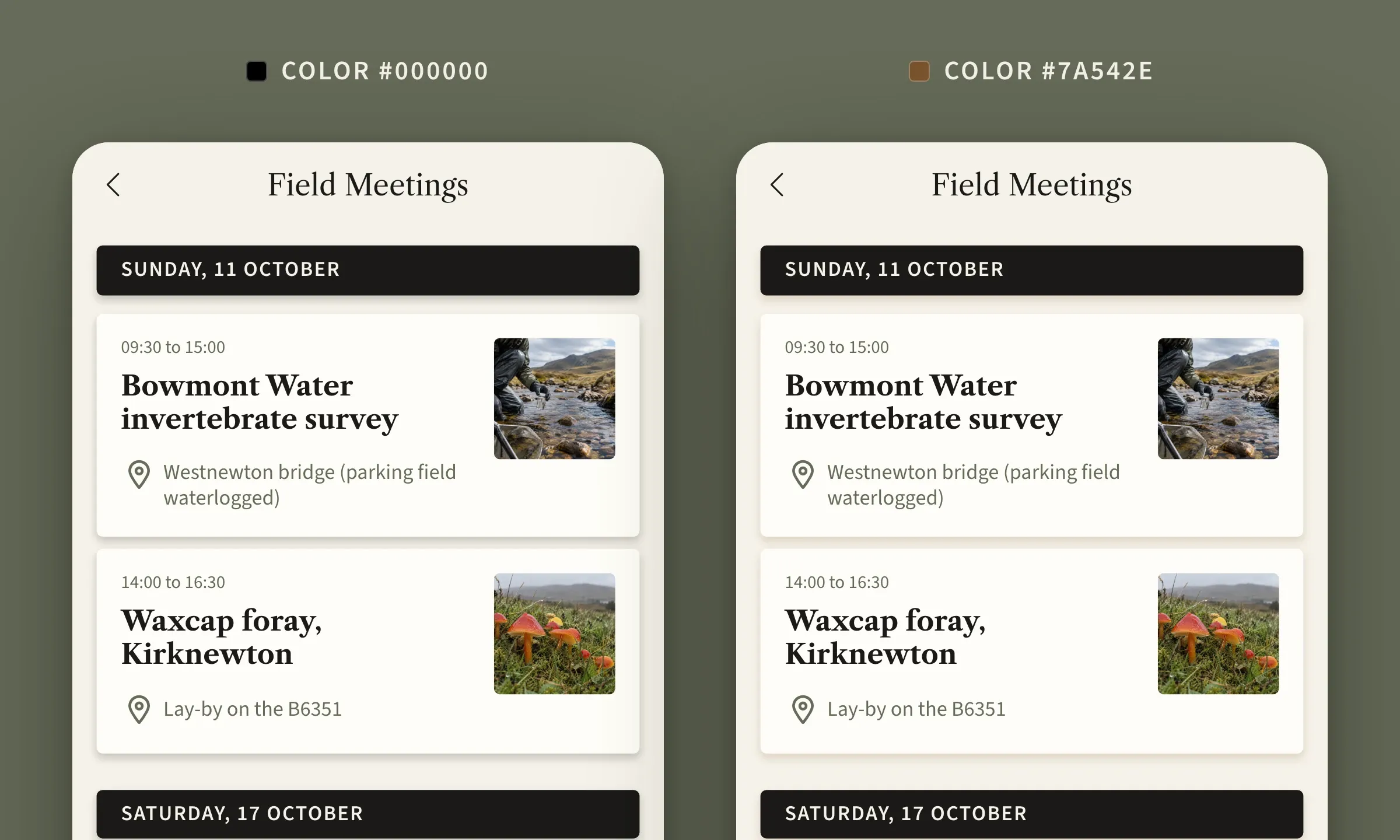
In real life, a shadow is never quite black. It takes the color of the light and of the surface it touches. Our default shadow is black for a good reason: it suits every palette, and that is what makes it safe from the first tap. A tinted shadow goes one step further. On a cream background, a brown shadow stays in tone with the background.
Here is the same screen twice. One value has changed, the color of the shadow, from the default black to the brown of the palette (the color key from step 3). Same offset, same blur, same strength. On the left, the cells lift off the background. On the right, they seem to rest on the page, and the whole page matches the palette. For a single key, the app looks drawn in one piece.
To judge a setting, do as here. Change one value at a time, save, and judge in the preview, with the whole page in view. A successful shadow is felt more than seen.
The shadow, from the most discreet to the boldest
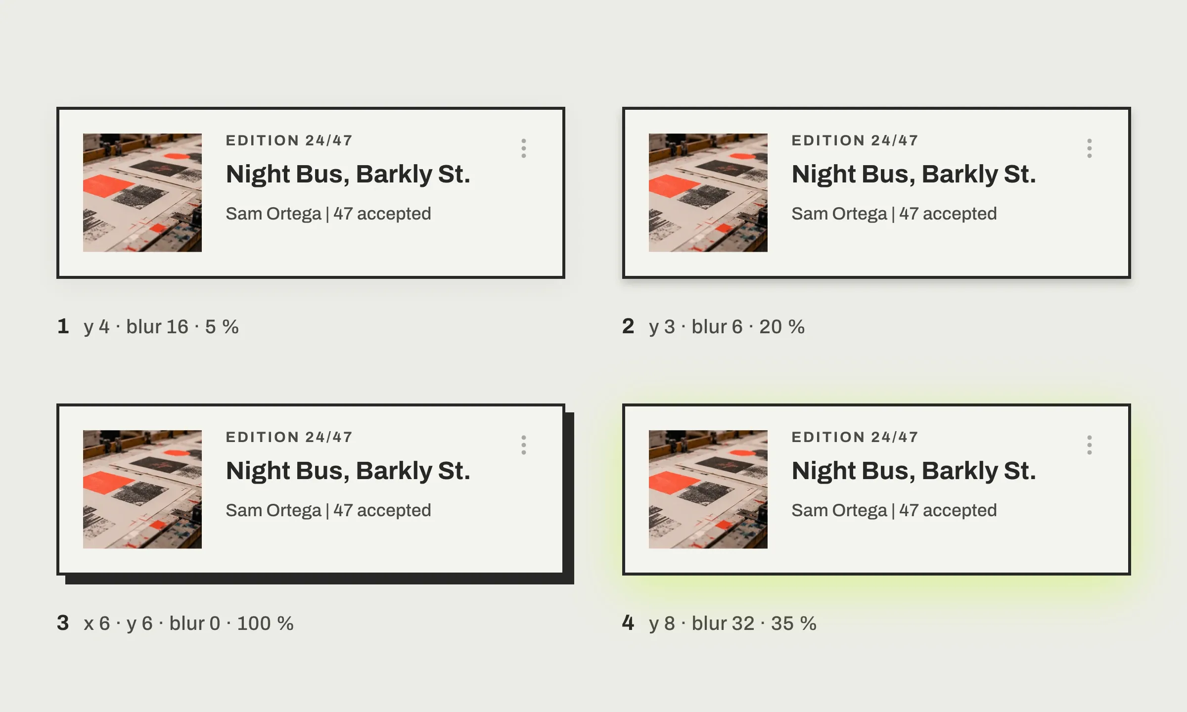
The same cell, in the same app, can carry very different shadows. At 5%, the shadow is barely visible: it lifts the cell and nothing more. Without blur, it cuts out sharply behind the cell, and the app gains character. The image shows four, from the most discreet to the boldest, all in type custom except the default one:
| Shadow | offset | blur | opacity (0 to 1) | color |
|---|---|---|---|---|
| 1. Barely visible | x 0, y 4 | 16 | 0.05 | #000000 |
| 2. Default (level2) | x 0, y 3 | 6 | 0.2 | #000000 |
| 3. Hard | x 6, y 6 | 0 | 1 | #282727 |
| 4. Colored | x 0, y 8 | 32 | 0.35 | #B9FF00 |
The default row only recalls its values: you have nothing to write to get it. The other three go into the editor as they are, key by key.
None of these shadows is better than another. Each gives the app a character, and all are set with the same keys. The hard shadow alone changes the character of an app, as in our art gallery app mockup, in neo-brutalism, on Dribbble, with an offset on both axes, zero blur and a solid color.
My favorite setting, a shadow in the button's color

Under a colored button, a shadow of the same color. It is my favorite setting: 10 px offset, 24 blur, a strength of 38%. It does not weigh on the button, it makes it glow, like a halo, and the eye understands that this is the action that matters. I keep it for a single action per screen. If everything glows, nothing stands out.
The floating button is set once for the whole app, in App style, with the same { EDITION } button, under floatingButton, then button, then shadow, with the same keys.
The shadow at a glance
- One tap to turn it on, “Enable shadow effect”, in the design panel of a list.
- Three settings, the offset, the blur, the color and its strength.
- By default, 3 px offset, 6 px blur, black at 20%; 6 and 12 px under the TabBar and the floating button.
- One free extension for fine-tuning, Advanced edition, the { EDITION } button.
- One key to tint the shadow without touching the rest, color.
- Two positions, external (relief) or internal (hollow, kept for form fields).
- One trap, opacity is written with a point, 0.2 and not 0,2.
Over to you
The next step is simple. Open the design panel of one of your lists and enable the shadow effect. When you feel like a shadow in your colors, the { EDITION } button is in the same place, and a single key is enough to start.
The Shadow atom page of the GoodBarber Design System gives the full reference, levels and keys. No app yet? Create yours with GoodBarber, the Mobile App Builder.


