 eCommerce
 Memberships
 Chatbot
 Online Courses
 Bookings
 Travel guide
 Events
 Content Creators
 Pickup & Delivery
 Newspaper
 Radio
 Schools
 Faith
 Organizations
 Restaurant
 Grocery
 Custom apps
 Employee Communication


 NO CODE APP BUILDER
 TECHNOLOGY
 WHY GOODBARBER?
 Design
 PRODUCT RESOURCES
 TOPICS

 MOBILE APPS RESELLERS
 DISCOVER
Which font for my app, and which sizes?
In GoodBarber, you choose your app's fonts once, on a scale of eight levels, and the whole app follows. An app is read more than it is looked at, and its fonts are its voice. One or two are enough. The font gives the character, the scale gives the reading order.

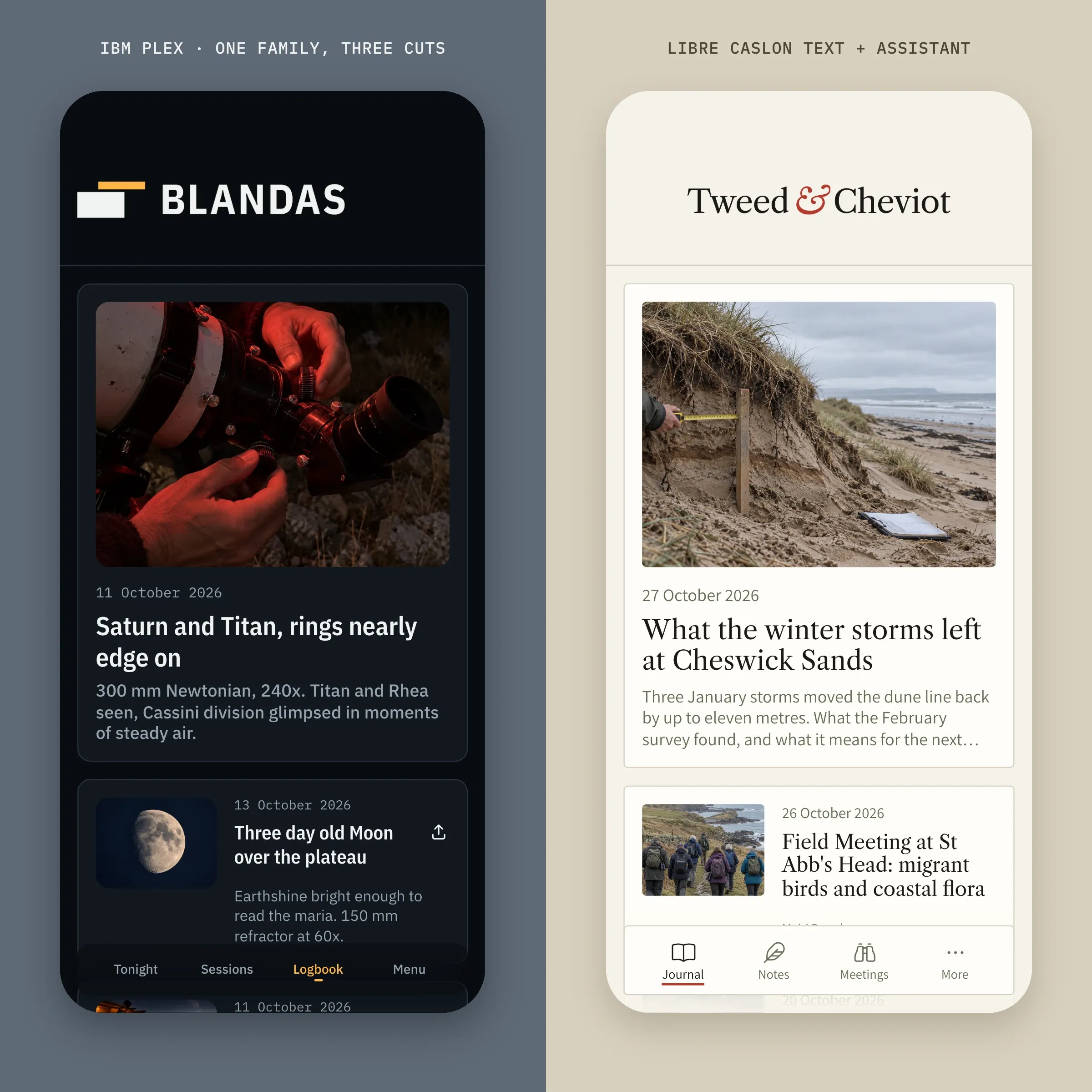
Here is how to choose your fonts, what each level of the scale is for, and where it is all set.
One or two fonts, no more
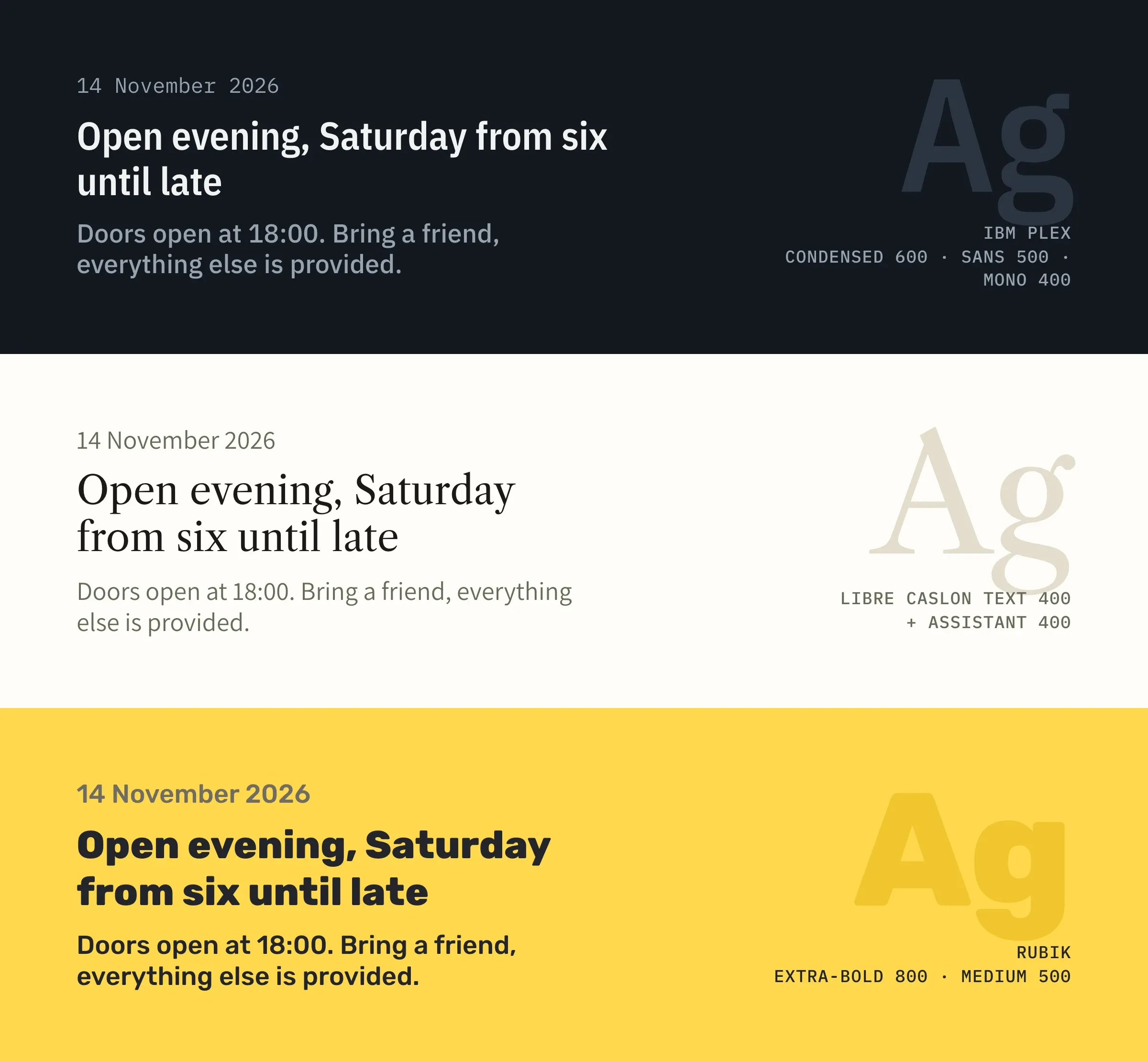
A font sets the tone of an app before anyone reads a word. In the image above, the words and the sizes are identical, only the font changes.
At the top, Blandas Astronomy Club uses a single family, IBM Plex, in three of its variants. The condensed version fits long titles on fewer lines, and the monospaced version lines up figures perfectly. The tone is precise, technical.
In the middle, Tweed & Cheviot keeps Libre Caslon Text for its titles, an elegant serif made for reading. Dates and summaries are in Assistant, a discreet sans-serif that leaves the spotlight to the title font.
At the bottom, Eastside Music Workshop has only one font, Rubik. It plays on sizes and on weights, that is, the thickness of the letters: Extra-bold 800 for the title, Medium 500 for the rest.
Titles, large and short, carry the app's character: that is where an original font shows best. Small texts, like dates or summaries, need easy reading first, hence a more sober font. The reading order, for its part, comes from the scale.
The scale: eight levels, from Main title to body text
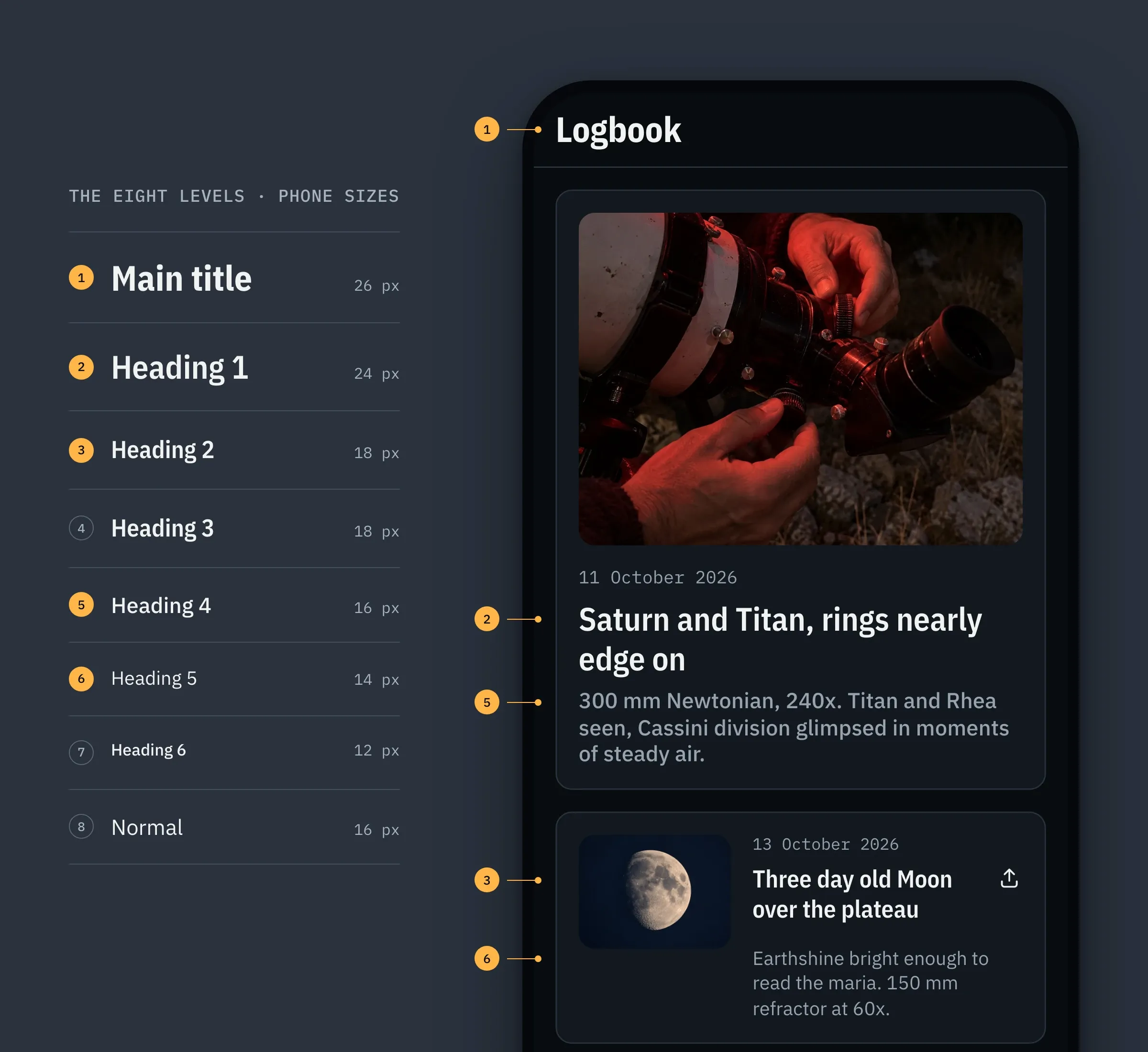
In a GoodBarber app, texts are arranged in eight levels, from Main title to Normal, by way of Heading 1 to 6. Each has its font, its weight and its size. On the left of the image, the Blandas scale.
On the right, five of these levels in the Logbook, the club's observation journal. The page name is a Main title (marker 1), the large title of the first observation a Heading 1 (2), its summary a Heading 4 (5). In the list, the title of an observation is a Heading 2 (3), its summary has the size of Heading 5 (6). Five levels are enough to tell where you are, what matters first and what adds detail.
Here is the full Blandas scale, on phone.
| Level | Font | Weight | Size |
|---|---|---|---|
| Main title | IBM Plex Sans Condensed | Bold 700 | 26 |
| Heading 1 | IBM Plex Sans Condensed | Semi-bold 600 | 24 |
| Heading 2 | IBM Plex Sans Condensed | Semi-bold 600 | 18 |
| Heading 3 | IBM Plex Sans Condensed | Semi-bold 600 | 18 |
| Heading 4 | IBM Plex Sans | Medium 500 | 16 |
| Heading 5 | IBM Plex Sans | Regular 400 | 14 |
| Heading 6 | IBM Plex Sans | Medium 500 | 12 |
| Normal | IBM Plex Sans | Regular 400 | 16 |
Sizes adapt to the device on their own: the title of a cell goes from 18 px on phone to 22 px on tablet and desktop. Set a level, and every text of that level follows, throughout the app. That is our principle "Set once, consistent everywhere".
Set your fonts in GoodBarber
Everything is set in the GoodBarber back office, in the My App › App style › Fonts menu.
- Choose one of the Font themes, more than sixty combinations selected by our designers, or build your own in the List of your app's fonts, giving each level a font and a weight.
- Adjust all sizes at once with the Font size slider. It enlarges or reduces every level together, without touching the gaps of the scale. Line height and letter spacing, that is, the space between letters, are set level by level.
- Click Apply, then confirm. Your choices are applied to the whole app.
The selector offers more than 1,000 Google Fonts. For your brand's font, simply upload it with the Custom font extension.
Set your fonts for the whole app first, then fine-tune a section if needed. The detailed steps are in our help center, Customize and upload fonts in your app.
Change the font of a single text
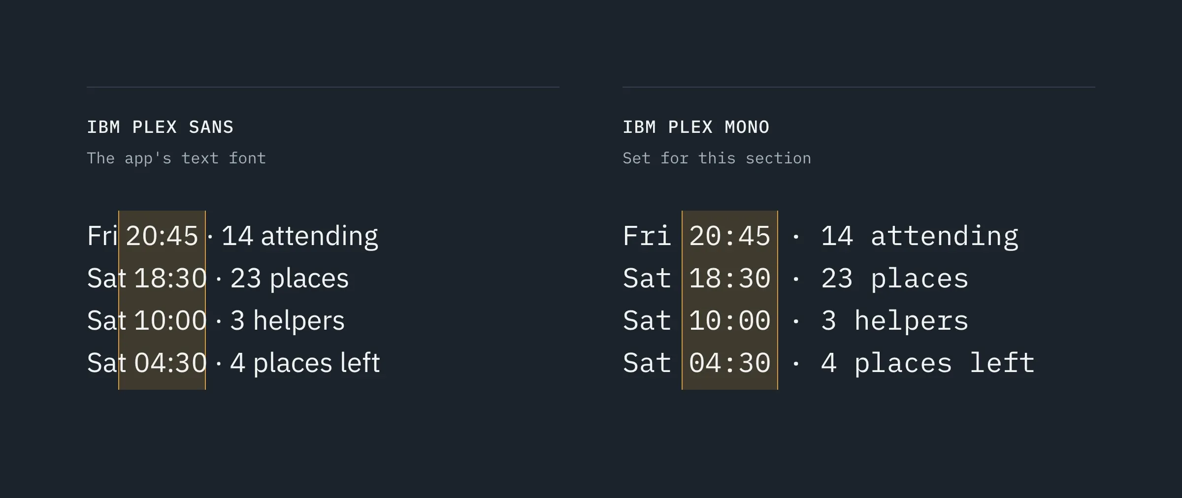
A section can also stand out from the others, text by text. In My App › Structure, a section's Edit the design button opens its texts one by one, the title, the date or the summary, each with its font, its color and its size.
In the Blandas session list, the line under the title gives the time and a practical detail. That is data, so we set it in IBM Plex Mono. In IBM Plex Sans, the times drift from one line to the next. In a monospaced font (every character takes the same width), they fall into a column, and the list reads like a table.
The entries of the menu at the bottom of the screen (the TabBar) also have their own font, chosen in My App › Structure › Menu.
A new click on Apply, on the Fonts page, resets every text to the font and size of its level, including the ones you set separately. So keep these settings for one or two details, and write them down.
Before, after: only one font changes
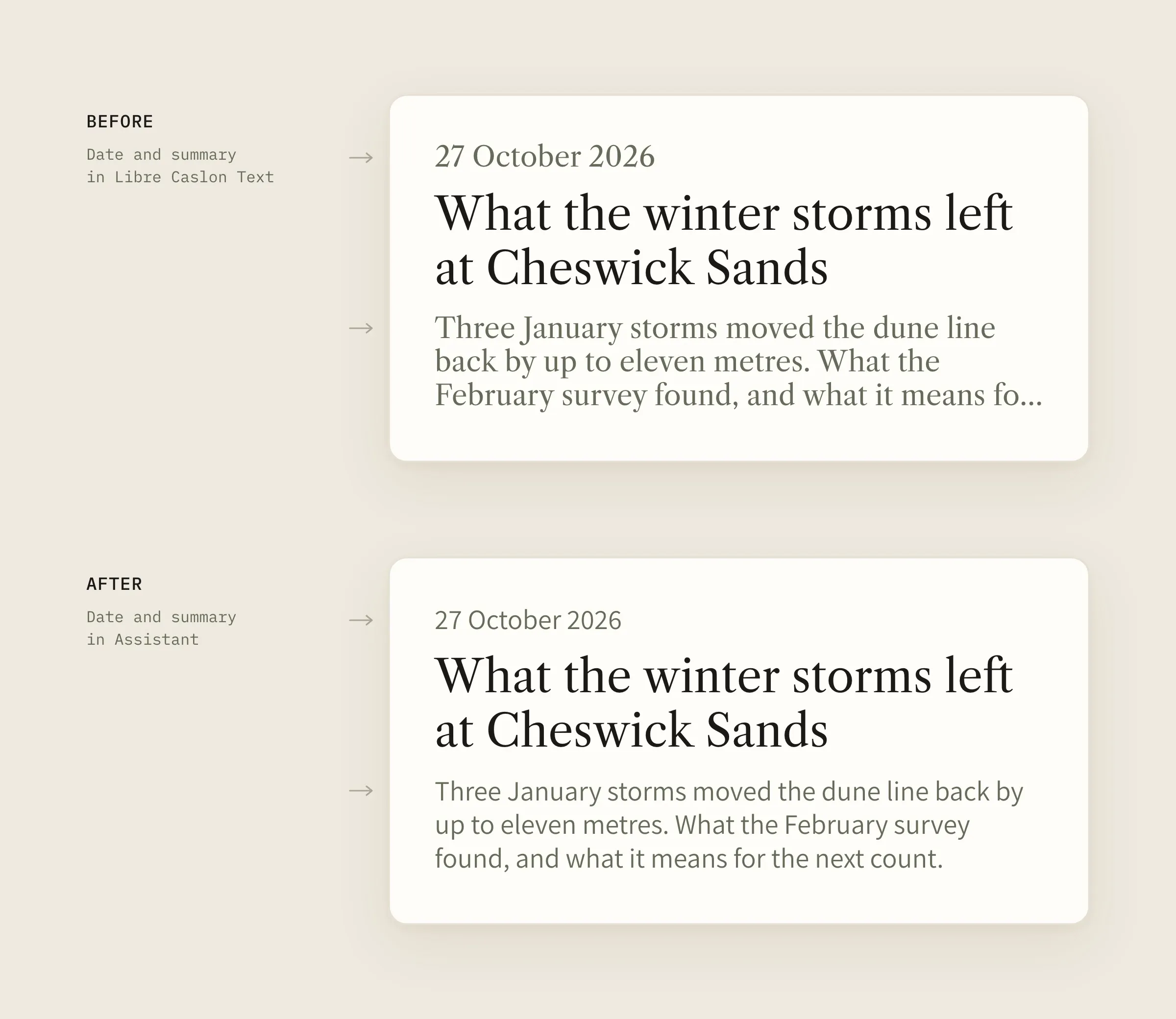
At the top, the same featured article set entirely in Libre Caslon Text. It is elegant, but the title, the date and the summary speak with the same voice, and the eye can struggle to know where to start.
At the bottom, only the date and the summary have switched to Assistant. The title, the only serif left, stands out without growing a single pixel, and the rest steps back.
The change is subtle. Yet it is this kind of setting that makes a real difference in reading comfort.
My favorite setting: strong contrasts
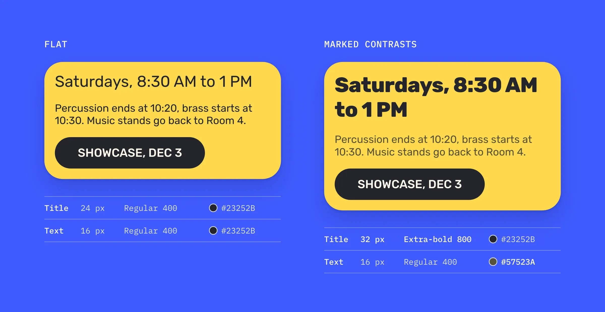
I like strong contrasts, between sizes, but also between weights and colors.
In the first block of the Eastside home screen, on the left, the title is at 24 px and the text at 16 px, with the same weight and the same color. Everything reads, but nothing stands out. On the right, the title goes up to 32 px in Extra-bold, and the text takes a softer ink. The font is still Rubik.
When two texts don't play the same role, give them a real gap in size, weight or color. If they look too alike, the eye hesitates.
Fonts in short
- One or two fonts are enough for a whole app, and a single family can do it all.
- In GoodBarber, texts are arranged in eight levels, from Main title to Normal.
- Each level has its font, its weight and its size, on phone, tablet and desktop.
- The scale is set in My App › App style › Fonts, then Apply.
- You can change the font of one particular text, for example the dates of a list, in its section's Edit the design.
Your turn
Open My App › App style › Fonts and compare, in the preview, the title of a list and the text that goes with it. If they look too alike, change just one thing, the font or the weight, and compare again.
To go further, the Typography page of our design system presents our rules, the Font atom page the technical details of a font, and our selection of the best font libraries will help you find yours.
GoodBarber, the Mobile App Builder, gives you the scale. The voice is yours to choose.


