 eCommerce
 Memberships
 Chatbot
 Online Courses
 Bookings
 Travel guide
 Events
 Content Creators
 Pickup & Delivery
 Newspaper
 Radio
Radio Schools
 Faith
Faith Organizations
 Restaurant
 Grocery
 Custom apps
 Employee Communication

 NO CODE APP BUILDER
 TECHNOLOGY
 WHY GOODBARBER?
 Design
 PRODUCT RESOURCES
 TOPICS
 MOBILE APPS RESELLERS
 DISCOVER
The new Favorites section: filter, sort and find your saved content
Your app's Favorites section has been redesigned. Your users can now filter their saved content by type, choose the order it appears in, and bring back a favorite removed by mistake in a single tap. Here is what changes for them, screen by screen.

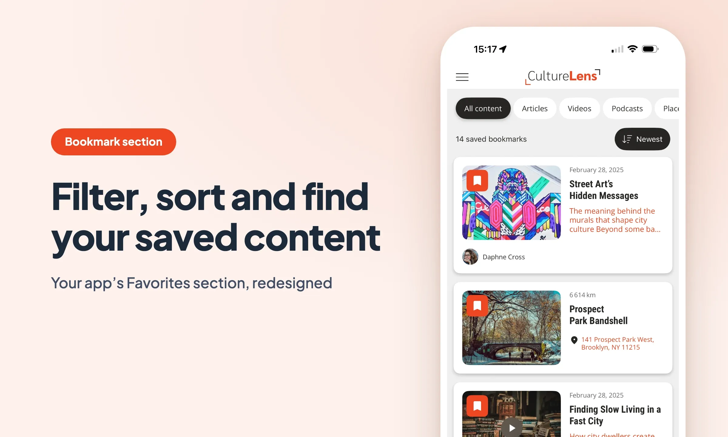
At first, a list of favorites takes care of itself. Ten items, in chronological order, everything is there at a glance.
Then it grows. Articles, podcasts, videos, events and addresses, all stacked in the same column. A few months in, the user looking for the episode they saved for their commute scrolls past fifty rows before finding it. Content they took the trouble to save becomes harder to find than if they had never set it aside.
That is exactly what the new Favorites section fixes.
A filter bar that only shows what is really there
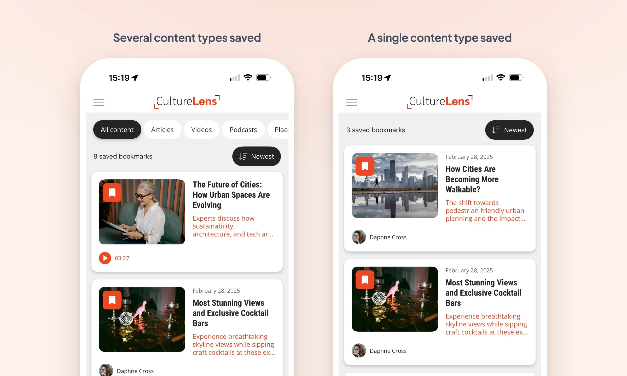
At the top of the list, a tab bar narrows the view down to a single content type. Articles, videos, podcasts, events, places: your user isolates what they are looking for instead of scrolling through everything.
What makes it different: it is built from the favorites that were actually saved. A tab only appears once at least one item of that type has been saved, and it disappears when the last one is removed. Nobody ever lands on an empty tab.
The bar therefore follows each person's usage. A user who only saves podcasts sees no filter at all, since there is nothing to filter. The day they set a first event aside, the matching tab appears.
Each tab keeps its own sort order
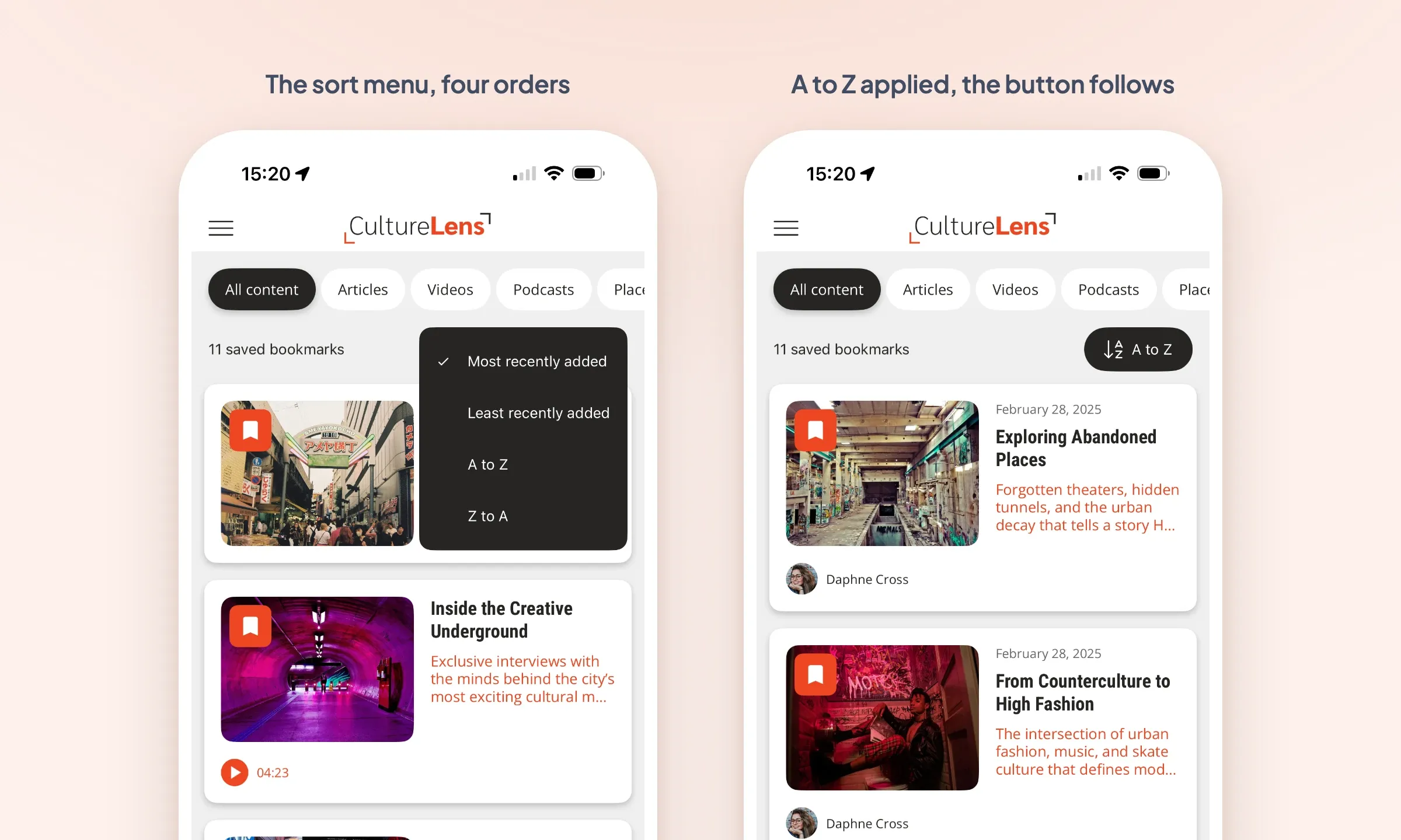
A sort menu opens from the list and lets users choose the display order. The button always reflects the sort in use: the icon and the label change along with the list, so nobody has to reopen the menu to know where they stand.
Four orders are available: newest first, oldest first, A to Z and Z to A. The choice is made tab by tab, and it is remembered from one session to the next. A user can show their podcasts newest first and keep their articles in alphabetical order: each tab holds on to its setting and finds it again the next time the app opens.
On your side, you set the default sort, the one that applies until the user changes anything. If you would rather offer a list with no settings at all, the sort button can be hidden: the list then uses the order you chose, with nothing exposed.
Every content type shows what makes it recognizable
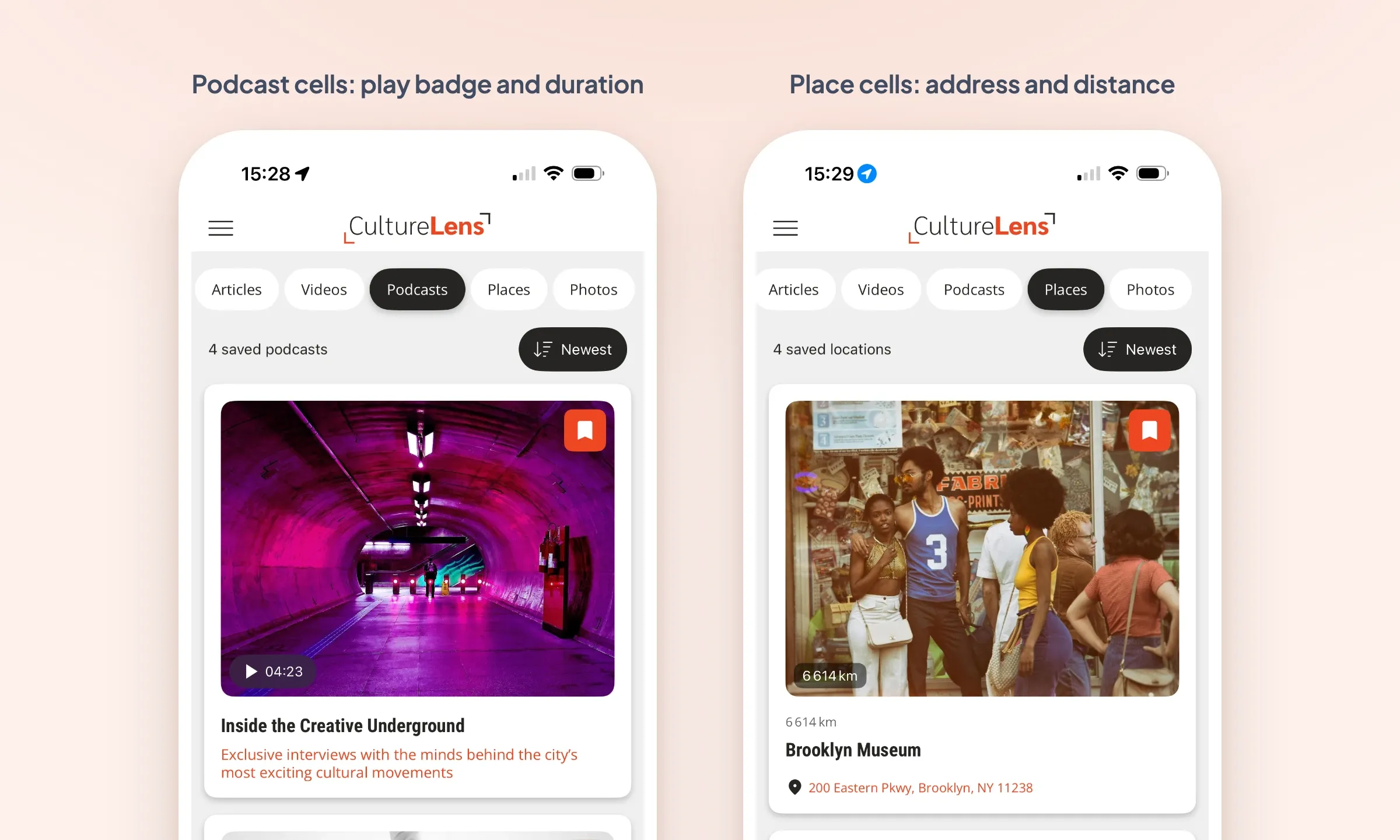
A video, a podcast and an event do not offer the same cues. The cells in the list now adapt to the type of content they display.
A video shows its duration and its play icon. A sound or a podcast displays its player and its duration, right in the list. An event carries its address and its date. A place shows its address and how far away it is. Only the title and the favorite icon stay the same for all of them.
The benefit is very concrete: you recognize a piece of content without opening it, and you start an episode without leaving your favorites.
Seeing your places and events on a map
On the Places and Events tabs, an extra action switches the list over to a map. Favorites are then displayed as they would be in a regular Map section, with the whole screen given over to the map. The same button brings the list back.
For a user who has set aside fifteen addresses while planning a weekend, that is the difference between a list of names and a geographic view of what they have lined up.
Removing a favorite is always reversible
The favorite icon stays visible on every cell: one tap is enough to remove an item from the list, without going through its detail page.
The removal comes with an animation that follows the structure of the list: a slide to the left on Enriched and Condensed, a fade on Visual Card. A toast then appears at the bottom of the screen with an undo action.
This is the safety net that was missing. A favorite deleted by mistake comes back immediately, with no need to track down the original content in the app. When several removals follow one another, the toast tracks the most recent one.
Downloaded podcasts stand out at a glance
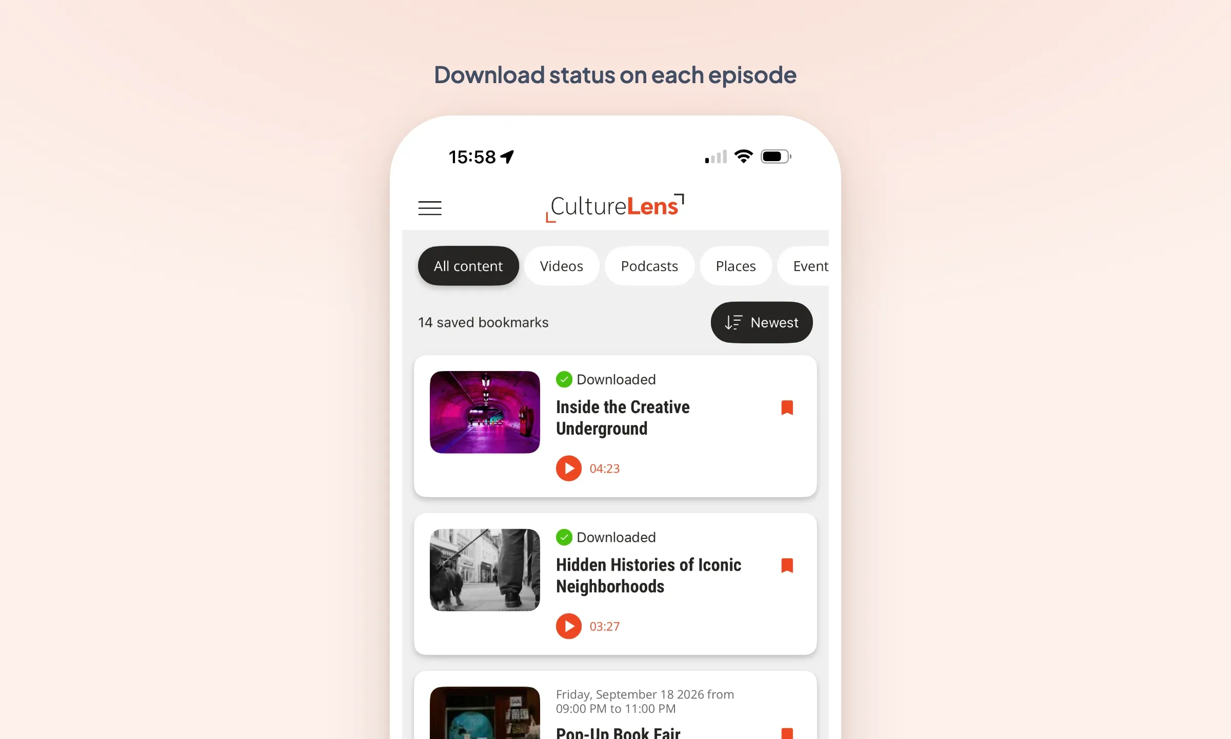
For sounds and podcasts, an indicator shows the download status of each episode: downloaded, or downloading. It updates in real time, and the player becomes active as soon as the file is available.
Before heading down into the subway or boarding a plane, the user sees at a glance what they will be able to listen to offline. They no longer have to open every episode to check.
An empty list that offers something
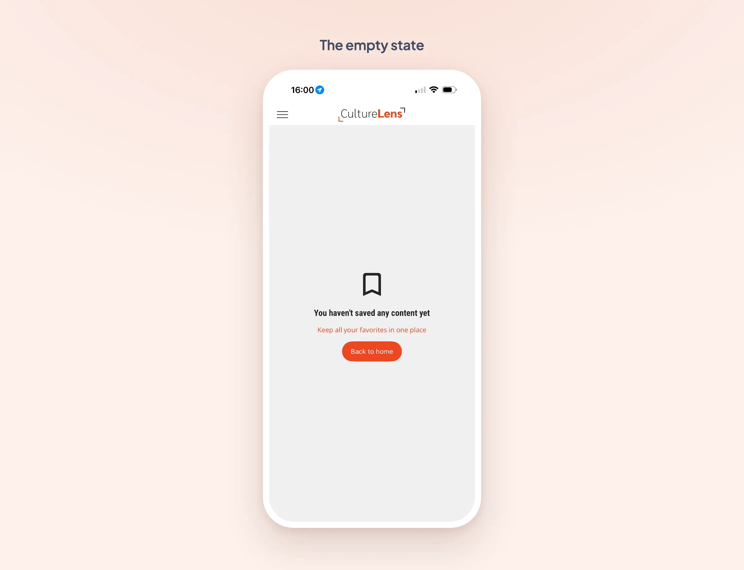
The first visit to the favorites is necessarily a visit to an empty list. That screen is now real content: an icon, a title, a description and an action button, all customizable.
You decide what that screen says and where the button leads. By default, it goes back to the app's home. It is up to you to point it at the section most likely to make someone save a first item.
Three densities to choose from
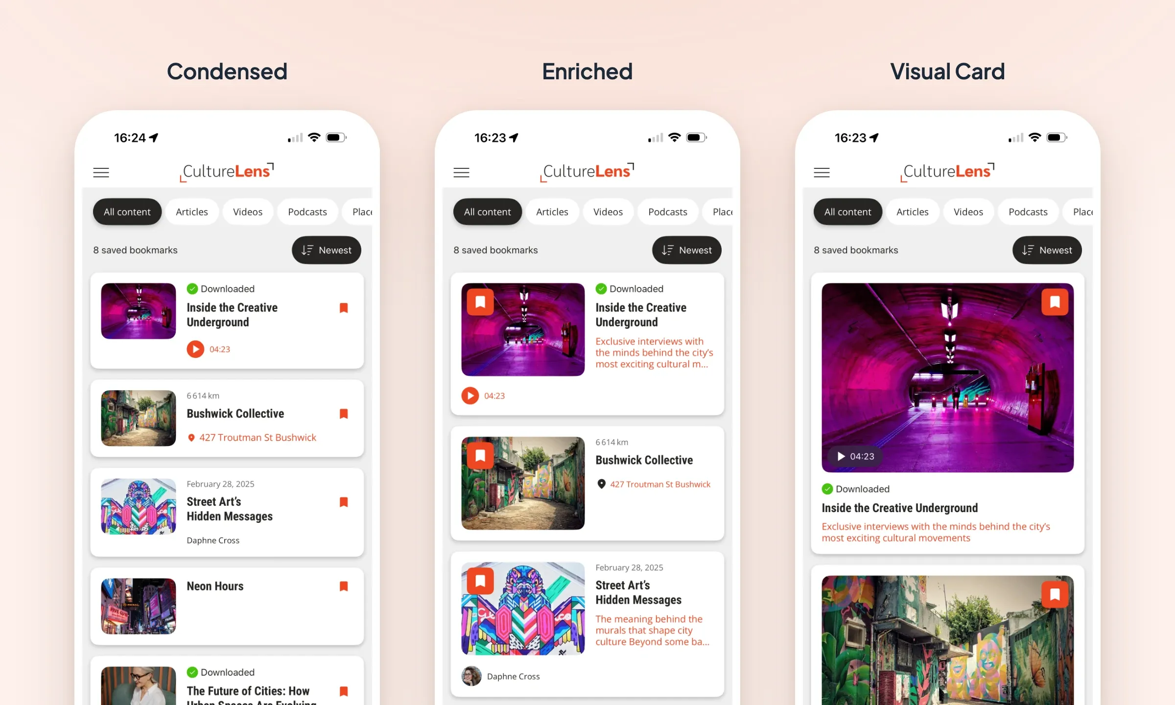
The section builds on the latest generation of list layouts: Enriched, Condensed and Visual Card. They all share the same filtering, sorting and action logic, and differ in their density and their composition.
Condensed for a dense list where a lot of content is found quickly, Enriched to give each item room to breathe, Visual Card for a read driven by the image. Your favorites line up with the rest of your app instead of remaining a list apart.
What is left for you to do
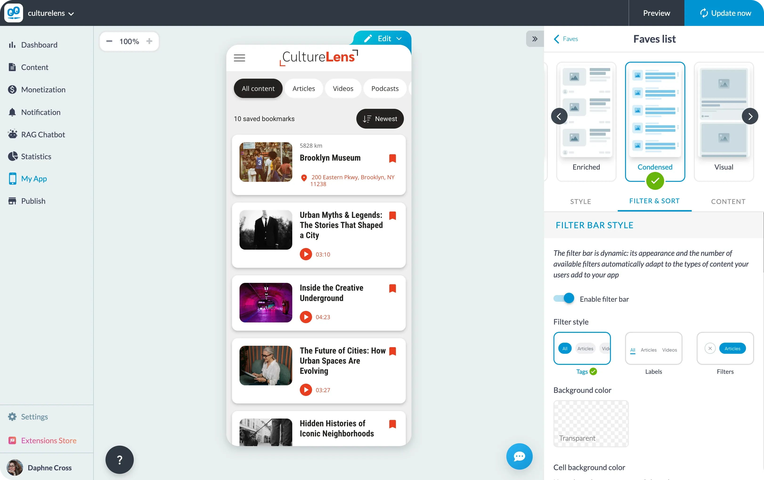
The Favorites section is available on iOS, Android and PWA. The settings, from the layout to the empty screen by way of the filter bar, the item counter and the default sort, are all found in the design of your favorites section, the one whose type is Bookmark, whatever name you have given it in your app.
One detail that matters: as with any new feature, your users will only see it after a new generation of your app.


