 eCommerce
 Memberships
 RAG Chatbot
 Online Courses
 Bookings
 Travel guide
 Events
 Content Creators
 Pickup & Delivery
 Newspaper
 Radio
Radio Schools
 Faith
Faith Organizations
 Restaurant
 Grocery
 Custom apps
 Employee Communication
 NO CODE APP BUILDER
 TECHNOLOGY
 WHY GOODBARBER?
 Design
 PRODUCT RESOURCES
 TOPICS
 MOBILE APPS RESELLERS
 DISCOVER
How to Design an App Yourself: 6 Decisions, Not 40 Screens
Written by Lesia PIETRI on
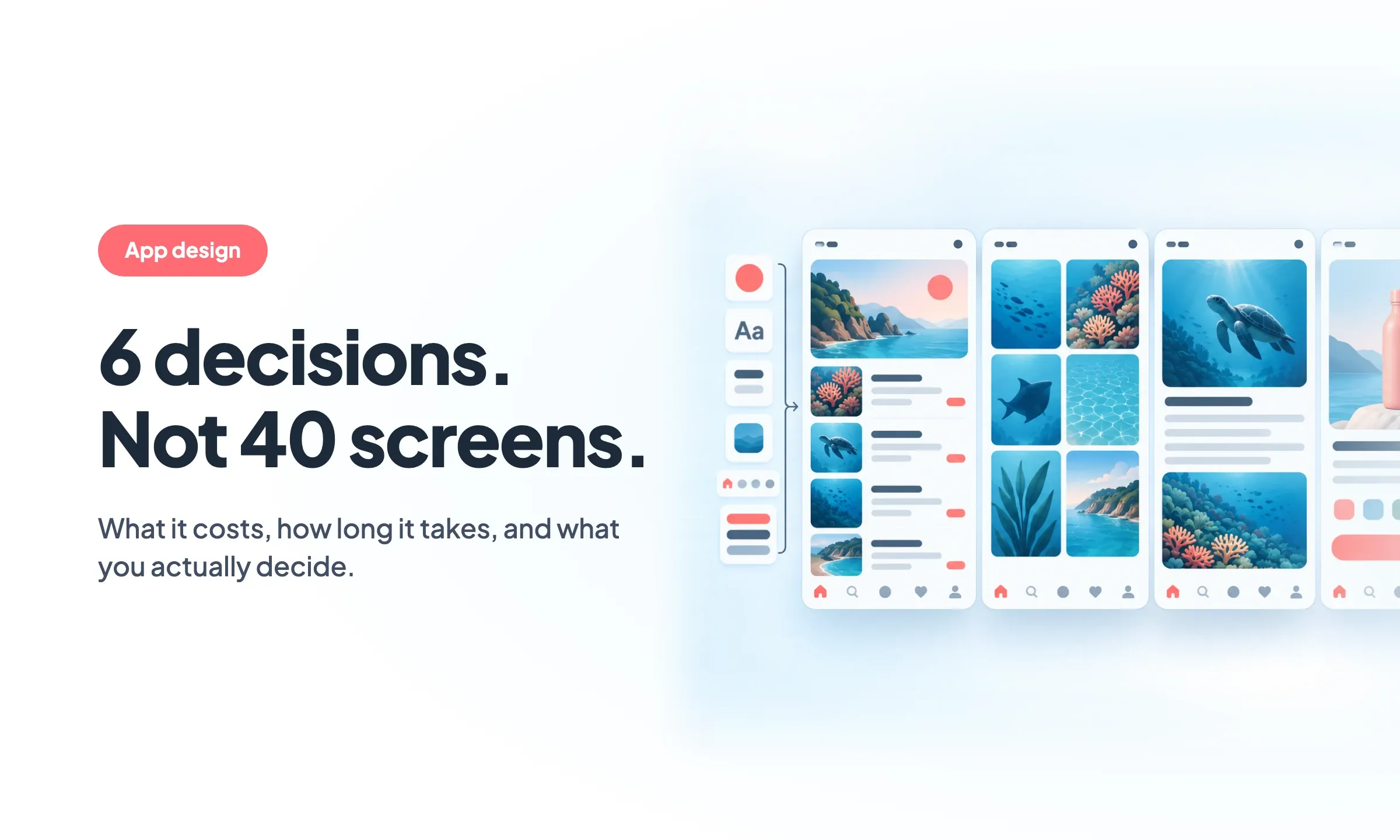
You have an app project and you are not a designer. The real questions are whether you can do the design yourself, what it costs to pay someone else, and how long it takes. Here are the numbers, and the six decisions that actually shape what an app looks like.
Most advice about designing an app assumes you are already a designer. Research your users, map the flows, sketch wireframes, move to high fidelity, hand off to engineering. That is a real process and it is the right one for a design team.
It is not an answer for someone who has an app project, a budget, and no design background.
The question underneath is simpler. Can you design your own app, or do you need to pay someone? Both answers are defensible. What follows is what each one costs, and what the design work actually consists of once you remove the parts a system can handle for you.
Can you design your own app?
For a content or a commerce app, yes.
News apps, community apps, media and podcast apps, course apps, local business apps, stores. These are built from pieces everyone recognizes: lists, article pages, product pages, a cart, a profile, a search. The design problem is well understood, and it has been solved thousands of times.
For a game, no. For a marketplace like Airbnb or Booking, no. Those apps hold their value in custom business logic rather than in their screens, and they need an engineer and a designer working together on something that does not exist yet. If that is your project, hire the team. This article will not help you.
The reason the first list is now within reach is not that design got easier. It is that the design decisions got factored out. The industry calls the result a design system: a set of foundations, components and rules that produce consistent screens without anyone redrawing them each time. Apple has one. Google has one. So does every serious product team.
The interesting part is what happens when the design system sits inside the tool that builds the app, rather than in a file your designer hands over.
What app design costs, and how long it takes
This is the question nobody answers with a number, so here are three sets of figures from studios that publish their pricing.
| What you are buying | Typical range |
|---|---|
| Freelance designer, straightforward mobile app | $5,000 to $15,000 |
| Agency, straightforward mobile app | $15,000 to $40,000 |
| MVP of 10 to 20 screens | $6,000 to $25,000 |
| Agency, complex mobile app | $40,000 to $80,000 |
| Per screen | $150 to $500 |
| Hourly, freelance | $50 to $150 |
| Hourly, agency | $150 to $250 |
Timelines land in the same place across sources: four to eight weeks for a focused MVP, six to twelve weeks for something larger. That is the design phase alone, before a line of the app is built.
Read those numbers with one caveat. They are published by design studios, which sell design. That makes them the primary source on their own rates and an optimistic source on how much design your project needs.
The figure that tells you the most is the per-screen one. It reveals the cost model: every screen is drawn, so every screen is billed. An app with twenty screens costs roughly twenty times one screen, and the number grows every time you add a section.
That is the model worth avoiding. Not by drawing worse screens, but by not drawing most of them.
On GoodBarber there is no design line, because there are no screens to bill. The design system is part of the subscription: Content Apps start at €30 a month billed yearly, and the plans that publish native iOS and Android apps start at €55. Hosting, updates and the three app engines are included in the same price.
The six decisions that are actually yours
Here is what is left of the design work once the system takes its share. Six decisions. You can make all of them in an afternoon, and you can change any of them later without redoing the app.
1. What goes in the app
Your sections, and their order. A content decision before it is a design one, and the one that most determines whether the app feels right. Five sections that each earn their place beat fifteen that do not.
Start from what people will open the app to do. Everything else is secondary navigation.
2. How people move through it
A tab bar at the bottom, a side menu, or a mix. This is the single most visible decision on a mobile app, and the one users feel before they notice anything else.
The rule of thumb: a tab bar for three to five destinations people switch between constantly, a menu for everything that gets visited occasionally.
3. What a list looks like
This is the decision that does the most work, and the one people underestimate.
Most of a content app is lists. Article lists, product grids, episode lists, event lists. Choose how a list is presented and you have chosen what most of your app looks like: image on the left or full width, one column or two, title above or below, how much text shows before it cuts.
GoodBarber ships more than 100 pre-built layouts, and you pick one per section. A magazine grid for your features, a compact list for news, a large-image carousel for your homepage. Same content, three different apps depending on what you pick.
4. Color
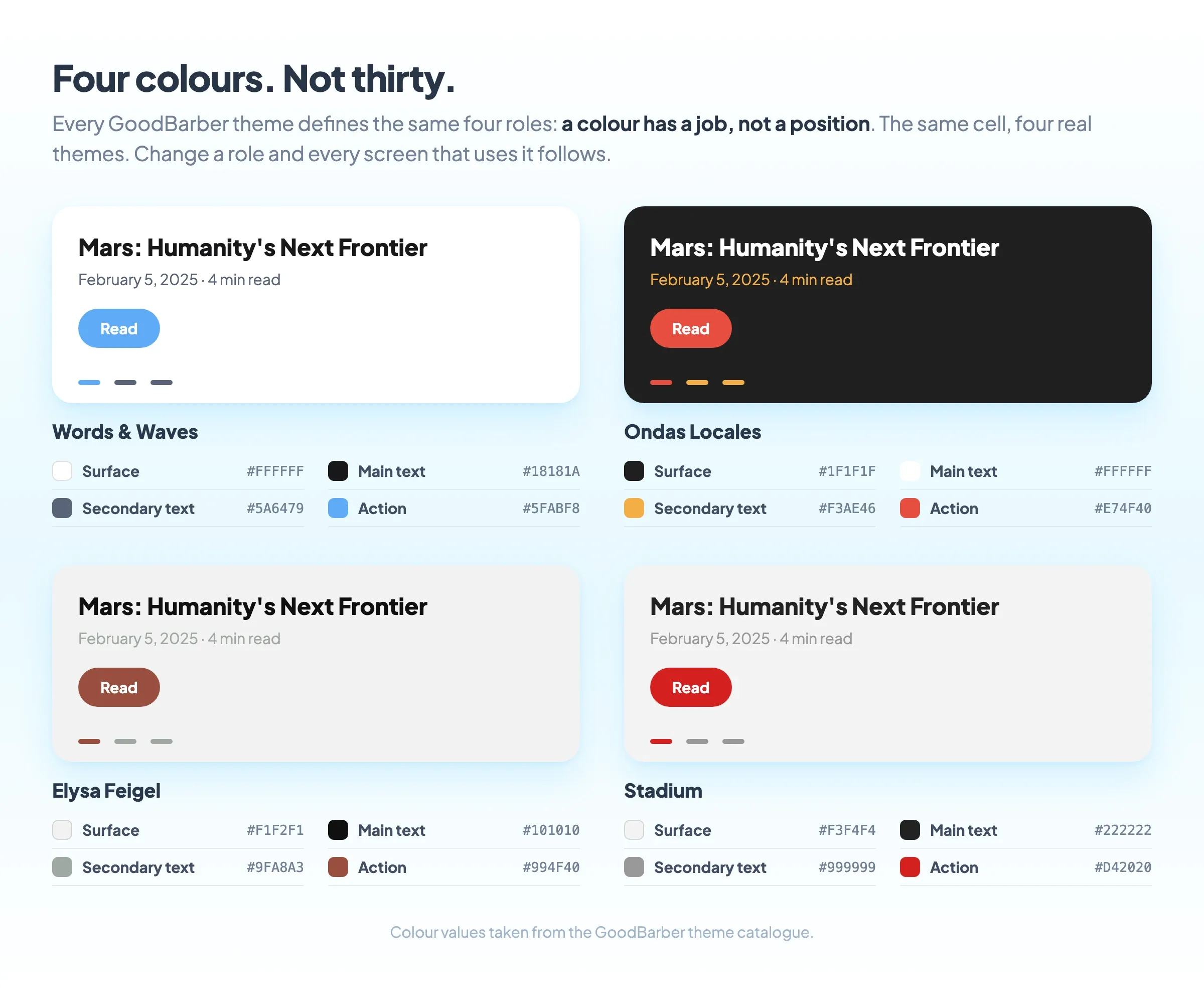
You choose four colors, not thirty.
A GoodBarber theme defines four semantic color roles, applied consistently everywhere. Semantic means each color has a job rather than a position: one is the color of your actions, another the color of your surfaces. Change the role and every screen that uses it follows.
If picking four colors that work together is exactly the part you were dreading, Genius Palette is an in-house AI trained specifically on readable app color. And if you know exactly what you want, you can override any color individually, down to item-by-item mapping.
5. Type
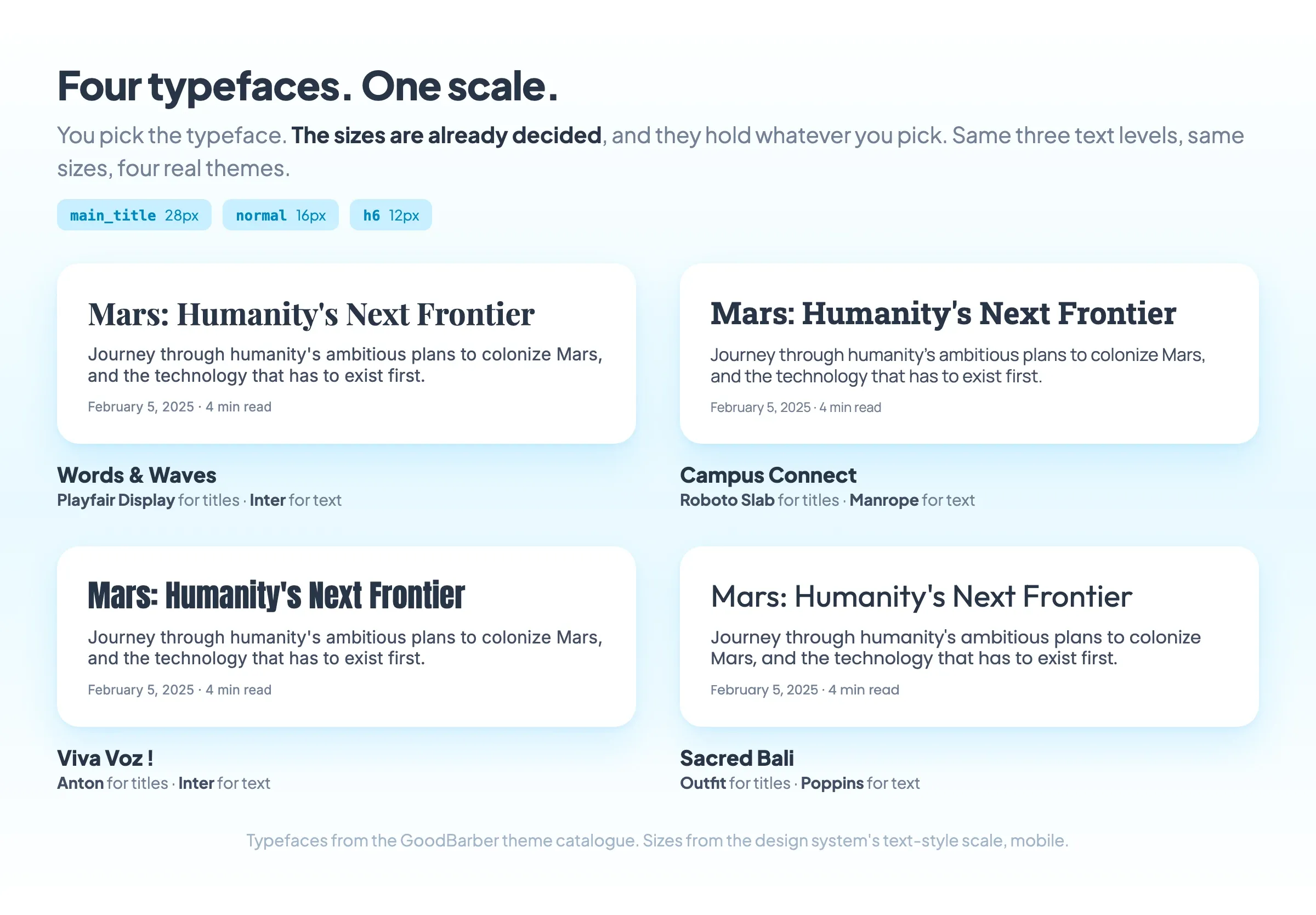
One typeface, or two if you want headlines to contrast with body text.
You are not choosing sizes. GoodBarber's typography is a system of 18 semantic levels, from display headings down to badges, each calibrated per device for phone, tablet and desktop, with a 1.2 line height. You pick the typeface. The scale is already built.
6. Your icon and your splash screen
The two images no system can decide for you, because they carry your identity rather than your interface.
The icon is the hardest thing in this list, and the one worth spending real time or real money on. It has to work at 60 pixels, next to Instagram, on someone's home screen. Simple shape, few colors, no text, recognizable at a glance.
What you do not have to decide
Everything below is handled by the system, on every screen, without a setting to learn.
Spacing. A gutter system scales by device from a base value: 16px on mobile, 20px on tablet and desktop, with half and double tiers and vertical steps. One configuration produces correct spacing on every form factor.
Typographic hierarchy. The 18 levels keep their relationships to each other whatever typeface you pick.
Readability. Palettes are built with contrast in mind, and every control keeps a comfortable tap area even when the element looks small.
Shapes, shadows, borders and states. Defined once as atoms and reused everywhere, so a button behaves like a button across the whole app.
Consistency between screens. This is the one that separates an app that looks designed from one that looks assembled, and it is also the one a human designer has to maintain by hand. Here it holds by construction.
Android, iPhone and the web
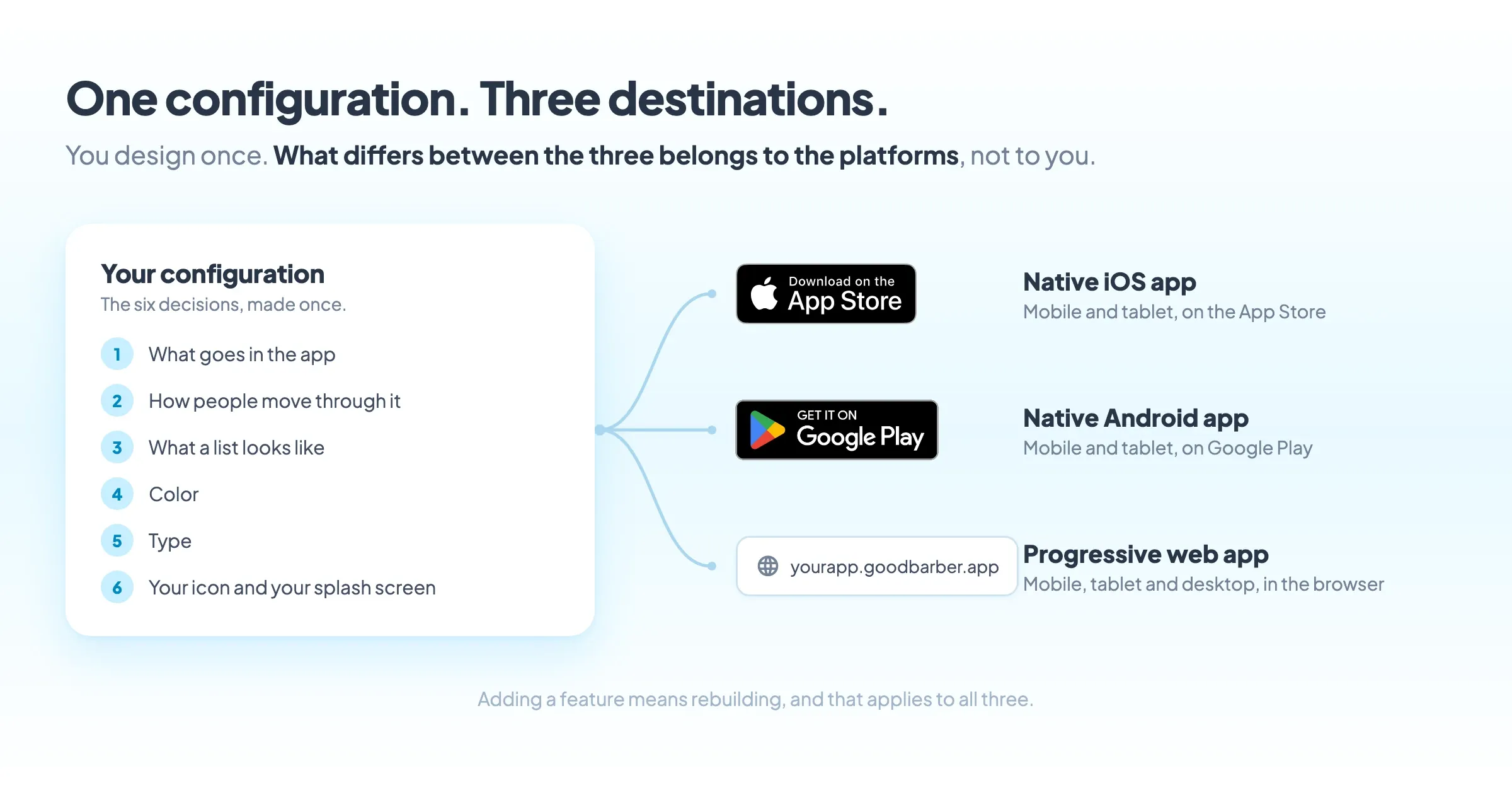
You design once. One configuration produces three outputs: a native iOS app, a native Android app, and a progressive web app.
What differs between them belongs to the platforms rather than to you. Both stores have their own conventions, and the system respects them. You do not maintain three designs, and you do not choose between an app that looks right on iPhone and one that looks right on Android.
One thing to plan for: adding a feature or changing your design means rebuilding, and that applies to all three outputs, the web app included. It is one action, but it is not instant.
What about Figma?
Figma is where the design industry works, and it is genuinely excellent at what it does. If you hire a designer, Figma is almost certainly what they will use, and what they will hand you at the end.
The distinction worth understanding before you spend weeks in it: Figma produces a design file, not an app. A beautiful, precise, fully specified design file. Someone then has to build it, and that is where the second budget appears, usually larger than the first.
Figma is the right tool when your app needs screens that do not exist yet, and when you have the engineering to build what you draw. For an app made of lists, articles, products and a cart, drawing those screens from scratch is work you are paying for twice: once to design, once to implement.
If you already have a Figma file from a designer, that is not wasted. Your colors, your typeface and your layout preferences are exactly the six decisions above, already made.
Where to start
Open a section, pick a layout, change the four colors and look at your own content in it. Fifteen minutes tells you more about designing your app than a week of reading about design.
Designing the app is one half of the question. If you are still weighing the other half, how the app gets built and published, that has its own guide: how to make an app.
You can start a free 30-day trial without a card and without committing to anything, and if you want to see how deep the system goes before you touch it, the whole design system is public: foundations, atoms, components and the principles behind them, at goodbarber.com/uxdesign.
Design cost figures compiled September 2026 from published rate guides by Parallel, Orbix Studio and DesignMonks.