 eCommerce
 Memberships
 RAG Chatbot
 Online Courses
 Bookings
 Travel guide
 Events
 Content Creators
 Pickup & Delivery
 Newspaper
 Radio
Radio Schools
 Faith
Faith Organizations
 Restaurant
 Grocery
 Custom apps
 Employee Communication
 NO CODE APP BUILDER
 TECHNOLOGY
 WHY GOODBARBER?
 Design
 PRODUCT RESOURCES
 TOPICS
 MOBILE APPS RESELLERS
 DISCOVER
TabBar: here comes a new generation
Written by Lesia PIETRI on
With the new TabBar, we're enriching the navigation of your apps with 3 new layouts, more customization options, selection animations, and a multi-device approach designed for every screen.
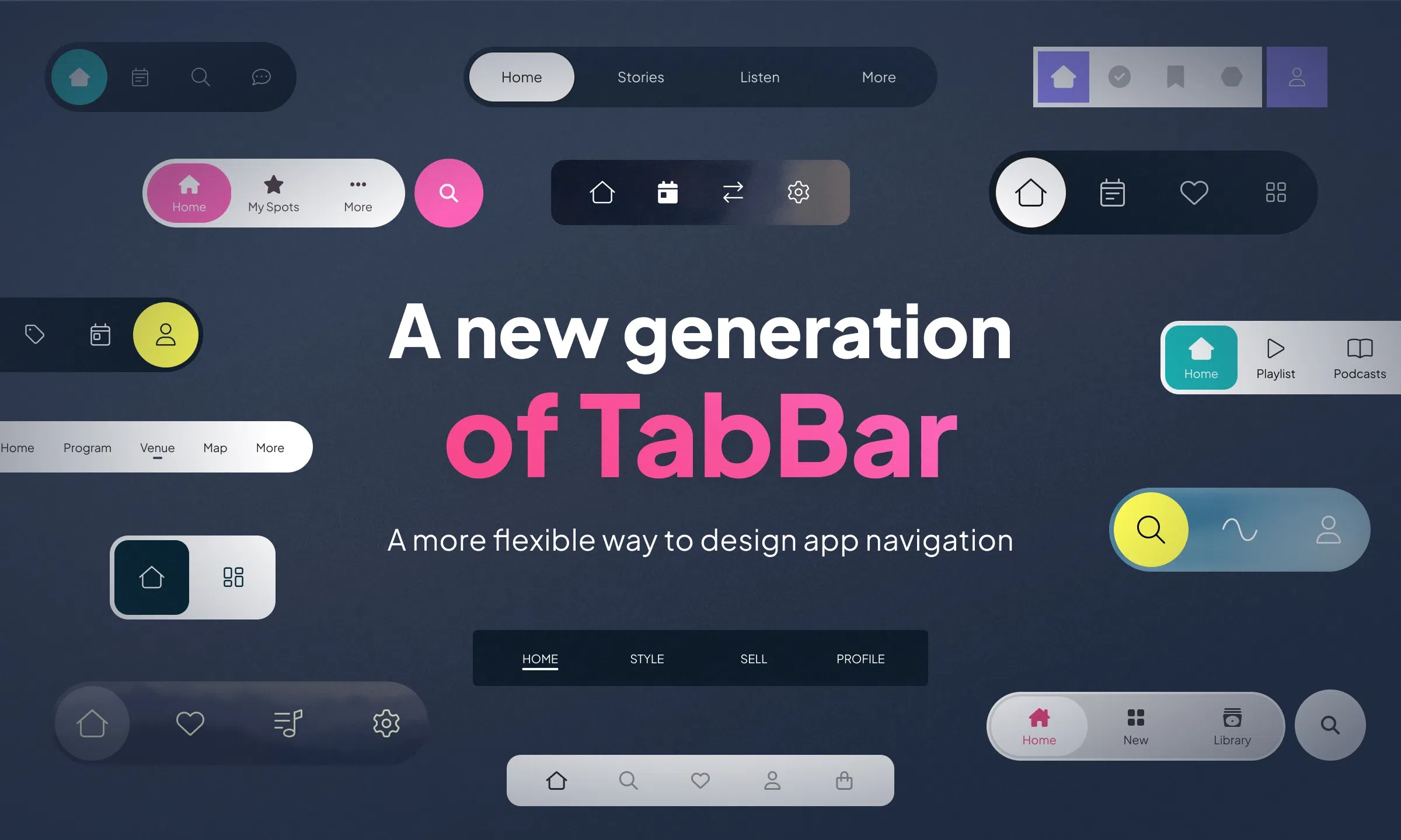
In a mobile app, navigation isn't just about moving from one section to another. It structures the experience, creates strong visual landmarks, and directly shapes how the product is perceived. With the new TabBar component, we're opening a new chapter in navigation design, with more design freedom, more flexibility in customization, and more refined adaptation to each device.
Three new layouts to set the tone
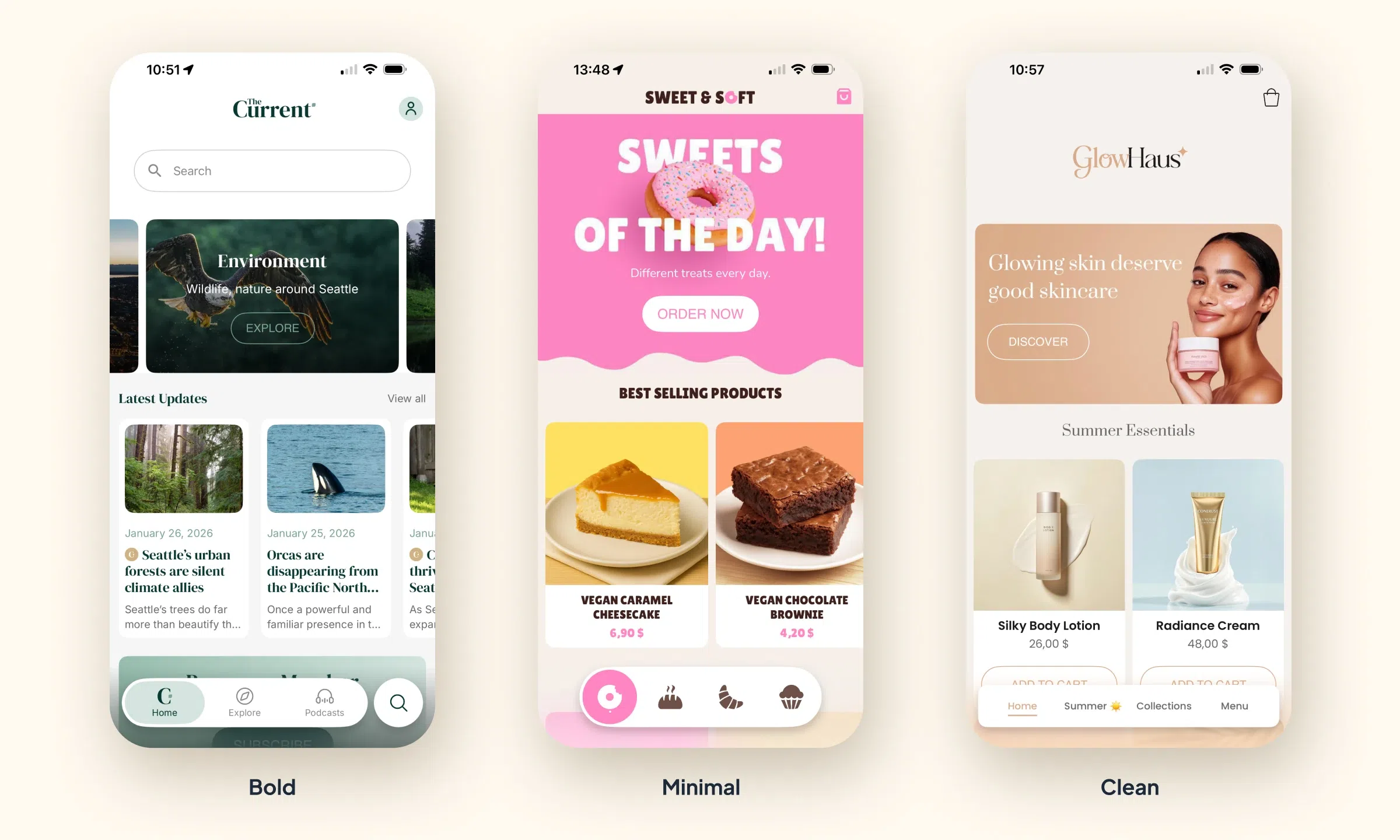
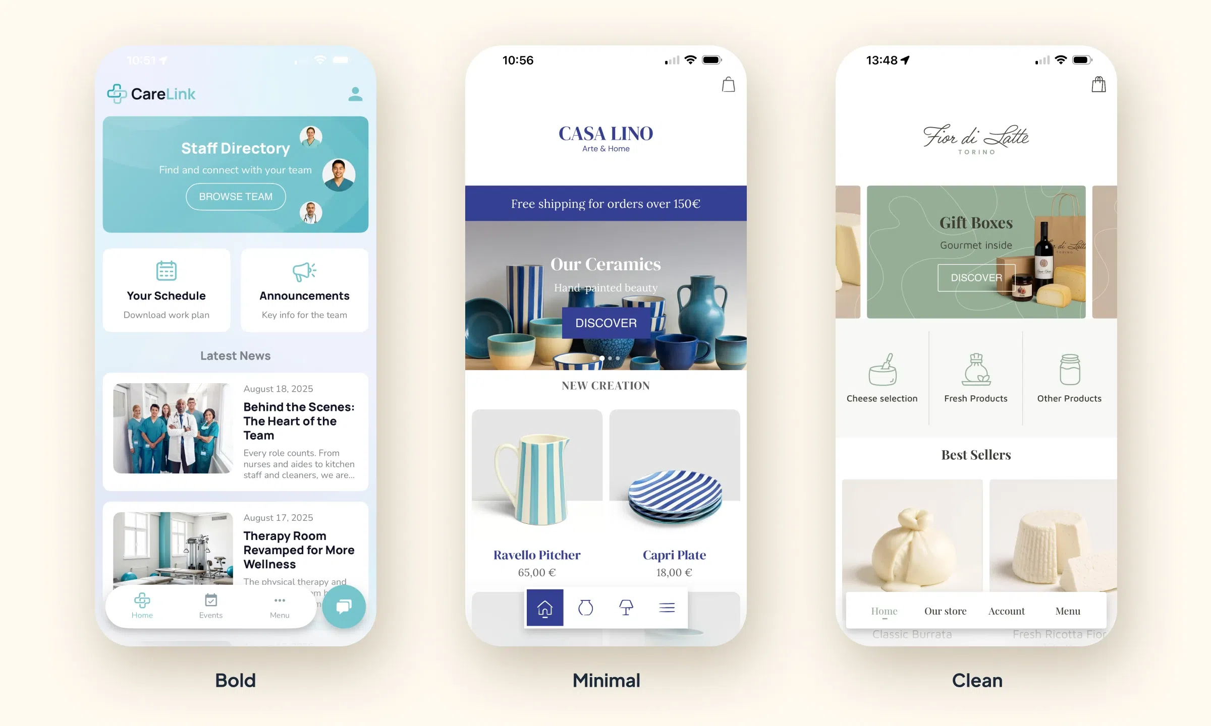
This new generation of TabBar comes with three layouts available at launch: Bold TabBar, Minimal TabBar, and Clean TabBar.
- Bold TabBar gives navigation more presence, with a strong, assertive visual structure.
- Minimal TabBar offers a more modern and more compact approach.
- Clean TabBar strikes an elegant balance, with a refined, versatile look that fits a wide range of visual universes.
With these three directions, the navigation bar becomes a real style lever. It can align more precisely with an app's identity — whether it's an editorial project, a branded app, a service, a lifestyle universe, or an e-commerce application.
A richer TabBar to customize
The new component isn't just about new layouts. It's part of the ongoing evolution of the GoodBarber Design System and expands the possibilities for customizing navigation. Backgrounds, shapes, shadows, item structure, selected states, "More" menu, variations across devices: every dimension has been thought through to deliver more precision in the rendering, while keeping the app's visual consistency. This new TabBar fully embodies the ambition behind our Design System: more creative freedom, without ever compromising on execution quality.
The selection animations support this evolution by bringing more fluidity to interactions, better readability of state changes, and an even more polished interface feel.
On iOS and PWA, the new TabBar can also benefit from Material Blur effects, which add depth and an even more premium touch to the visual rendering.
Navigation designed for every screen
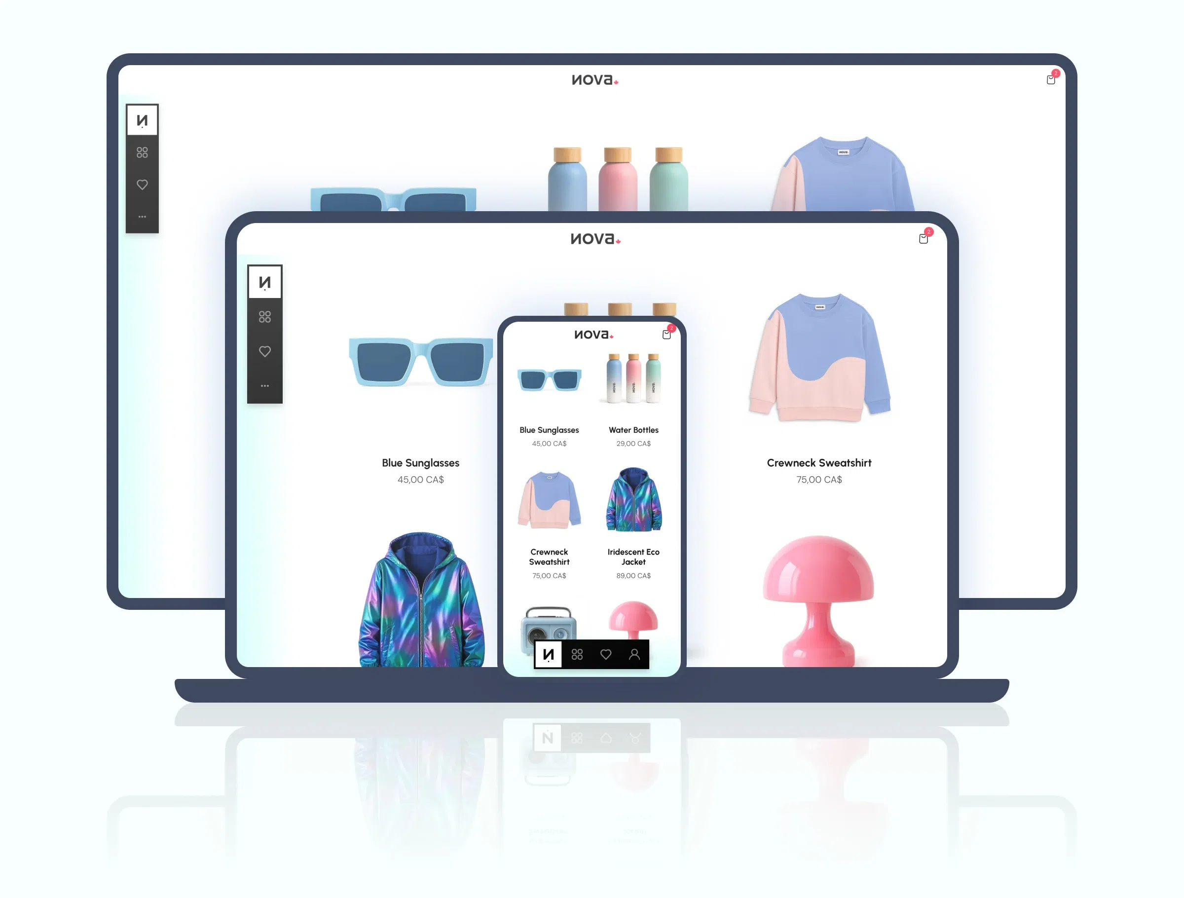
This evolution also reflects a more assertive multi-device approach. On mobile, the TabBar keeps its natural position at the bottom of the screen. On desktop, it becomes vertical to make better use of available space and align with the usage patterns of large-screen interfaces.
This choice extends GoodBarber's mobile-first logic while affirming real adaptation quality on desktop. It's not just about displaying the same navigation everywhere — it's about offering an experience consistent with each usage context.
A new step for app design on GoodBarber
With this new component, GoodBarber further expands the possibilities offered to anyone who wants to create a mobile app with premium design, without leaving the production simplicity that defines no-code.
More expressive, more customizable, more fluid, and better designed for every screen — this new TabBar adds a new dimension to navigation in GoodBarber apps. An evolution that reinforces both the perceived quality of interfaces and the creative freedom available to designers, brands, media, and every kind of app creator.