 eCommerce
 Memberships
 RAG Chatbot
 Online Courses
 Bookings
 Travel guide
 Events
 Content Creators
 Pickup & Delivery
 Newspaper
 Radio
Radio Schools
 Faith
Faith Organizations
 Restaurant
 Grocery
 Custom apps
 Employee Communication
 NO CODE APP BUILDER
 TECHNOLOGY
 WHY GOODBARBER?
 Design
 PRODUCT RESOURCES
 TOPICS
 MOBILE APPS RESELLERS
 DISCOVER
Item: the element that shapes every tab in your app
Written by Marie-Pierre Jeffard on
Every tab in your app's navigation relies on the same element: the Item, which can combine an icon, a label and an indicator. We designed it to shape our TabBars, today and tomorrow. It is now documented in the GoodBarber Design System.
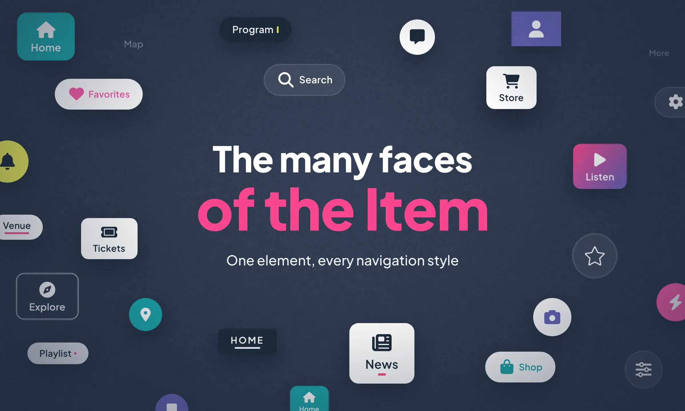
Your content is polished, your colors chosen. That leaves the navigation bar, which takes your users from one section to the next and weighs heavily on the impression your app makes. Each of its tabs is built on an element designed as a building block: the Item. In the new generation of TabBar, it is the Item that gives every navigation its character.
An icon, a label, an indicator
Within an Item, each element has its role. The icon represents the section, the label shows its name, and the indicator, which is optional, marks the active tab. Each one can be shown or hidden on its own, which gives three compositions: icon and label, icon only, label only.
That is what sets the Minimal TabBar, all icons, apart from the Clean TabBar, all text: the same element, composed differently.
17 properties for the TabBars of today and tomorrow
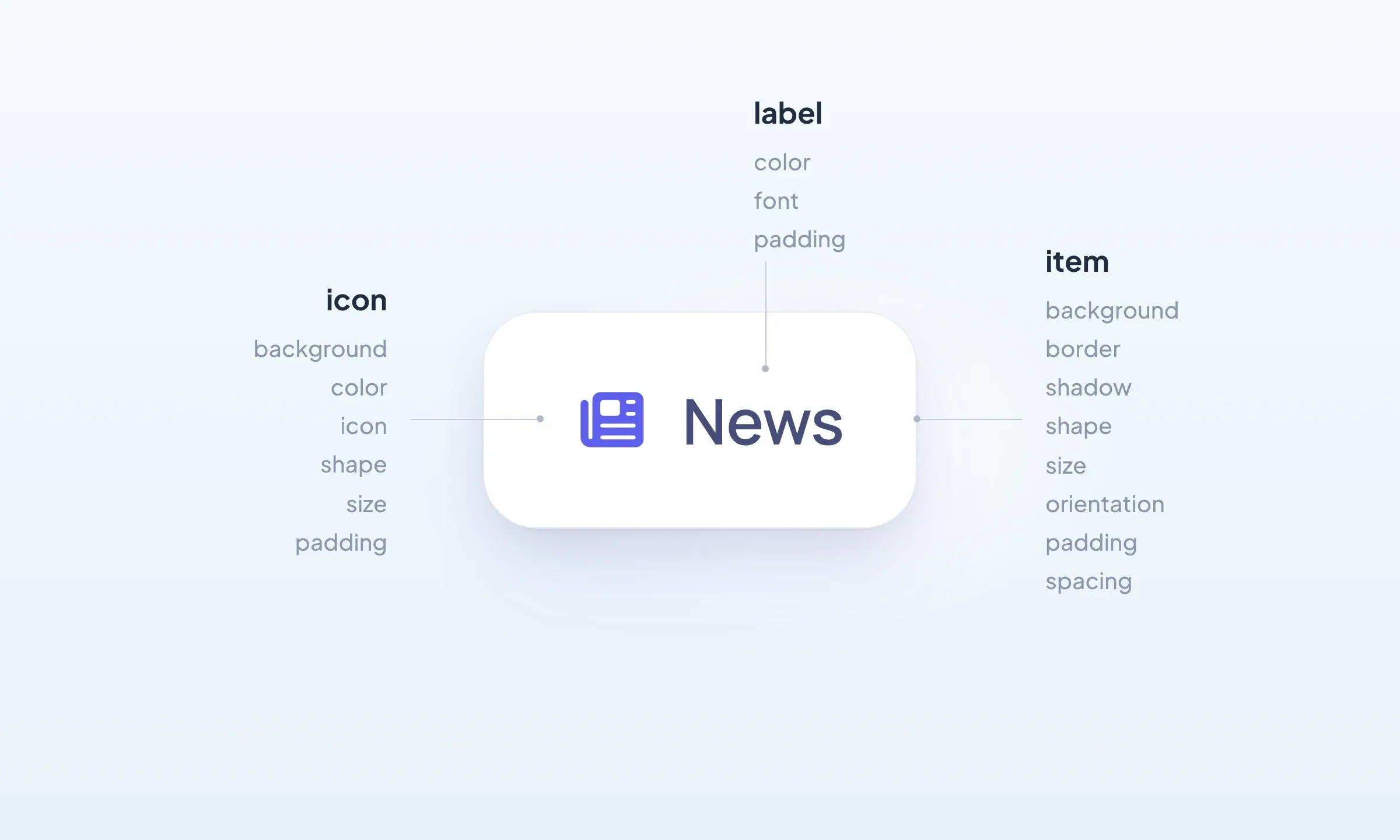
To design a TabBar, our designers have 17 properties at hand: 8 for the Item, 6 for its icon and 3 for its label. The Item's surface takes a solid color, a gradient or a blur effect, a border, a shadow, square or rounded corners. Its layout sets its size, its orientation, its inner padding, which defines the touch area, and the spacing that lets its elements breathe.
You don't need to adjust all of it. This range lets us compose complete TabBar layouts, in line with today's app design conventions: Bold, Minimal and Clean TabBar are the first three. As those conventions evolve, new layouts will grow out of the same element, without starting from scratch. So the TabBars we offer you always keep up with the times.
In your back office, you choose your TabBar, then match it to your brand: tab size, corner radius, colors, label font, the way the active tab stands out. Your own icons can even sit alongside the system ones.
Clear states, polished animations
An Item has two states: default and selected. To set the active tab apart, it has four means, alone or combined: color, background, border and indicator. The indicator only appears on the selected tab, in three shapes: a dot (Dot), a short dash (Tiny) or a line (Line).
Each shape has its own motion. The dot and the line shrink on the previous tab and grow on the new one, while the short dash slides from one to the other. When the selection relies on the background, as on the Bold TabBar, it is the colored background that moves. Short transitions that make every change easy to read, without overdoing it.
The same Item, from mobile to desktop
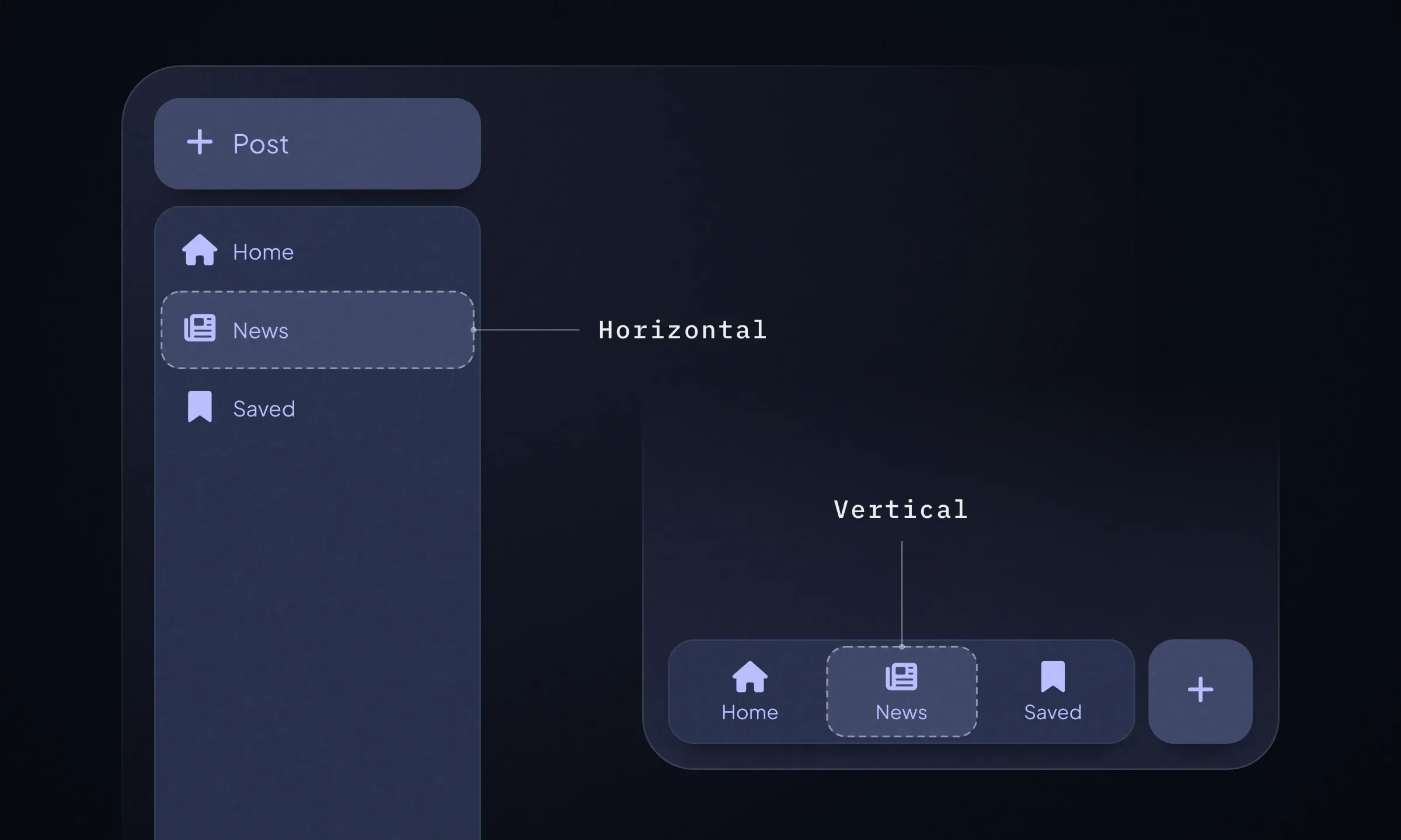
The Item adapts its orientation, inner padding and spacing to every screen: mobile, tablet and desktop. At the bottom of a phone, the icon sits above the label. On desktop, the TabBar becomes a sidebar, and the Item can switch to horizontal to fit in. You set up your navigation once: each screen gets the version that suits it.
The Item joins the Design System
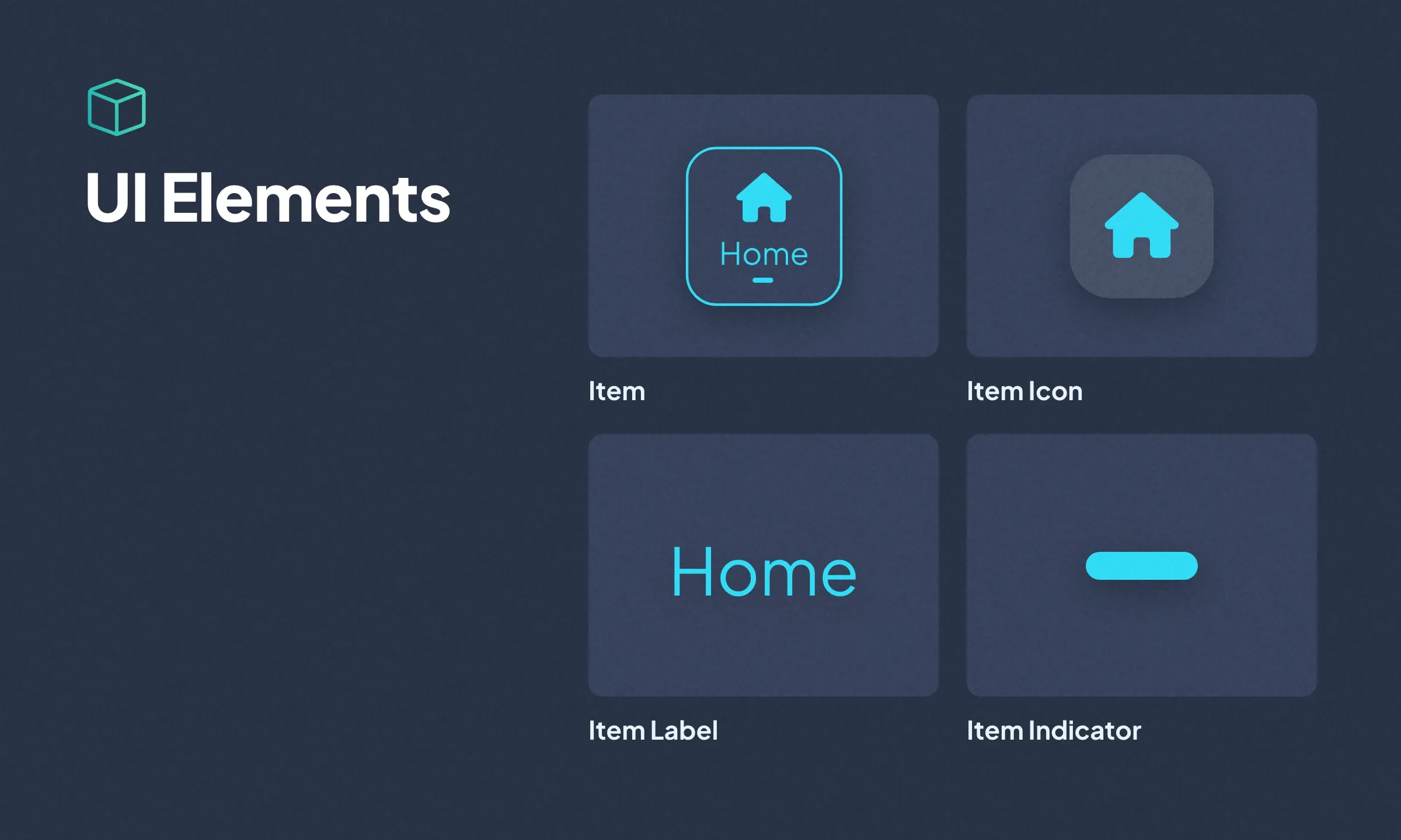
After the TabBar, the Item now has its own page in the GoodBarber Design System, and it comes with its family. With the Item Icon, the Item Label and the Item Indicator, it opens a new category: the UI Elements, the building blocks of our components, each dedicated to a single role.
To explore the Item in detail, head to its Design System page. And to see it in action, choose your TabBar in the Menu section of your back office.