 eCommerce
 Memberships
 Chatbot
 Online Courses
 Bookings
 Travel guide
 Events
 Content Creators
 Pickup & Delivery
 Newspaper
 Radio
Radio Schools
 Faith
Faith Organizations
 Restaurant
 Grocery
 Custom apps
 Employee Communication

 NO CODE APP BUILDER
 TECHNOLOGY
 WHY GOODBARBER?
 Design
 PRODUCT RESOURCES
 TOPICS
 MOBILE APPS RESELLERS
 DISCOVER
How do I set borders in my app?
In a GoodBarber app, a border is waiting on the cells, the fields, the buttons and many other elements. Give it a color, and it appears. You can also set its thickness, from a discreet rule to a bold frame, and keep a single side under the title of a widget.

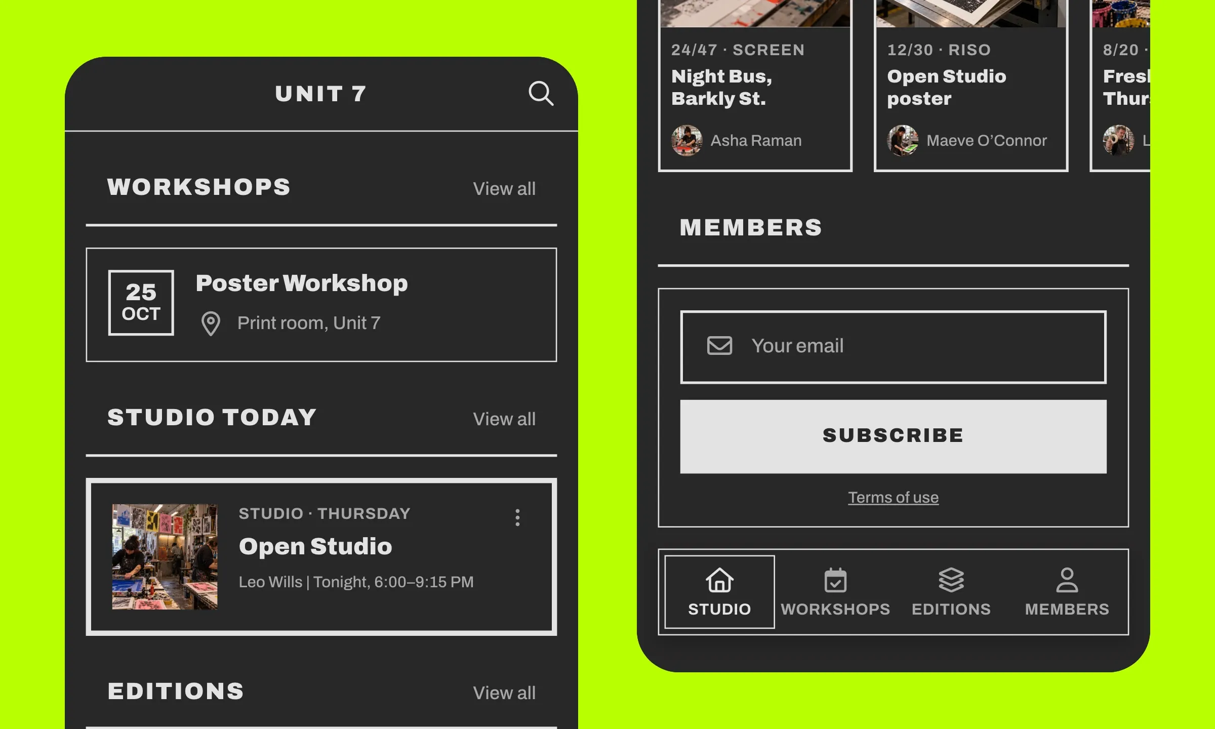
Here is how the border works in a GoodBarber app, where it lives and how to set its color and its thickness, down to the rule under a title.
What makes a border, in three settings
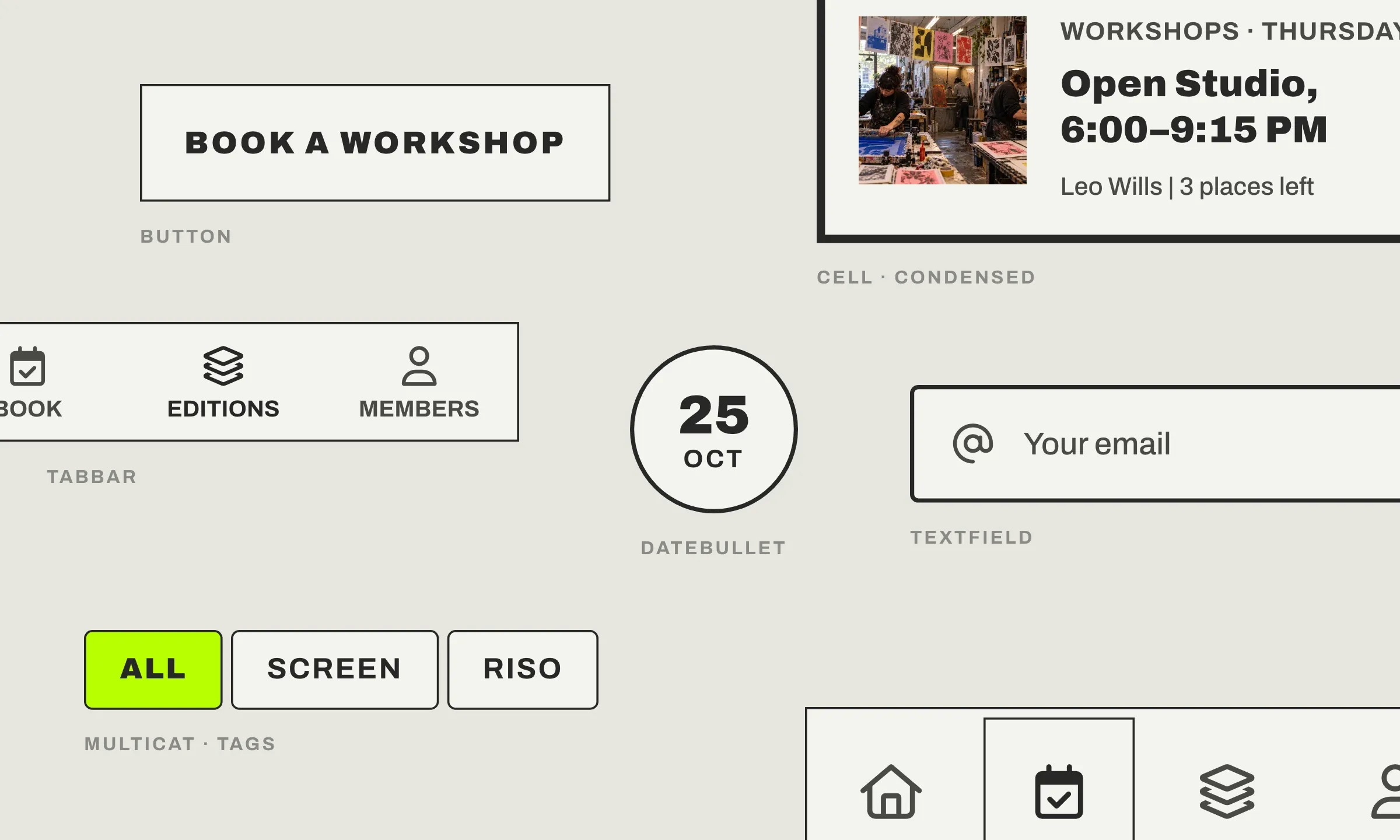
A border is a stroke that follows the edge of an element. It marks where the element starts and where it ends, and it reveals its shape, square or rounded corners. A cell, a field, a button, a date bullet, a category tab, the tab bar all carry one. Three settings describe it:
- The color, transparent by default on a cell or a widget, to pick from your palette or elsewhere.
- The thickness, a whole number, in pixels. It is 1 by default.
- The sides, on the header of a widget: top, right, bottom and left, each one on or off. All four on, they frame the title. The bottom one alone underlines it.

That is all, and that is what makes the border so simple to set. In the GoodBarber Design System, it is the Border atom, with its color and size keys, and, for a header, one key per side.
The border is already on your cells, your fields and your buttons
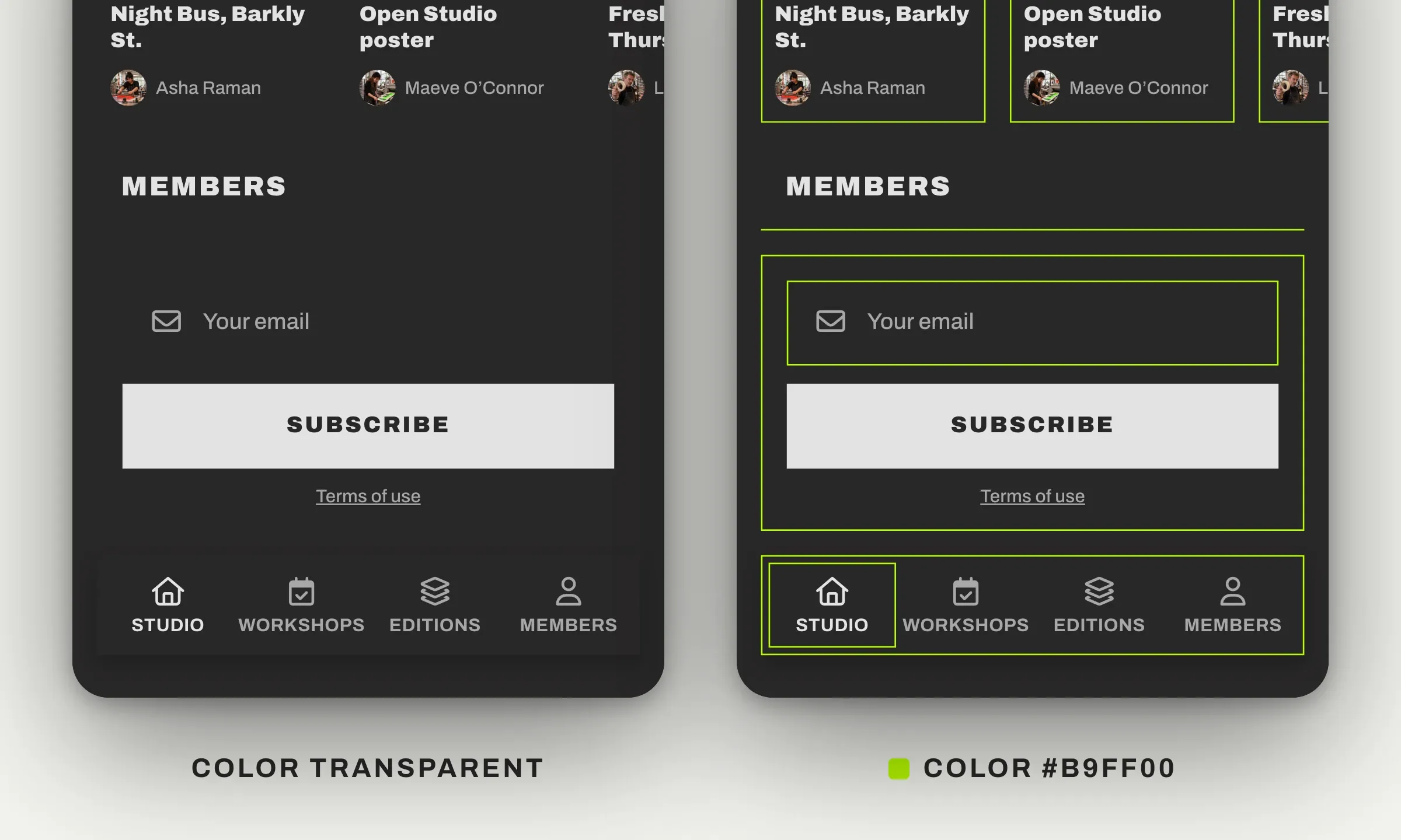
In a GoodBarber app, you do not add a border, you reveal it. The cells, the Home widgets and their headers carry one, at 1 px, transparent. Give it a color and it appears. The fields and the buttons have one too, and theirs already shows, light gray on a field, in the text color on an outline button. That is our “Design by system” principle, each element is built with its border, ready to serve.
On a Home widget, the color is chosen in the design panel, by the path My App › Structure › Home › your widget › Edit. You will find three colors there, “Borders” for the header, and two fields both named “Border color”, one for the frame of the whole widget, one for each cell. The thickness is set in the JSON, we are getting there.
For the fields, one setting is enough for the whole app. It lives in App style, with the { EDITION } button we talk about below, under designComponents, textField, then border.
In a list, border or separator, never both
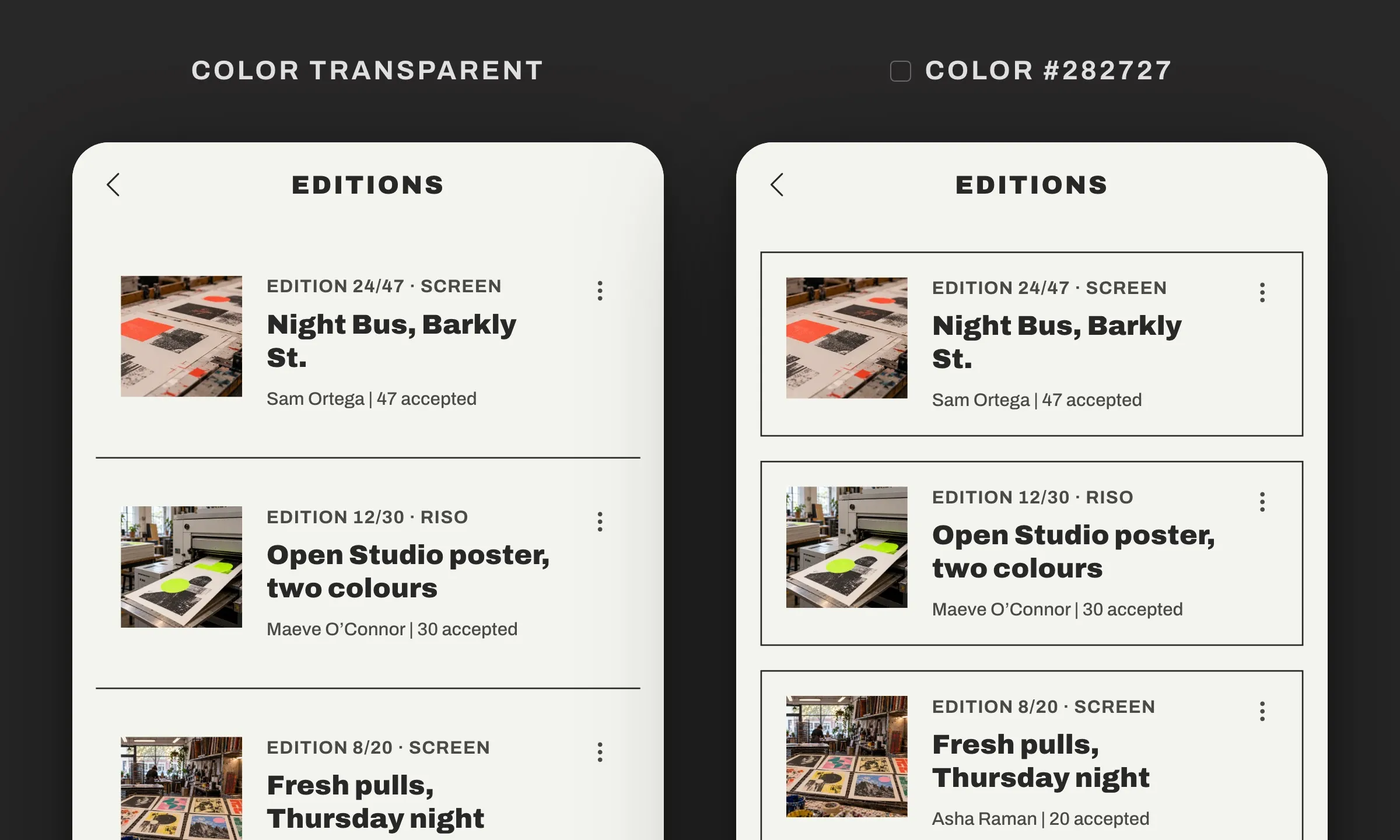
A list has one more rule. When its cells have neither a background nor a border, they follow each other right on the page and a thin rule separates them, the separator, in the “List separator” color of your Colors. Give the cells a color, on their background or on their border, and the list changes mode. The separator disappears by itself. Each cell detaches from its neighbors and its corners appear, according to your shape setting. Nothing to turn off, nothing to align.
So, in a GoodBarber app, a list never stacks two strokes, the rule between the rows or the stroke around each cell, and the system makes the choice. That is our “No design burden” principle, so that design is never a burden.
Set your border in GoodBarber
To set the border yourself, the Advanced edition extension opens the JSON, the complete list of settings, the same one as for the shadow. There you set the thickness of any border, the sides of a widget header, and its color where the panel does not offer it, such as the list of a section, with the same keys for a cell, a header or a widget.
Free, the extension installs from the “Extensions Store” menu, on the “Advanced edition” page. Your design screens then gain the { EDITION } button, top right.
- Open the JSON. In the design panel of your section (My App › Structure › your section › Edit the design) or of your widget, click { EDITION }. Unfold list, cell, then border for the list of a section, cell then border for the cells of a widget, or header then border for its header. The keys are sorted alphabetically.
- Choose the color. Click the value of color and type its hex code (#282727 here). Already chosen in the panel of your widget? Move on to the next step.
- Set the thickness. Click the value of size, type a whole number (2 here), then save. The border appears. A list in separator mode switches to cell mode as soon as its border has a color.
- Underline a widget title. In the JSON of your widget, unfold header, then border. Under border, click “+ Add”, type top in the newKey field, leave “Value” selected, enter 0 (0 turns the side off), then “Add”. Do the same for left and right, and save. Only the bottom side keeps its stroke, under the title.
Two things to keep in mind. The thickness stays a whole number, 2.7 becomes 2. And the border is drawn inside the cell. At 4 px, it takes 4 px off the content space on each side. Check your fullest cells in the preview.
Before, after: the thickness of the borders creates the hierarchy
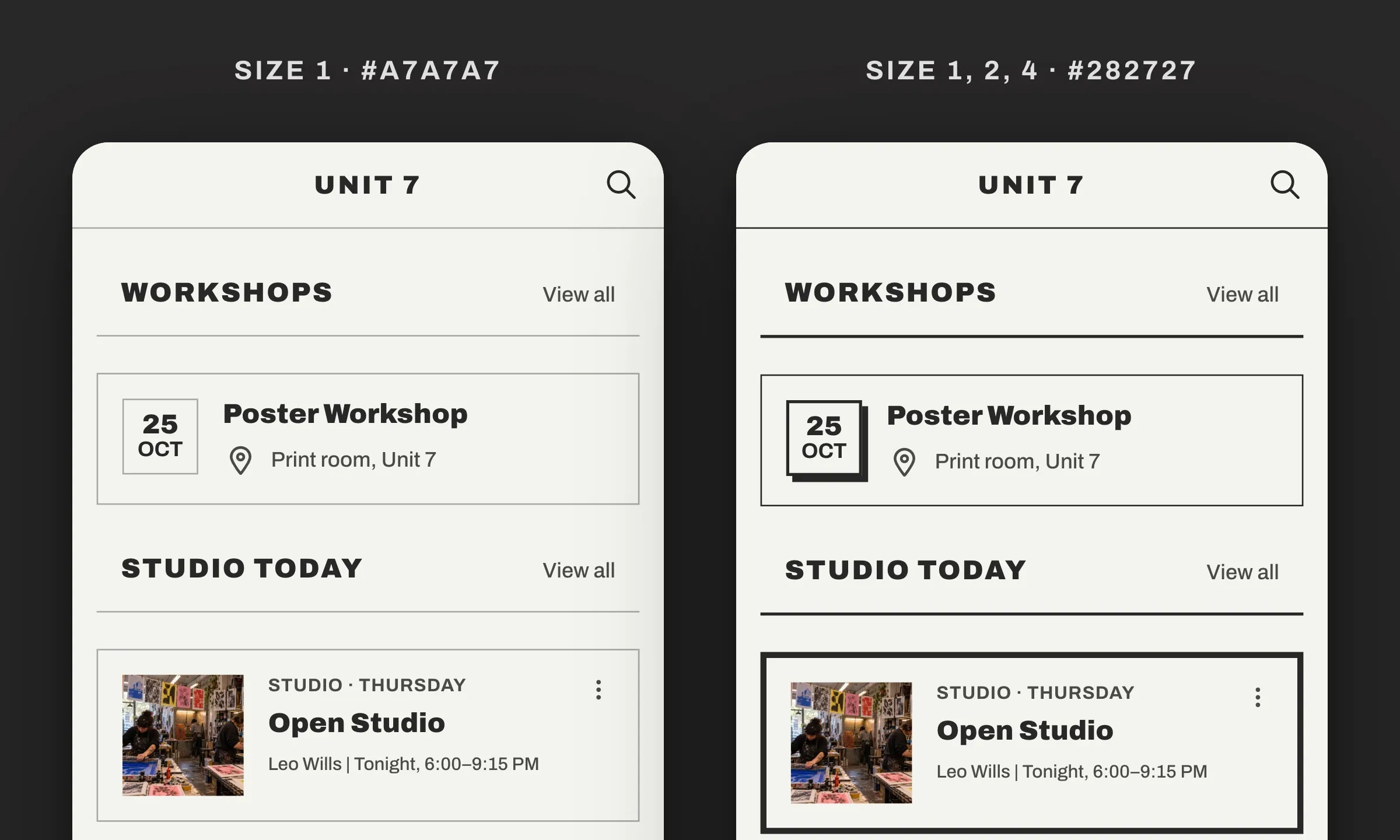
Here is the same screen twice. On the left, all the borders are at 1 px, in a discreet gray. They delimit each element, but nothing stands out, everything is equal. On the right, they switch to the soft black of the palette (#282727) and their thickness follows the role of each element. 1 px for the navigation bar and the event cell, 2 px for the widget headers and the date bullet, 4 px for the one featured news item. A hard shadow under the bullet finishes giving the screen its poster feel. The eye knows at once where to go.
Thicknesses change in an instant. Try, compare in the preview, and keep what your eye prefers.
Thin or thick border, what effect on your app?
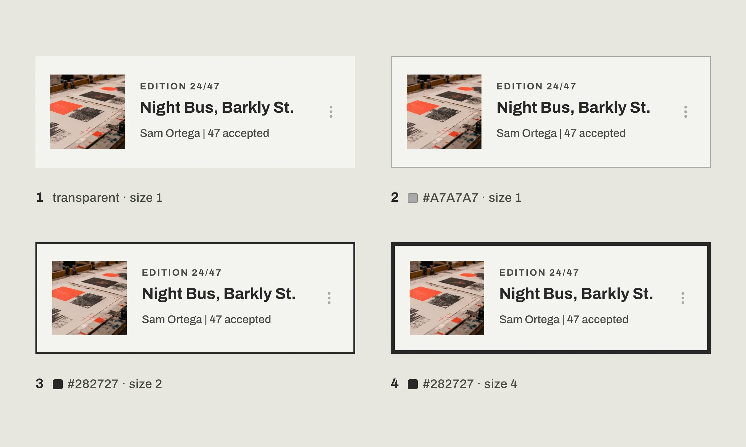
The same cell can carry very different borders, and each one changes the style of your app. The image shows four, from the most discreet to the boldest:
| Border | color | size | The effect |
|---|---|---|---|
| 1. Default | transparent | 1 | The cell melts into the page, the content speaks alone |
| 2. Thin and gray | #A7A7A7 | 1 | A discreet limit, ideal when your cells have no background |
| 3. Sharp | #282727 | 2 | A clean outline, each cell stands out clearly |
| 4. Thick | #282727 | 4 | A graphic frame, for an app with a bold style |
The first row is the default setting, the one you get without writing anything. The other three go straight into the editor, key by key.
None of these borders is better than another, and all of them are set with the same keys. The thickest one, on its own, can give an app its style, as in our art gallery app mockup, in neo-brutalism, on Dribbble, with thick black borders and square corners.
A border under the title, to separate without enclosing
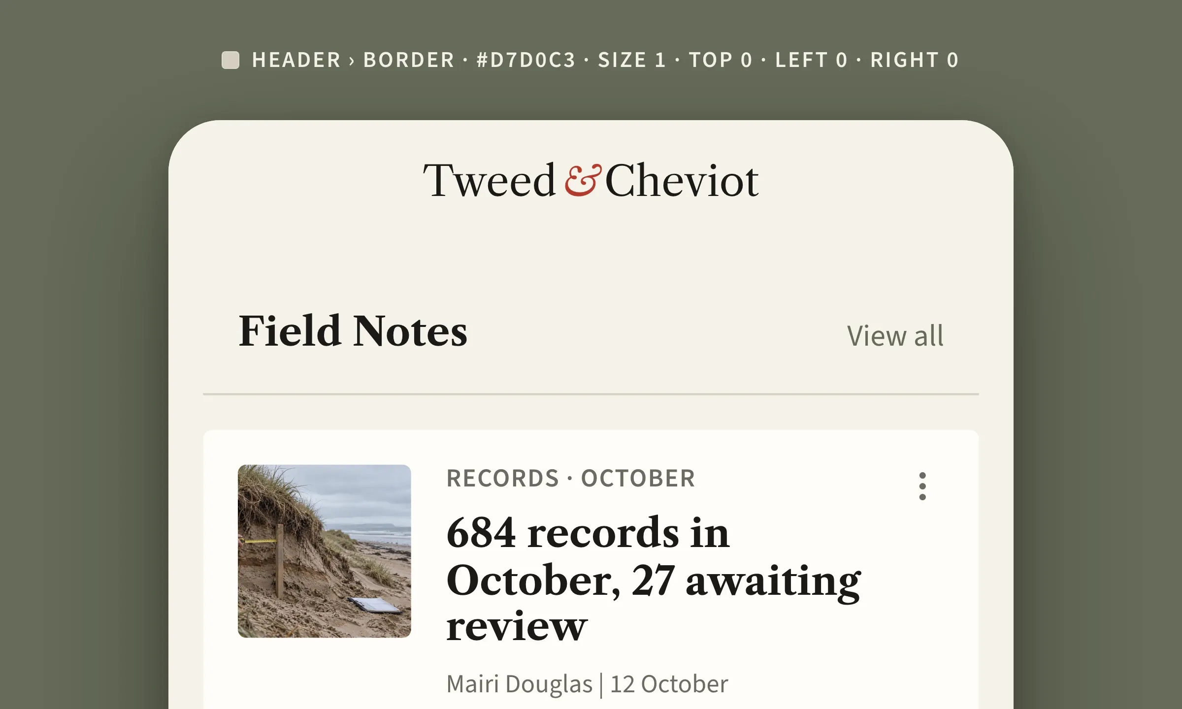
My favorite setting fits in one stroke, a 1 px rule under the title of a widget, in the rule color of the palette. You have come across it in the images of this article. As in a newspaper, it separates the title from the content without closing anything, and the list breathes. A full frame around the title would turn it into a button.
Its color is chosen in the widget panel, under “Borders”, and its sides in { EDITION }, that is the move of step 4 above.
The border in brief
- In a GoodBarber app, the border is already there, 1 px, on the cells, the widgets and their headers, the fields and the buttons, transparent except on fields and outline buttons.
- Three settings, the color, the thickness (a whole number in pixels) and, on the header of a widget, the sides (top, right, bottom, left), each one on or off.
- Border or separator, never both. A background or border color on the cell removes the separator and detaches the cell.
- On a Home widget, three colors in the panel, the header, the widget, the cell.
- For the fields, one setting applies to the whole app.
- The thickness and the sides are set in the JSON, with the free Advanced edition extension ({ EDITION } button).
Your turn
The next step is simple. Open the design panel of one of your Home widgets and give a color to “Border color”. When the urge for a bolder stroke comes, the { EDITION } button is in the same place, and a single key, size, is enough to begin.
No app yet? Create yours with GoodBarber, the Mobile App Builder.


